Folder, Letterhead, and Business card redesign advice
Hello everyone,
I have been going back and forth on a project for weeks - it's time I reach out for a little advice. Please feel welcome to share your thoughts.
Some context: I am redesigning three collateral pieces which I want to be more in line with some of the newer design pieces we've put out at my organization. This round of materials includes a folder, letterhead, and business cards.
The challenge: Our colors seem a little dated and, unfortunately, this can't be changed. But what I do want to do is move away from using our red (0/68/86/28). In more current materials, we have been using a lot of angles and variations in opacity with our blue color (57/11/11/22) - which feels more modern. Another thing I've struggled with is how to continue to use angles as well as our curvy butterfly without over-complicating the design.
The goal: To create a fresh design that is professional (we are an organization that highly values professionalism and we work to help individuals reconnect with the workforce). Possibly incorporate our butterfly into the design with angles/overlays. Keep everything clean and modern - perhaps blue isn't the right direction?
Thank you in advance for providing insight, creative advice, and honest feedback.
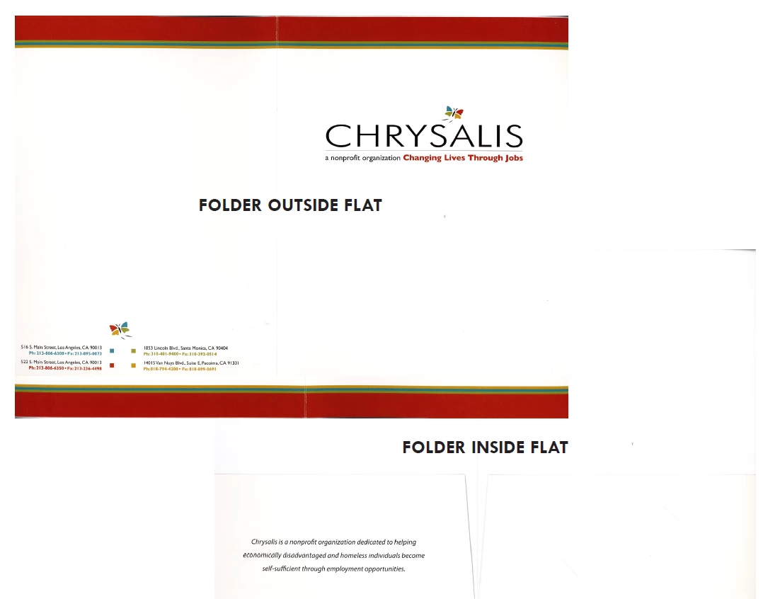
OLD folder, letterhead, and business card:
--------------------------------------------------------------------------------------------------------------------------------------
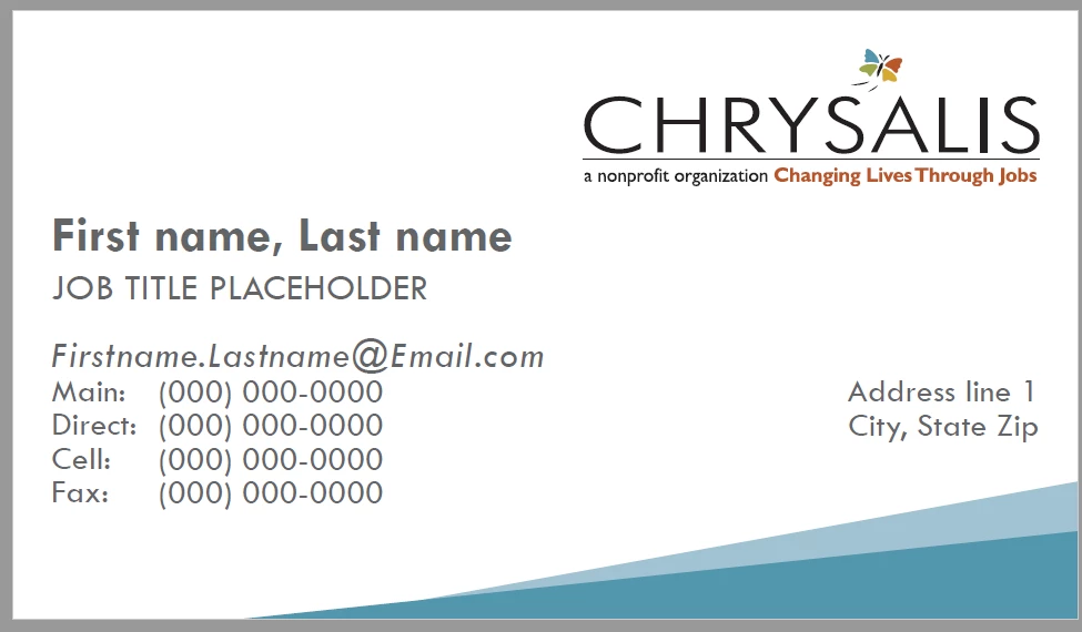
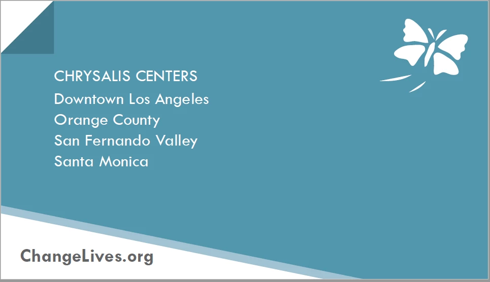
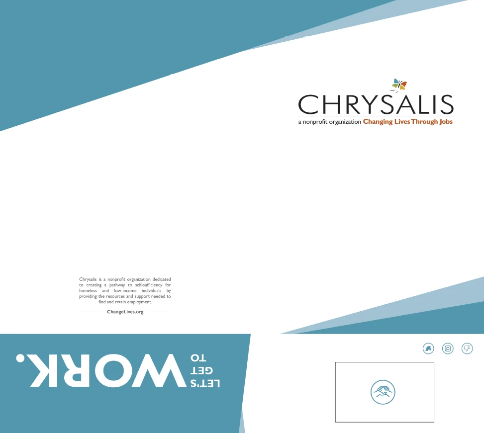
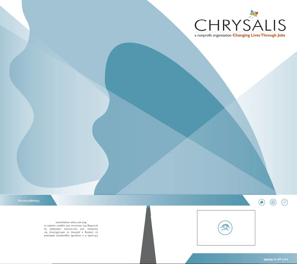
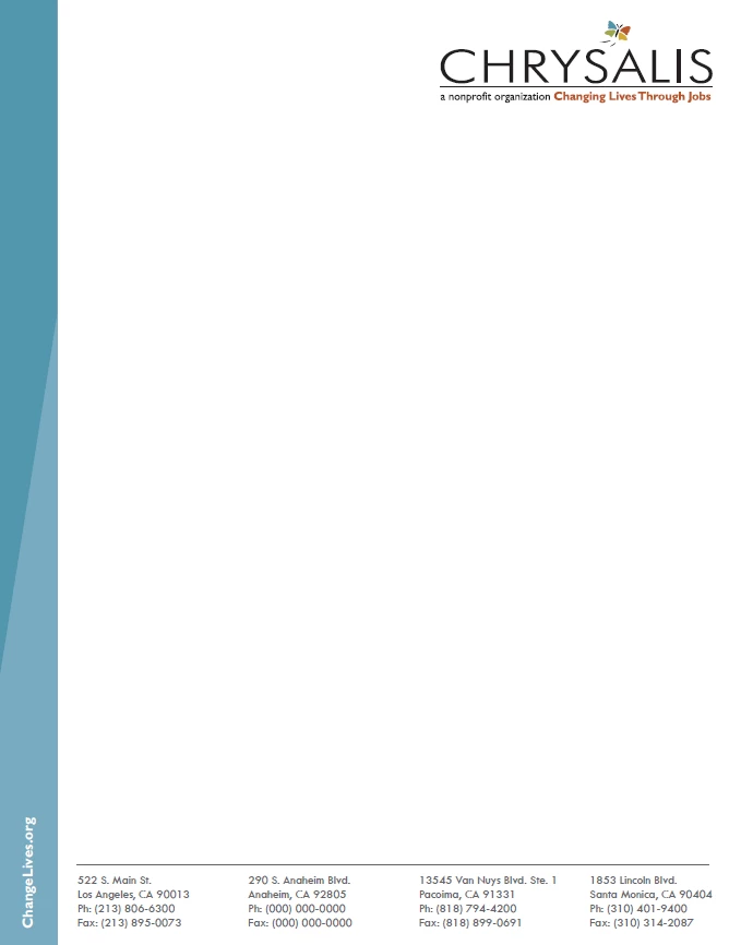
NEW DRAFTS folder, letterhead, and business card:
Folder option 1 - flat, unfolded
Folder option 2 - flat, unfolded:
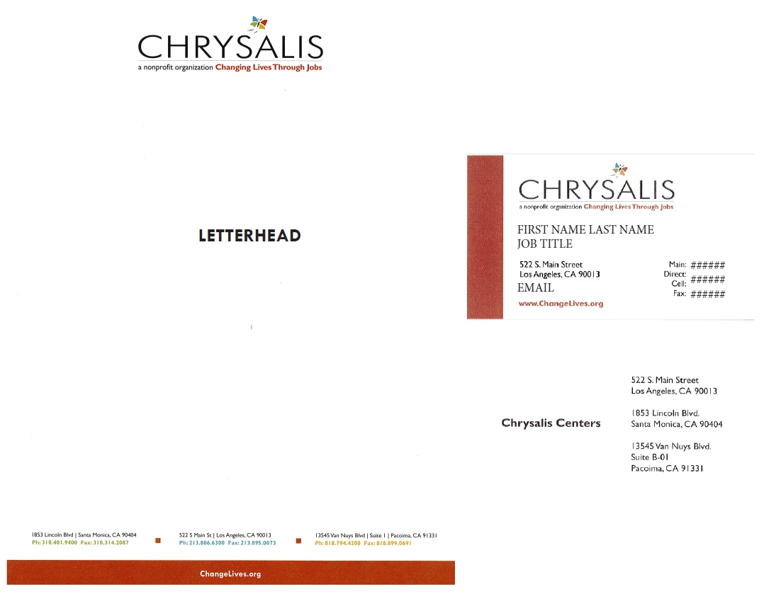
Letterhead draft:
Business card draft: