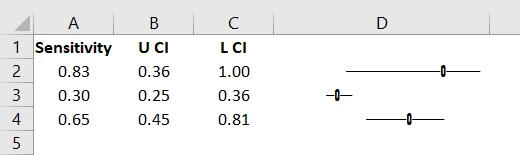
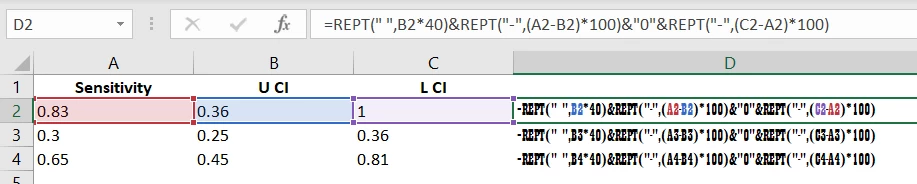
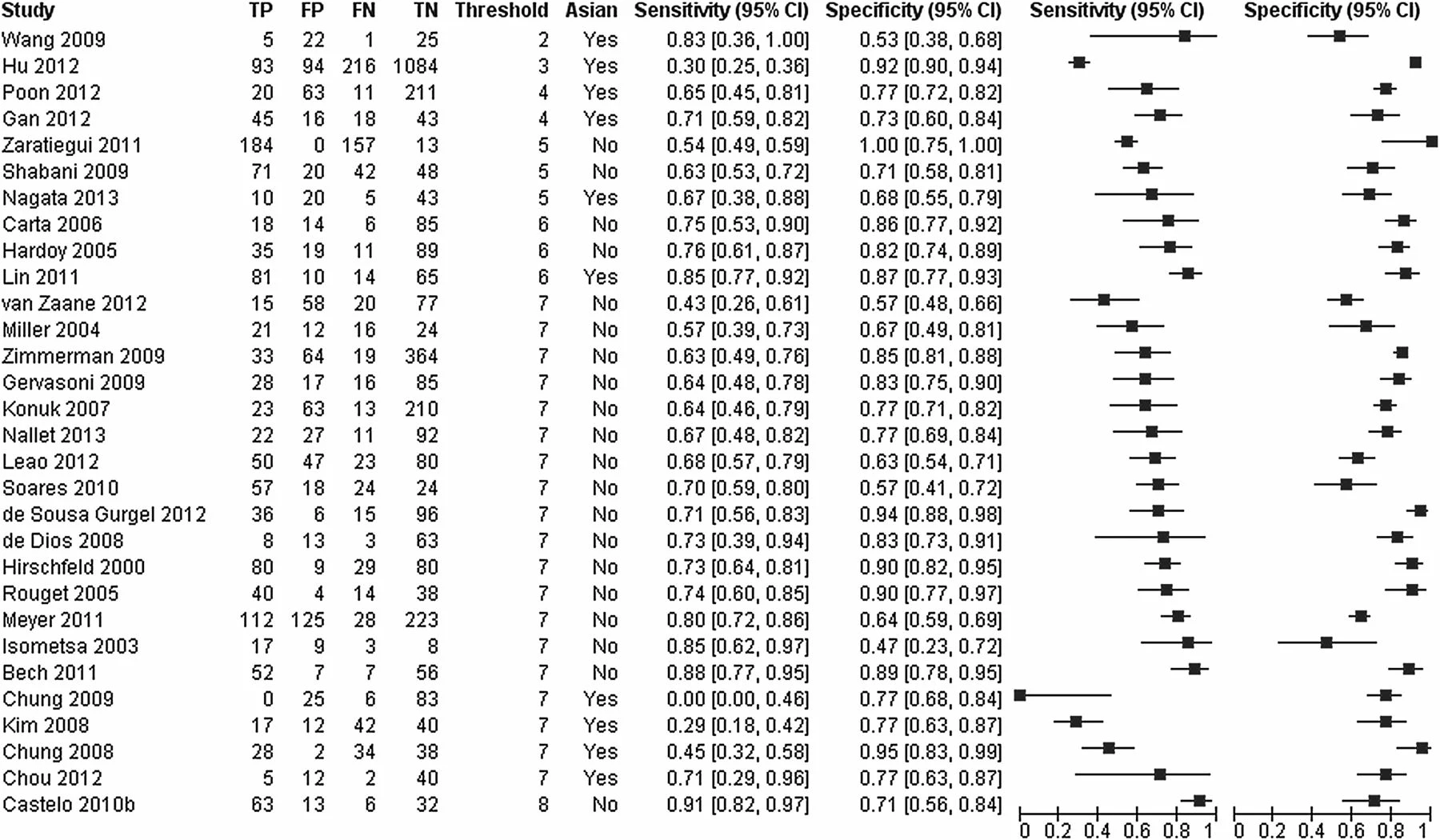
Copy link to clipboard
Copied

Hoping to recreate a graphic similar to the one above. Due to missing data (TP, FP, Fn TN) I cannot use the usual tools to create the above figure like Stata, RevMan or R. Was thinking of using illustrator to create two line graphs for sensitivity and specificity, above right. And the table function to input the rest of the data, above left.
Tried 2 datasets of 3 cells per study (row): sensitivity, lower CI and upper CI. other data set: specificity, lower CI and upper CI

This is the output for two studies for sensitivity only.Can put a line between the point representing the CI (upper and lower confidence interval) and edit the points. But I cannot change the categories to the vertical axis and values to the horizontal. Any one got any good suggestions please? Pretty stumped!
Thanks
how about using Excel? use font Playbill
Copy link to clipboard
Copied
Probably disappointing news, but this kind of graphing including some automated styling is something that Illustrator does not provide, unless you are willing to do manual modifications.
Illustrator's graph capabilities are old, really old ...
Copy link to clipboard
Copied
Hi Kurt
Bad news alright. Such a shame as I used Illustrator recently for statistical presentation and really like the results.
Thanks for considering!
Barrie
Copy link to clipboard
Copied
how about using Excel? use font Playbill
Copy link to clipboard
Copied
Hi Carlos
Going to give this a go. Thank you.
Will the output be transferable to a word document?
Copy link to clipboard
Copied
Hi, sure it will, straight copy/paste
barriew73769468 wrote
Such a shame as I used Illustrator recently for statistical presentation and really like the results.
the whole thing could be automatically built and stylized in Illustrator, do you do this often?
Copy link to clipboard
Copied
Going to have a crack off that excel suggestion. WOuld be interested in knowing more about the automation if that might be an option too. Thanks Carlos for the help.
Copy link to clipboard
Copied

I think I a m missing something.
Got the bit of code in but the only difference is what appears to be a large blank merged cell to the right of the formula entry.
Copy link to clipboard
Copied
Grr .. decimal place!
Copy link to clipboard
Copied

Worked a treat. Thanks Carlos. Will mess around with the formating
Copy link to clipboard
Copied
Excelent!!! The issue was the big numbers you were trying. The main thing to consider is the multiplying values in the formulas. 40 and 100 worked ok for the 0 to 1 range you posted initially. For bigger ranges like 0 to 100 you might need to use 4 and 10? Try different numbers, trial and error is your friend
Copy link to clipboard
Copied
I meant 40 "spaces" look as wide as 100 "dashes"
Copy link to clipboard
Copied

Getting a bit closer. Works ok for the sensitivity Sp and PPV and NPV, but not so much with the likelihood ratios. They have a much more varied range:

Copy link to clipboard
Copied
try changing your font to Playbill, the values I used (40 and 100) worked ok specifically with Playbill font and that specific range of values in your sample data (0 to 1)
Copy link to clipboard
Copied
it works fine, but unfortunately comparing 29.33 to 0.07 it's going to look awkward, the difference is too wide.
Get ready! An upgraded Adobe Community experience is coming in January.
Learn more