Copy link to clipboard
Copied
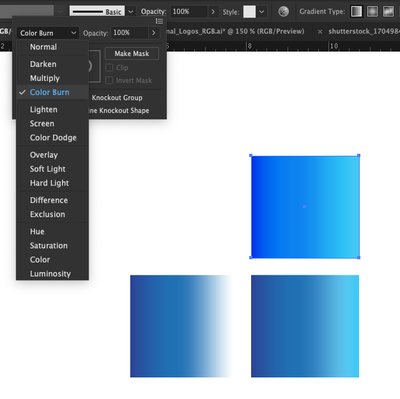
Hello, I have a gradient logo that I am trying to make as bright and rich as possible in PMS. I'll need to supply the logo in a range of fromats (CMYK, RGB and PMS.) The best way I have discoverd to achieve a bright gradient is using Color Burn as an opacity effect on the gradient vs. multiply. Are there any watchouts I should be aware of for setting my art files up with a color burn opacity?
 1 Correct answer
It's not a good idea to use Pantone spot colors in a gradient fill. Like Ton said, it's very difficult to get an accurate preview on-screen versus what would actually print. And then depending on the printing output method, the result would likely just be a CMYK-based simulation of those spot colors anyway. Not many clients are going to pay substantially more money to add additional spot color plates on top of CMYK just to cover a couple colors in a gradient fill.
I personally would only apply Pa
...Explore related tutorials & articles
Copy link to clipboard
Copied
Gradients between pantone colors are hard to preview but using an effect like color burn with pantone colors will be impossible to print.
Are you working in CMYK with the Pantone Colors and did you use Overprint Preview?
Copy link to clipboard
Copied
Thank you for your response. I have it in cmyk with overprint preview on. One more question, what about the multiply effect (vs. color burn) if I convert the gradient spot color to process, put a multiply on it & lay it over a solid color, would that print somewhat consistently?
Copy link to clipboard
Copied
It's not a good idea to use Pantone spot colors in a gradient fill. Like Ton said, it's very difficult to get an accurate preview on-screen versus what would actually print. And then depending on the printing output method, the result would likely just be a CMYK-based simulation of those spot colors anyway. Not many clients are going to pay substantially more money to add additional spot color plates on top of CMYK just to cover a couple colors in a gradient fill.
I personally would only apply Pantone spot colors to a gradient if the gradient was various percentage levels of a single spot color. And I would only do that if the print job was something on the order of black and white with a single spot color added.
Really it's just better to build gradients that are purely CMYK for any kind of logo branding purposes. Then choose corresponding RGB values for versions of the logo to display on computer and portable device displays. As to the need of making the logo colors bright and rich as possible, you really have to do that while ALWAYS thinking of gamut limits with how the logo will be printed. CMYK output allows colors to be only so bright.
Copy link to clipboard
Copied
Very helpful. Knowing this, I think I will convert my spot colors to process. Thank you!
Copy link to clipboard
Copied
Pantone Spot Colors are opaque, so they really do not intermix. CMYK Process Colors ( 4-Color Process ) are semi transparent in that they do intermix. So, you can use Pantone colors in gradients, but they pretty much overlay eachother. Not sure if you would ultimately have to apply and type of "Color Burn" or "Multiply" to the file because, unless you have the colors set to "Knock Out", they are going to "Overprint" eachother on press. That said, whenever you venture into uncharted territories, reach out to a print service provider and pass it by them. They can tell you where you are in the prepress matrix. Reagardless, you should always get a contract proof ( yes, a hard copy print ) before committing to a full print run.
Copy link to clipboard
Copied
Not to be contrary, but Pantone spot colors are not opaque, unless you're screen printing. The lithographic inks used to match the Pantone Formula Guide base color set (i.e. Rubine Red et. al.) are transparent... even Mixing Black. That said, gradients are almost always handled in CMYK. As a printer, my $0.02 for designers is, "Don't use gradients!" It may look great on a computer screen, but may not look so good on paper if you're expecting to match a corporate Pantone color.
Copy link to clipboard
Copied
Sent from my iPhone
Copy link to clipboard
Copied
Just to through the cat among the pigeons. As a flexible packaging printer we are always converting CMYK to pantone and print pantone to pantone vignettes/gradations. The issues we see are more designers using the Adobe transparency blend modes rather than just overpint. For example multiple ratherthan overprint becasue you don't need to turn on Overprint preview. If you want white text it will be reversed out of the printing inks and due to material movment on press this can depending on materials lead to a loss in clarity but do that from a pantone single ink you have no movement issues for example. That isn't to say it isn't without issues as usually presses curves don't allow to the differing gain you will see from diffeent pantone colours on press. Where as the CMYK will have been recorded when fingerprinting the press and materials and compensation curves built to help the print look like the original.
Find more inspiration, events, and resources on the new Adobe Community
Explore Now
