- Home
- Illustrator
- Discussions
- How can I get vibrant, almost neon colors to print...
- How can I get vibrant, almost neon colors to print...
Copy link to clipboard
Copied
I'm creating abstract art in Illustrator with a color mode of RGB and the profile Adobe RGB (1998) and am testing with giclee printing. Some of my very saturated and bright colors come out okay to well, with an almost close match. However, the hot colors, such as pinks and bright-to-dark blue and purple gradients do not.
I know that printers have a more limited color gamut, but want to know how I can get as close to the digital color gamut as possible.
Is there a way I can select alternative colors to get the same dramatic effect?
Or, are there settings in Illustrator I can use to help print that gamut range?
Or, is there a way to tweak them in Photoshop?
I haven't been able to find any current information and really need to find solutions for my art prints.
Thanks!
 1 Correct answer
If you are doing test-prints, I would suggest doing a grid of swatches. You'll get more colours and you can keep it as a guide for the future.
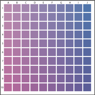
Pick 2 Colours to test, in this case I have added Magenta going down and Cyan to the Right. In your case you would use RGB instead of CMYK colours. Keep the Test Print and the actual File so you can figure out what the colour formula was in the file. Something like this:
Explore related tutorials & articles
Copy link to clipboard
Copied
Thanks, Mike. Ultimately, it sounds like I need to do a lot of test prints with my printer.
Copy link to clipboard
Copied
If you are doing test-prints, I would suggest doing a grid of swatches. You'll get more colours and you can keep it as a guide for the future.
Pick 2 Colours to test, in this case I have added Magenta going down and Cyan to the Right. In your case you would use RGB instead of CMYK colours. Keep the Test Print and the actual File so you can figure out what the colour formula was in the file. Something like this:
Copy link to clipboard
Copied
Great idea! Hadn't considered that. That would also help with the test print costs. Thanks!
-
- 1
- 2
Get ready! An upgraded Adobe Community experience is coming in January.
Learn more