

- Home
- Illustrator
- Discussions
- Re: How do I convert Greyscale to a Spot Colorscal...
- Re: How do I convert Greyscale to a Spot Colorscal...
How do I convert Greyscale to a Spot Colorscale ?

Copy link to clipboard
Copied
Hi guys,
I own a textile screen printing business. Sometimes I vectorise photos or images into greyscale. This gives nice halftone images, once I output to my printer through my RIP, (I use Accurip). This allows us to reproduce some great images with 1 ink colour. The great thing is that we can output the greyscale image, then use any ink colour we choose on the printing press to actually print the image. If we output greyscale, we can use scarlet ink to give us all shades of scarlets and pinks if we print onto a white shirt, for example. No problem there.
However, greyscale is essentially based on a black ink, with variable transparency. When I want to do a mockup for the customer of what the image would look like with a different base/ink colour other than black, (and the variable opacities of black that form the swatch pallette), I'd like to show the image using the actual base pantone spot colour we will use. That way, the customer can see how the variences in ink transparency will look on any shirt base colour that we choose to put in a layer behind the image. Right now, we can only show what it looks like if we choose black ink.
So..... once I have a vector in greyscale, how can I recolourise all the various opacities (of black), to various opacities of...say, Red?
If I try any kind of overlay or hue / saturation changes in photoshop, the base black colour is still present, and doesn't accurately represent what would print on a white shirt
Many thanks,
Richie


Explore related tutorials & articles
 19
Replies
19
19
Replies
19

Copy link to clipboard
Copied
Richie,
You may use an Opacity Mask as follows:
1) Create a large rectangle with the background colour;
2) Create a large rectangle with the full spot colour (or whichever full colour (set));
3) Place the artwork on top;
4) Select 2) and 3), and in the Transparency palette flyout tick Make Opacity Mask with both Clip and Invert Mask ticked.
Copy link to clipboard
Copied
I think the Photoshop method is still probably your best bet.
Open a copy of your greyscale image in Photoshop.
Adjust Hue/Saturation. Check Colorize.
Increase Lightness to 50 to get rid of the black.
Fiddle with Hue and saturation to get the right colour.

Copy link to clipboard
Copied
You can apply a Fill Swatch to a grayscale raster image in Illustrator. Simply select the image and apply the desired Swatch as a Fill.
greyscale is essentially based on a black ink, with variable transparency.
No. Grayscale can contain variable tints, not variable transparency. They are two different things.
It's not really clear exactly what you are doing because of the terminology you are using. You say in one place: "...if we print onto a white shirt..." and in another place "...with a different base/ink colour other than black..." and in another place "...on any shirt base colour...".
You seem to first be calling "base" an ink. Usually, in screen printing, the term "base" in context of inks refers to an underprint. For example, printing opaque white on a dark substrate before printing the other colors so as to enable the other colors to be bright. Thereafter, you seem to use the term "base" in reference to the color of the shirt.
So for clarity in the following, let's get terminology straight first:
"Substrate" is the object being printed. So the substrate color is the color of the shirt (or sign panel, or umbrella, or whatever) itself.
"Base" refers to an opaque ink (usually white) printed as a solid (100%) to provide a backing for the artwork when printed on a dark substrate.
"Tints" refers to grayscale values of an ink less than 100%, printed as a tint screen or as a halftone.
"Transparency" refers to a software feature which creates an effect to simulate translucent artwork. The suggestions from others involve the use of transparency features (opacity masks, etc.) I'm not going to suggest that.
Second, it seems that you may be under the all-too-common misconception that screen printing requires vector artwork. It doesn't. The reason I mention it will be clear later.
It sounds like you are...:
1. Autotracing a color raster image using the Grayscale preset of the autotrace feature in Illustrator.
2. Printing the resulting grayscale image as a single-ink halftone.
...and everything you want to do is working fine for production, but you now want to create a mock up for the customer which simulates the printed result when printed in a single spot color ink on a white substrate.
If that's correct:
You could:
- Use the recolor artwork command to colorize the autotraced grayscale vector paths with tints of the spot color.
- Or, you could simply set the autotrace feature to keep the resulting raster instead of keeping the vector paths, and then apply the desired spot color as a Fill to the raster image. (Unless you are manipulating the resulting paths afterwards, all you're really doing by using the grayscale preset of the autotrace feature is, in effect, posterizing the artwork.)
- Or, you could simply rasterize the autotraced grayscale vector paths to grayscale, and then apply the desired spot color as a Fill to the raster image.
Any of those methods would allow you to mock up the colored artwork as printed on a white substrate. Any of those methods would also let you print the spot color separation(s) you need for production. The spot color would still print as grayscale on the separation(s). In other words, there's no need to have a separate version of the artwork consisting of only tints of black. You could build the file in spot color from the beginning and the same file would work for both production and mockup--again, assuming a white substrate.
That's the rub. In a nutshell, Illustrator cannot simulate onscreen the opacity of individual inks (spot swatches). It can't do that with so-called opacity modes; it can't do that with Overprint Preview. Illustrator always assumes the translucent inks of process color. So whenever you want to mock up the appearance of light opaque inks printed on a darker substrate, the setup for that mockup either becomes too tedious or impossible.
But Photoshop can simulate the opacity of individual inks. And as stated above, screen printing does not require vector artwork. That's why more sophisticated screen printing setups (which routinely print halftoned, tint screened, or textured toning to simulate shades) create and/or assemble their production files in a raster imaging program like Photoshop instead of a vector drawing program like Illustrator. It's both simpler and more versatile to work this way when designing for screen printing.
What you're missing is this: Don't use transparency modes in an attempt to simulate the printed results. Don't use CMYK or RGB color modes at all. Create your Photoshop (or Corel PhotoPaint, or whatever) file as a multi-channel file.
Just like in a normal CMYK color mode file, in a multi-channel file, each channel corresponds to a single printing ink. You can have as many ink-specific channels as you need. Just like in CMYK, each channel is really an 8-bit grayscale image. The difference, though, is that each channel can be set to display when viewed as a composite using any color you want (in other words, representing spot inks) and can be set to display at any needed opacity to simulate the real-world opacity of the physical ink that will be used.
So you can:
- Ceate a channel for the grayscale artwork.
- Either create the artwork directly in that channel, or paste it in (from another channel, or from Illustrator or whatever).
- Set the channel to a particular spot color (ink).
- Set the opacity of the channel (simulating opaque inks in composite view).
- Create a temporary channel to simply fill with the color of the substrate.
- Preview it in composite view (all channels on) to show your customer a mockup of the printed results.
- Print separations suitable for production.
Plus, in programs like Photoshop you have the ability to actually re-rasterize individual channels to an actual halftone suitable for your screen printing. You can specify the angles, the frequency, and the shape (lines, for example, instead of dots) suitable for your screen printing setup. No RIP is really even needed, because you can (if you want) convert each channel to a 1-bit halftone which, in effect, prints as lineart.
But what about text, or vector paths? Again, you can draw those elements in a vector drawing program if you want, and then paste or import them into the appropriate channels of the multi-channel raster file.
So the workflow is sort of reversed from that most often used for offset printing: Instead of:
- Creating your raster image elements in Photoshop.
- Importing the raster images into Illustrator.
- Printing separations from Illustrator.
...you:
- Create your vector elements in Illustrator.
- Import the vector elements into Photoshop.
- Print separations from Photoshop.
For your described project, involving one continuous-tone raster image being printed in one opaque spot ink on a substrate of any color your customer may want:
- Open the original photo in Photoshop.
- Do whatever color adjustments you want (Levels, Curves) to optimize the contrast, etc.
- Change mode to grayscale.
- Run a Posterize filter (i.e. limit the pixels to a reduced number of grayscale values--essentially the same thing using the grayscale autotrace preset does).
- Change to multi-channel mode.
- Assign the spot color and opacity of the ink that will be used.
- Create another channel to represent the substrate. Fill it with the color of the shirt.
There is no real downside to this. Screen printing is a relatively low-resolution repro medium. You don't need the huge final resolutions of commercial offset because even in the areas of lightest tints, you still need halftone dots (if that's the screening method you're using) large enough to be held by the thread count of the screens.
Layered multi-ink designs (6-color, 8-color common in screen printing) can be built this way with far less tedium than by trying to simulate ink opacity in a program that simply can't do that.
JET

Copy link to clipboard
Copied
JETalmage wrote:
...That's the rub. In a nutshell, Illustrator cannot simulate onscreen the opacity of individual inks (spot swatches). It can't do that with so-called opacity modes; it can't do that with Overprint Preview. Illustrator always assumes the translucent inks of process color. So whenever you want to mock up the appearance of light opaque inks printed on a darker substrate, the setup for that mockup either becomes too tedious or impossible....
Jet, printing bureaus that are serious about reproducing color should have color profiles of their printers and each media, substrates, etc. The clients like designers should be supplied with the color profiles. When the right color profile is assigned to the document, then choosing View > Proof Setup > Customize, checking Simulate Paper Color, and making sure the supplied color profile is selected for Device to Simulate, this should soft proof the appearance of the printed result.
Copy link to clipboard
Copied
Jet, printing bureaus that are serious about reproducing color should have color profiles...
Emil, I'm quite familiar with offset printing. And I'm also quite familiar with screen printing involving opaque inks printing layered contone images, which is the matter being discussed. Color profies do not enable Illustrator to simulate the variable opacity of a continuous-tone light spot color overprinting a dark color without resorting to transparency settings, which will alter the actual greyscale output values. For example, show me a preview of a continuous-tone grayscale image with a 100% spot white Swatch applied to it as a fill, set to overprint a darker object (i.e.; the color of the substrate).
Richie,
Here's an example of the method commonly used for setting up spot-color multichannel files in Photoshop for screen printing:
This is a 5 spot color imprint. Each ink prints a raster image that will be either printed as line art or as a halftone.

Note that:
- There are 5 channels for inks, another for the substrate, another for a working alpha channel used to make selections.

- Previewing for different colored shirts is a simple matter of changing the color of the substrate channel.
- The composite displays correctly, regardless of the lightness/darkness of the substrate.


- The one file lets you work in a reasonable preview of how the finished piece will appear because you can stipulate the display opacity of each ink channel without affecting its actual output values. In a program like Illustrator, this would be equivalent to applying 100% of a spot color Swatch to a grayscale image, setting the display of that particular Swatch to something like 90% opaque, setting the image to overprint, and turning on Overprint Preview. But Illustrator cannot do that. Illustrator's Overprint Preview assumes the translucency of process inks, even when using spot colors. That's why you have to resort to things like Opacity Modes and Opacity Masks in order to simulate onscreen an accurate preview of what will actually happen when ink hits shirt.
- The same file is used to print the grayscale separations used to burn your screens.
- Each color separation prints to PDF as a grayscale page.
- Each sep prints as a solid because you are working with separation channels; there is no value-altering "transparency" or "opacity" masking going on in order to make the preview of the contone raster images look right for your customer (and for yourself as you work).
- All the inks overprint, despite some of the front colors being lighter than the back colors. This is commonly done in screen printing, because inks can be opaque, and each ink can be flashed if necessary to prevent wet inks from mixing.

JET
Copy link to clipboard
Copied
JETalmage wrote:
...For example, show me a preview of a continuous-tone grayscale image with a 100% spot white Swatch applied to it as a fill, overprinting a darker object (i.e.; the color of the substrate)...
I see what you mean Jet, I don't have much experience with screen printing except some of my logo designs with flat colors printed by the clients on t-shirts and other things so, your input is greatly appreciated.
However I would like to say that although the multi channel preview in Photoshop obviously and based on your input, simulates much better the screen print, I'm not sure if it was designed for that purpose. Multi channel doesn't have a color space and the display of the colors on the monitor assumes the RGB working color space (profile) selected in the Color Settings. If you check the different RGB working spaces available in the menu with the preview checked, you will see how different the display becomes which is more obvious if you are using an image like a photo with a lot of tones. Also I don't see noticeable difference when the image is on one channel but when I add another channel that simulates the substrates changing the RGB working spaces makes a big difference. I have a wide gamut monitor which can display the Pantone colors pretty closely to the printed Pantone book when I'm using a wider color space. But I don't know what color space is supposed to be used for simulating screen prints. May be for most practical purposes for rough previews of screen prints such precision doesn't matter anyway.

Copy link to clipboard
Copied
hello 20vK2,
no, do this:
Open the Image in PS. Save as (a copy) close original. Change Mode to Grayscale (if not already). Then change mode to Duotone. Leave preset alone in the Duotone Options diologue box, change type to Monotone. Double click the colour for INK 1, Click colour libraries, select the Pantone Book (eg Pantone solid coated) select the pantone colour you want. Click ok, and ok. Then if you want to send that to client best thing to do is change mode back to RGB.
Cool?
/Grant
Copy link to clipboard
Copied
or you could (in AI):
Save a copy of the file. Then in the new doc. add the spot colour you require to the swatches panel. Create a group with just that swatch. Then, select all the artwork, click on recolor artwork, click on the colour group in the options diologue.
and voila.
/G
Copy link to clipboard
Copied
Grant H wrote:
or you could (in AI):
Save a copy of the file. Then in the new doc. add the spot colour you require to the swatches panel. Create a group with just that swatch. Then, select all the artwork, click on recolor artwork, click on the colour group in the options diologue.
and voila.
/G
Grant, unless I'm not doing it correctly, this will not recolor the artwork with tints of the color in the group but change all colors to one blob of the same color
Copy link to clipboard
Copied
must be doing something wrong mate,
/G
Copy link to clipboard
Copied
Ok, I got it, it was a stupid mistake, sorry for the trouble.
Thanks
Copy link to clipboard
Copied
 you forgot that the OP vectorised didnt ya..
/H Hi Emil, been long time
Copy link to clipboard
Copied
No, I didn't change the preset to one color job. I open Colorize with F3 which is a hotkey for it in CS5 and the preset defaults at "Custom"
edit: I also deleted my post suggesting using a brush and tints which achieves the same thing like Colorize but is not as simple
Thanks

Copy link to clipboard
Copied
This is the best answer in my experience. Thank you!

Copy link to clipboard
Copied
This...almost worked for me. It changed the majority of the objects OK, but there were still a number that weren't.
I guess I don't understand why there isn't an easy way to do this. In InDesign you can assign any color to a grayscale JPEG or TIFF, and it just replaces all the shades of gray with shades of that color. Why isn't there a quick and easy way to do this in Illustrator to vector grayscale objects?
Copy link to clipboard
Copied
Here's what I'm talking about, and why everyone designing for screen printing should become comfortable with working in Multichannel mode in Photoshop (or PhotoPaint, etc.):


Plus, as mentioned in my previous post, there's the whole matter of being able to take advantage of a more robust selection of halftone settings (for example diffusion dithering). Illustrator still does not provide for object-level halftone settings (and couldn't preview them if it did).
Also as already mentioned, screen printing does not need vector artwork. It needs line art. In a raster program, you can use a wide array of high contrast stippling effects and textures which convert well to line art (1-bit images), with which to render tones—as is commonly done in higher-end screen printing designs you see everywhere commercially.
Also, BTW: Multichannel mode is quite different from duotone. A duotone (and monotone, tritone, quadtone) is all about printing a single grayscale channel (i.e.; a single image) with multiple inks, merely using different grayscale curves for each ink. It simulates what used to be done in litho darkrooms with process cameras using multiple exposures on a single image and then printing each exposure with a different ink. It was commonly used to add a bit of color (similar to a sepia tone) to and enhance the dynamic range of halftones printed in black on two-color jobs. For special effects it can be used to make images appear to have a "third" color when printed with two inks. Not at all the same thing as having multiple separation channels containing independent images.
JET

Copy link to clipboard
Copied
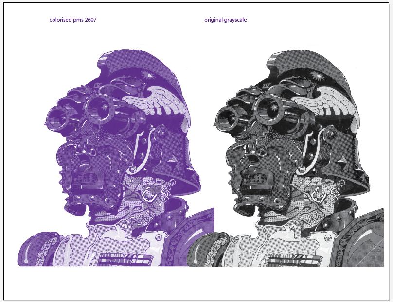
20vk2,
"When I want to do a mockup for the customer of what the image would look like with a different base/ink colour other than black, (and the variable opacities of black that form the swatch pallette), I'd like to show the image using the actual base pantone spot colour we will use.
this really is a simple process - place grayscale into Illustrator, select it with direct selection arrow, add your specific PMS color to pallette, select 'fill' from swatch pallete

Copy link to clipboard
Copied
Wow so simple! Thank you for this answer! Took ages trying to figure this out!

Copy link to clipboard
Copied
If your art is vector, scripting can help.
http://forums.adobe.com/message/5621099#5621099 <-post 22 has a working script that converts any cmyk-black or grayscale to a spot which can then be merged.
http://forums.adobe.com/thread/1283327 <-in case you need to bring it back to grayscale.

Find more inspiration, events, and resources on the new Adobe Community
Explore Now
 AdChoices