- Home
- Illustrator
- Discussions
- How do I 'Flatten' an Illustrator file?
- How do I 'Flatten' an Illustrator file?
Copy link to clipboard
Copied
I have a logo I've been working on with lots of layers, and sub-layers and now I would like to collapse or 'flatten' everything into one layer for use as a logo without the encumbrance of the many layers it took to make this artwork. I've tried 'flatten' but that still keeps the layers and sub-layers. I'm not sure what else to try. I want what is on top to appear and layers below to be sandwiched down so everything looks like it is on the screen. In Photoshop, I would just flatten and get the result I am looking for on one layer, but in Illustrator, it's not cooperating the way I would like it to. I have converted all type to paths, so that is done.
Where do I go from here to get the 'flattened' file I am after?
TIA,
Ken
 1 Correct answer
Ken Nielsen wrote:
I have selected all, cut to clipboard and pasted into a new document... is that what you mean? This does not change the many layers still remain.
Create File>new, then File>Place the logo file in the new document.
Explore related tutorials & articles
Copy link to clipboard
Copied
KrisHunt wrote:
Ken, you have a fundamental misunderstanding of how Illustrator works. Grouping the layers will get you the closest to what you're after, but you will never be able to get rid of all the sublayers, because Illustrator is object-oriented, which means your graphics are composed of objects with a stacking order, i.e., layers. Just close the disclosure arrow that reveals the sublayers and you can pretend they're not even there if they bug you.
And this is what I come up to as a conclusion to this whole informative and also entertaining discussion: Illustrator is an 'Object-Oriented' program and as such, layers have nothing to do with what I am trying to do. As you all have me seeing the light on this subject now I can see that if I want my 'finished' art to be on one layer, then I would need to re-construct the file and save as a new file where I, 'by hand' build the resulting one layer from elements needed from the other layers, with fills where there is color and just the most elemental paths that are needed to make the one-layer rendition work. Too much work for nothing as a result. Practicality is key in this discussion and a native Illustrator file can be brought into InDesign or wherever I need it. Or, if I need another file format, I can export to a suitable resolution bitmap file if that would be needed. As it is, A tightly cropped and grouped Illustrator file can be placed into another Illustrator file and is scaleable with no loss and is 'set in stone' as the logo - so no chance of unwanted alterations after the fact.
This has been a most invigorating and informative discussion and has awakened and enlivened some very essential information about Illustrator which should always be kept close at hand.
Thanks Again To All Whom Have Posted Here,
Ken
Copy link to clipboard
Copied
Getting rid of layers in Illustrator or "flattening" is completely unnecessary.
Turn that layers palette off and completely forget about it.
The only time you'll ever need to pay attention to layers is if you're using dielines or reference drawings, etc.
FORGET THE LAYERS. They mean nothing for your logo project.
Save your file as an .EPS and drop it into your project or send it to your client. DONE.
**********
ADDENDUM - For your reference, I find Photoshop to be the absolute BEST program for ad layouts. I've been doing this for over 20 years, and Photoshop is fluid, responsive and gives you realtime results. AND you can work in layers that you can understand. Just paste your logo into your ad as a "Smart Object" and you can scale it up and down forever as you're building your ad. Unless your ad has MASSIVE amounts of copy, stick with Photoshop for layout... you'll be so much happier and your work will go much much faster.
Copy link to clipboard
Copied
Photoshop is definitely not the best application for layouts.
Also: EPS is last century's file format. It might still be appropriate for exchanging logos with some excentric applications, but definitely not for delivering layouts for printing.
Copy link to clipboard
Copied
Everyone has a different way of doing layouts, but if they're photo-based (as most single-page ads are), Photoshop is the IDEAL application. (It wasn't always that way, as Photoshop used to soften type, which is no longer the case). If you're talking multiple-page documents, InDesign is your thing. Illustrator is great for anything technical... logos, vector illustration and designs with dielines (such as packaging). My work environment is extremely fast paced, demands extreme attention to detail and has a lot of money on the line. My method for single page ads with minimal copy is Photoshop (flattened and dropped into Illustrator for crops and PDF). Feel free to experiment with what works for you. After 20+ years, I depend on this method for ultimate speed and quality.
And regarding EPS, I'm not sure what "eccentric" applications, you're talking about, but if a client wants their logo in vector format, 99.5% still want it sent to them in vector EPS format.
Copy link to clipboard
Copied
royd79955180 schrieb:
After 20+ years, I depend on this method for ultimate speed and quality.
Please don't try to beat me by years of experience. You might lose this.
Copy link to clipboard
Copied
Monika Gause wrote:
royd79955180 schrieb:
After 20+ years, I depend on this method for ultimate speed and quality.
Please don't try to beat me by years of experience. You might lose this.
Absolutely, You sure wouldn't want me in this contest either...
Copy link to clipboard
Copied
I was just under the assumption that you were a beginner, since this is one of the first things that new Illustrator users encounter.
Copy link to clipboard
Copied
I have to disagree with you. Doing layouts in Photoshop is like hammering a nail with a screwdriver. Most users who are doing layouts in Photoshop and Illustrator, do so only because they really don't know what InDesign can do.
Copy link to clipboard
Copied
Doing an ad layout with a publishing program sounds like as much fun as having a root canal with no anasthesia. Enjoy that!
Copy link to clipboard
Copied
royd79955180 wrote:
After 20+ years, I depend on this method for ultimate speed and quality.
The only thing you can depend on with that workflow is poor quality, rasterised type, unreadable proof PDFs of the publications that include your ads, and RIPs chugging through entirely rasterised pages that they would breeze through if they were constructed properly.
The 'eccentric' program is Quark XPress, really. Its historical dominance and unreliable placement of AI or PDF is probably the biggest reason for the inertia that has people still requesting EPS files, even in an Adobe workflow.
Copy link to clipboard
Copied
Who uses Quark any more? Long dead, though I have encountered companies that refuse to give it up.
Rasterized type from Photoshop? If you're printing in black and white on newsprint, I would say you're correct. Otherwise, what decade are you talking about? I have color ads running in national magazines every day... razor sharp type.
Well, I can see what kind of "progressive" designers are on these forums. Not going to gain much insight from people that are stuck in the 90s. See ya!
**********
P.S.
From Creative Intuition: "When working with a printer or promotional products vendor or sign company they will most likely ask for your logo as an “EPS” or “vector file.” If you don’t have this file type you need to get it from the designer that created the original art. If that person is not available then your vendor will probably have to recreate your logo from scratch."
From Vector Magic - "Adobe's EPS format (Encapsulated PostScript) is perhaps the most common vector image format. It is the standard interchange format in the print industry."
Not sure what magic vector files you're using, unless you're embedding PDFs in your document, which works fine most of the time, but is much more dummy-proof when you place the actual vector information.
Copy link to clipboard
Copied
royd79955180 schrieb:
Not sure what magic vector files you're using, unless you're embedding PDFs in your document, which works fine most of the time, but is much more dummy-proof when you place the actual vector information.
The "actual vector information" is in the AI file. Save it with "PDF compatible" option and it has a PDF part embedded, so you have to deal with only one file for editing and placing in layouts (and also in Photoshop as a smart object). This reduces errors as well since you don't need to update your EPS when you change something in the AI file.
Copy link to clipboard
Copied
The "actual vector information" is the same, whether in AI, EPS or PDF. That never changes. I'm simply stating that when sending your logo file to a client, the safest version will always be EPS, and print houses won't deal with anything else. More often then not, you're dealing with some boob on the other end with an old PC using Corel Draw or some secretary trying to create an ad in Word (who will also ask for it in some ancient form of BMP).
Copy link to clipboard
Copied
I don't know when was the last time I sent an EPS to a print house. Around here the vast majority of them demands PDF that has been saved using their joboptions and color management settings.
Send them anything else and you'll have to pay additional fee.
EPS files also tend to cause major problems in current InDesign versions.
Copy link to clipboard
Copied
The actual vector information is not the same.
In an EPS file transparency is flattened (because PostScript does not support transparency).
That results in new objects, possibly some rasterized.
PDF and AI can keep the actual vector information.
Copy link to clipboard
Copied
This thread could grow on forever. Just because I was working through the 90's doesn't mean I wasn't having success. At that time, placing a Photoshop EPS with a vector clipping path into InDesign would produce perfect transparency outside of the clipping path, a very sharp way to outline bitmap objects and would even 'cut cleanly' through pixels. Did thousands of those. I wonder if this means that a vector path in Illustrator can act as a 'clipping path' does in Photoshop?
Copy link to clipboard
Copied
Ken Nielsen wrote:
I wonder if this means that a vector path in Illustrator can act as a 'clipping path' does in Photoshop?
Yes, in Illustrator you would use a Clipping mask for this purpose.
Copy link to clipboard
Copied
Reading your response again.
What I call transparency is the blending of objects when the top one has an opacity other than 100%.
Or when a soft dropshadow blends with background objects. Or when a blend mode is applied.
Clipping paths are different.
Copy link to clipboard
Copied
royd79955180 wrote:
Who uses Quark any more? Long dead, though I have encountered companies that refuse to give it up.
Which one is it? It's not 'long dead' if people still use it, and believe me, I'm far from a proponent of clinging to Quark. I'm just stating why EPS has stuck around, for the most part needlessly.
royd79955180 wrote:
Rasterized type from Photoshop? If you're printing in black and white on newsprint, I would say you're correct. Otherwise, what decade are you talking about? I have color ads running in national magazines every day... razor sharp type.
What does the printing method have to do with whether the elements of a file are vector or raster? The only way to get vector type out of Photoshop is to save directly out as an unflattened PDF. The moment you flatten, which you say you do, all live text and vector content is rasterised at the resolution of the document. You are sending rasterised type with that method, fact.
You wouldn't want to be a fly on the wall of the production department of those national magazines when they're working with your files.
royd79955180 wrote:
Well, I can see what kind of "progressive" designers are on these forums. Not going to gain much insight from people that are stuck in the 90s. See ya!
...from an proponent of EPS, without a hint of irony.
royd79955180 wrote:
From Creative Intuition: "When working with a printer or promotional products vendor or sign company they will most likely ask for your logo as an “EPS” or “vector file.” If you don’t have this file type you need to get it from the designer that created the original art. If that person is not available then your vendor will probably have to recreate your logo from scratch."
From Vector Magic - "Adobe's EPS format (Encapsulated PostScript) is perhaps the most common vector image format. It is the standard interchange format in the print industry."
Those posts are clearly intended to discourage people from sending raster files of their logo, which is a common issue, especially for promotional product vendors that deal directly with small businesses. It's true that a lot of vendors will ask for 'EPS', for the historical reasons I mentioned. What they really want is vectors.
Copy link to clipboard
Copied
Yeah, all the talk online about Quark being dead is because it's alive and well. Sorry, my error.
Whether you're printing from a vector source or a raster source, your file is still converted to dots on the press. With digital files, supplying a 300ppi file is almost an overkill of information, giving you razor sharp type in modern color printing. And anyone in the business should know that if you're printing in greyscale on newsprint, you want to keep tones to a minimum because that heavy screen is going to soften everything... and you'll be better off with vector type. Geez. It's like talking to bricks here.
This is like listening to people comment on political speeches... they only hear what they want to hear, then rant on endlessly.
The original discussion was about finishing a logo. I had mentioned to forget about the layers. I mentioned saving the file out as an EPS and send it to the client (because every client I've ever had has asked for an EPS version to keep in their files... its the usual case).
Copy link to clipboard
Copied
royd79955180 schrieb:
Whether you're printing from a vector source or a raster source, your file is still converted to dots on the press. With digital files, supplying a 300ppi file is almost an overkill of information, giving you razor sharp type in modern color printing.
Line art and text should be rasterized at a resolution of 1200 ppi or higher in order to be "razor sharp". That's why these settings in the PDF export dialog still exist.
Copy link to clipboard
Copied
Upload one of these razor sharp files. I'll build it properly, run both through the RIP at 2540dpi and your chosen LPI, and post a screenshot of the dots that hit the plate with 1 screen pixel to 1 plate pixel. I might even play around to simulate newsprint dot gain if you like.
Copy link to clipboard
Copied
I grew up in the industry after WWII and it was all paste-up, cold type and all ran through a Robertson camera and then onto a plate then on to the press. Far advanced from the previous generation with moveable type. It's great to still be alive and engaged, but I do say that my old experience adds more rhyme and reason to what these discussions are all about. Artists and production people used to work side-by-side in the same environment, so knowledge was shared. This is what we have now in these forums and I think it is wonderful and essential to growth from within the industry. Many good insights and experiences have been shared in just this one thread.
Copy link to clipboard
Copied
My first professional experience was in a tiny ad agency, where the delivery method was bromide paper. We hadn't bought an imagesetter yet, So we'd design the ads 1:1 on our little Macs, print individual elements of them at 400%, 300dpi, 20lpi on an Apple LaserWriter, paste them back together (I did a lot of manually cutting around images of cars) then take the board into the darkroom to shoot it back down to 25%. Viola, 1200dpi bromide. I don't miss watching holes gradually appear in my jeans from the developer!
Copy link to clipboard
Copied
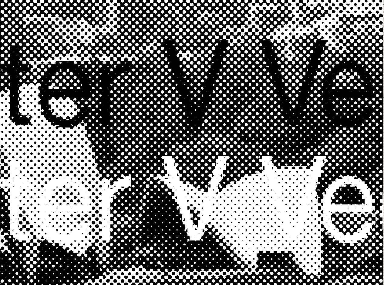
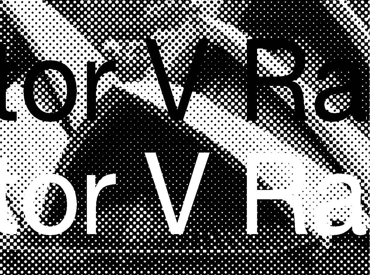
These are both exact representations of what would get imaged to plate, produced by a Harlequin RIP at 2540dpi, 150lpi, from a 300ppi image with text set in Photoshop (raster) and Illustrator (vector). Which would you rather went on press?


Get ready! An upgraded Adobe Community experience is coming in January.
Learn more


