Copy link to clipboard
Copied
Hi everyone! Can anyone help me with the choice of colors for shading? I would like the colors to be more even, and here orange and red come out. I have no idea how to choose the colors so that there is no such difference between them, and at the same time get the shading effect. I'm just getting started and I'm learning to shade.
I am putting a picture in the attachment.
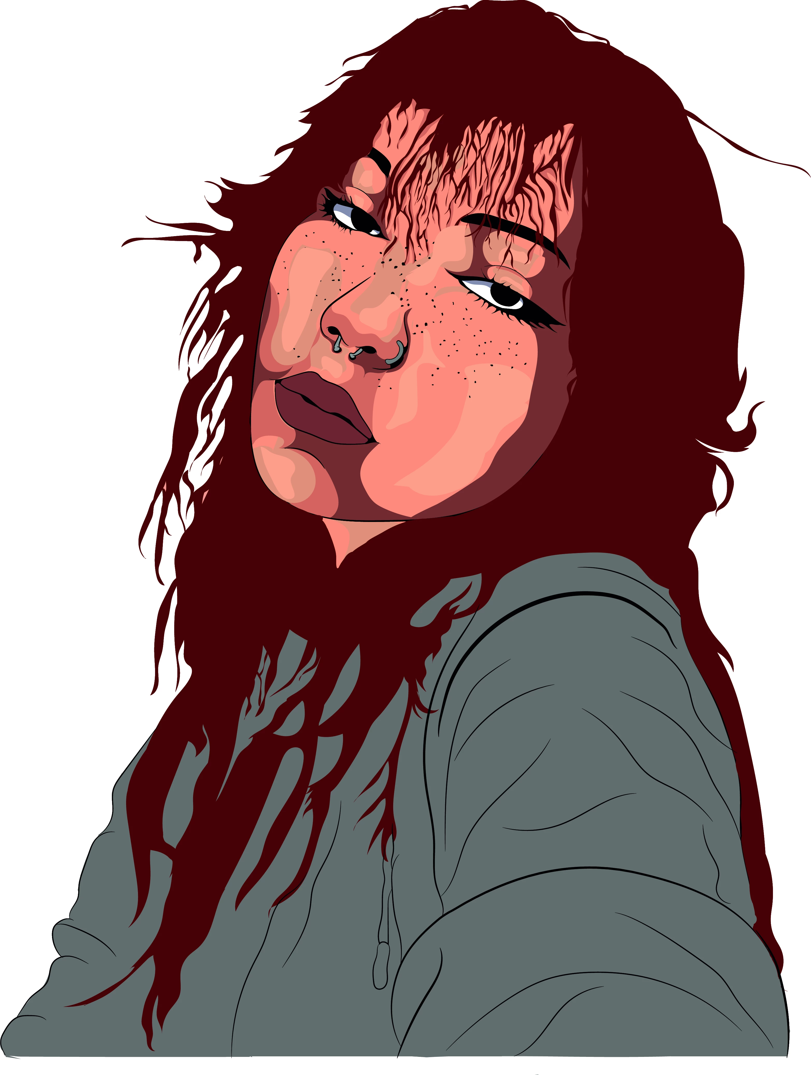
Ty for everyone to try help.
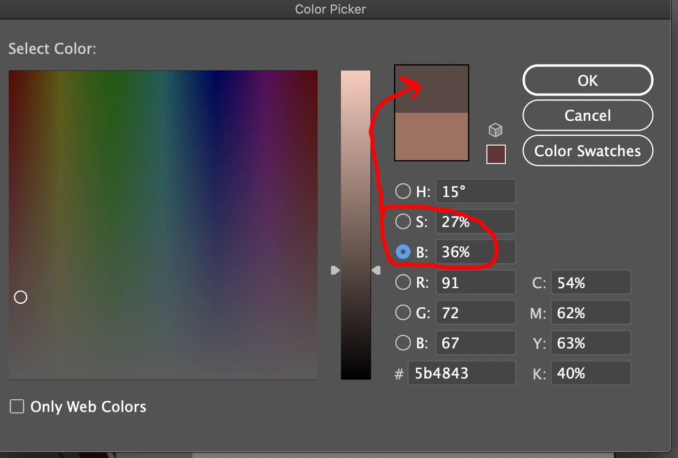
Depends what look you are gooing for shadows & highlights can be very surreealistic. You could for example sample the skin, and then reduce brightness an amount and saturation about half the amount to get a skin light shadow color, than agan gfro s sking dark shadow color..
While there are steadfast rules atelst you will have a color harmony for multiple shading colors on same elelment.
Copy link to clipboard
Copied
Sorry it's my first time checking the community. There are a few different ways of arriving at the right shades.
One way is to choose one two colors. One light and dark. You can use the blend mode in Illustrator to create additional shades in between.
You can also use the edit colors option to adjust the colors to make them connect more smoothly.
Maybe start off with deciding how many shades you want to use. I would suggest at least one base tone, 1 highlight and 1 shadow. It all depends on how much detail you want in the portrait.
Hope this helps!