
How to get a fat stroke on swoosh with sharp pointed corners
Hi everyone... please can you help me with this? I am trying to put a fat stroke on this swoosh but need the outline/stroke to have a pointed sharp corner on each end of the swoosh, so that the stroke mimics the exact shape of the swoosh...but I am just not having any luck!!
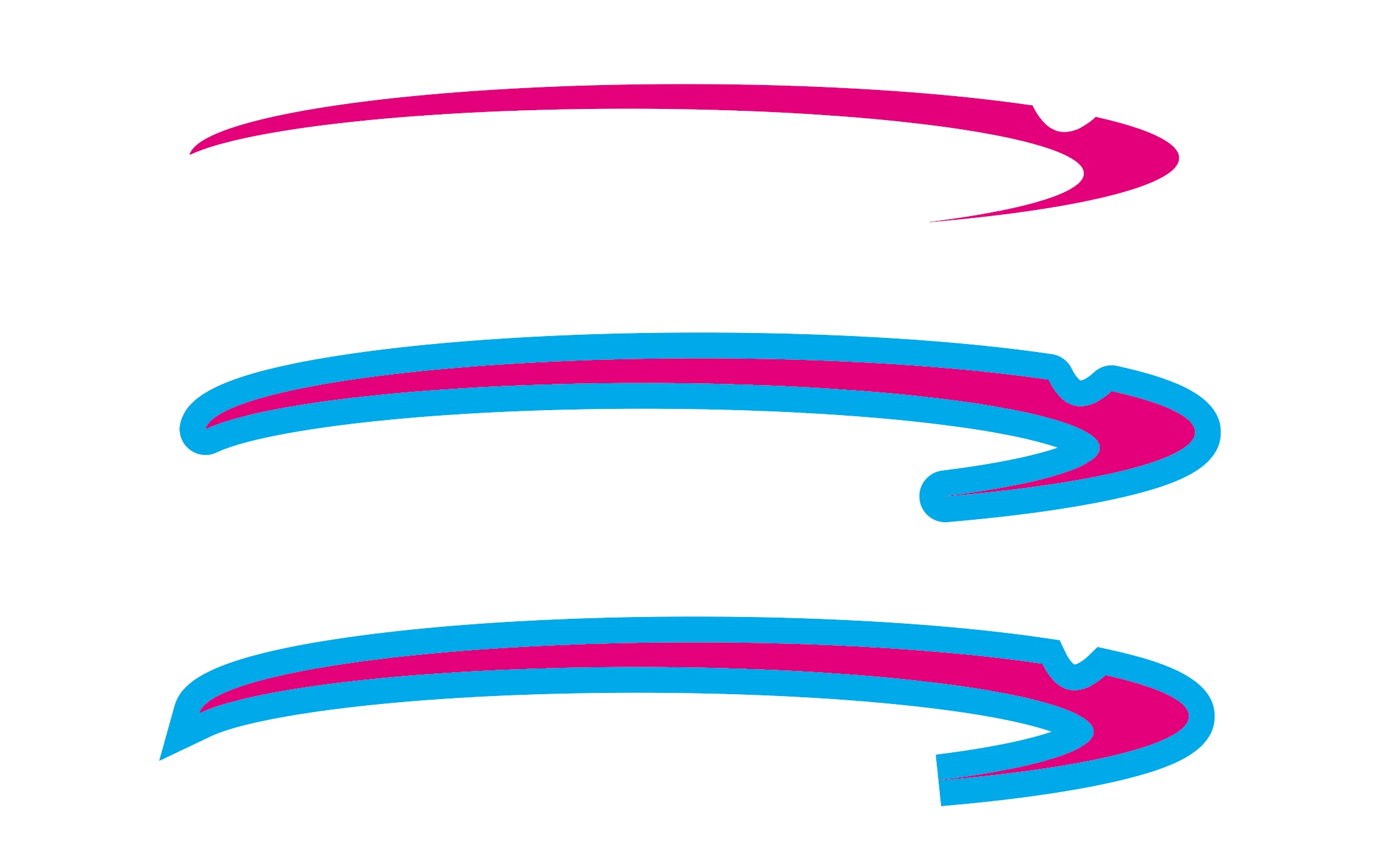
The top swoosh shows the original swoosh.
The second one shows the swoosh with a fat outline/stroke (stroke is behind the fill) with the corner set to "round join" in the Stroke panel.
The third one shows the swoosh with a fat outline/stroke (stroke is behind the fill) with the corner set to "miter join" in the Stroke panel.
Please note that these colors are used for the illustrative purposes of this discussion only and also note that this swoosh is just PART of a logo. The entire logo has a fat stroke behind it. My client wanted this swoosh added in to the logo, so I needed to add the fat stroke behind this too, but am having trouble with the corners!! Can anyone give me some quick tips as to how to get the sharp points that I need? Thanks so much in advance for your help 
 I think I will have to just go about drawing another path for each stroke...and I am also going to try to dissuade my client from using the swoosh because it REALLY uglifies the logo.