- Home
- Illustrator
- Discussions
- Re: How to make a text follow a shape in a smooth ...
- Re: How to make a text follow a shape in a smooth ...
How to make a text follow a shape in a smooth way?
Copy link to clipboard
Copied
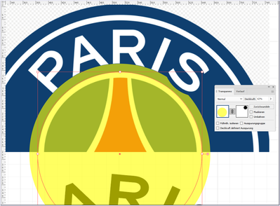
I wonder if there is a function that makes the text follow a shape in a smooth way? For example, look at the PSG logo where you see how the A and R follow the circular shape, without distorting the shape of the letter.
Explore related tutorials & articles
Copy link to clipboard
Copied
Text on a path is a mechanical operation, and can't produce the "organic" treatment you see on the R in the PSG logo. That was positioned and altered manually to produce the final result. There is no way to get that "automatically".
Copy link to clipboard
Copied
You can try turning the letters into an art brush and applying them to a circular path (or a segment of that circular path). I've used the trick before on round "seal" style logos. There will be some distortion involved, but it can look more natural than letters that have been randomly rotated along a path. Usually text on path effects work better if the letters are small in relation to the path. If the letters are too big the result will look very wacky, like the "Paris" example above.
I can fine tune lettering treated as an art brush by using variable fonts that feature a width axis and by taking note of the target path's length. If I need the lettering to fit a cetain path length I can adjust the font's width axis values to fill that length without crudely stretching or squeezing the letters. The line of text gets dragged into the art brush palette and then applied to the target path.
Copy link to clipboard
Copied
Thanks Bobby! Unfortunalety I think this solution distort the letters. It may work in some cases I guess.
Copy link to clipboard
Copied
Kittl does not distort text on a path. You could give Kittl a try. I haven't used it myself, but I understand that Kittl files can be exported as SVG, which could then be imported into Illustrator.
You can request bug fixes and features to be added to Illustrator. https://helpx.adobe.com/x-productkb/global/how-to-user-voice.html
You are not alone in wanting text on a path without distortion -- it has been requested for years. Hopefully Adobe will add the feature in an Illustrator update.
Copy link to clipboard
Copied
Kittl doesn't appear to do anything different with text on path effects than Illustrator (or any other vector-based graphics application). The letters attached to the path are simply being rotated. The examples they show feature letters that aren't very big in relation to the target path. Often those letters are set in condensed or compressed letter styles, which makes it easier to make the text on path effect look more natural. The images in the original post above feature a normal width or extended width typeface. So the rotation effects on the path don't look natural. The wacky look takes over.
The trick of turning lettering into an Art Brush will allow even extended or wide letters to conform perfectly to a curved path. But there is going to be at least some distortion involved the more the path bends.
Copy link to clipboard
Copied
wilsonfredrik,
The PARIS is cumstom made, including rotation of the P and the R (slightly differently).
In order to recreate (something like) it, you can do (what is similar to) this, Smart Guides being your friends:
1) Type PARIS normally, then outline;
2) Add a vertical guide line on top of each letter, starting from the top of the letter and extending as far as the centre of the circle they are to rest upon (the centre shown at the bottom of your screenshot), centred on the letters without a vertical stem (A and S) and following the vertical stem of the others (centred on the P and I and following the right edge on the R), then group each guide line with its letter;
3) Extend the stems/legs of PARI downwards so they end a sufficient bit below the baseline, and leave the S as is;
4) Draw the cutting circle at the S (shown at the bottom of your screenshot) so that its centre is at the bottom of the guide line of the S and so that it only touches the S; then move a copy of it to its final position;
5) Position a copy of each letter/line set (starting with the R and proceeding left and right) with the bottom line ending at the circle centre (snap with Smart Guides), then rotate each letter/line set (except the R) round the circle centre to best visual fit; adjust until the kerning/trackning/distances between the letters look right (disregarding the parts below the circle;
6) Make further adjustments to the angles between the letter when you have all of them placed;
7) Rotate everytning as needed;
8) Save a backup of the artwork to be able to fall back on it (you can do that in earlier stages as well);
9) Ungroup each letter/line set and delete the guide line;
10) Select the cutting circle and make it the topmost object in the stacking order (you can hold Ctrl/Cmd and press X then F, or move it up in the expanded Layer);
10) Select everything and apply Minus front/Subtract from shape area.
This ought to cut all the letters except the S and give the desired appearance.
Copy link to clipboard
Copied
Thank you! I was experimenting with a similar solution and I think it's the most correct way at the moment. Although I hope Adobe will make the type on a path tool more smart, with more options, in the future!
Copy link to clipboard
Copied
For my part you are welcome, wilsonfredrik.
You can make/join a feature request,
https://illustrator.uservoice.com/forums/333657-illustrator-desktop-feature-requests
https://illustrator.uservoice.com/
Copy link to clipboard
Copied
It's handmade
Copy link to clipboard
Copied
Well, all they did was chop off the bottoms of stock letters to make them sort of look like they're conforming to the curve. The problem is the tops of the letters are still wacky looking. They could have drawn out letters from scratch to make them curve more naturally, but that would require a good bit more work.
Copy link to clipboard
Copied
Most accurate way, but most time consuming, is to follow James Bugge's suggestion.
Find more inspiration, events, and resources on the new Adobe Community
Explore Now


