- Home
- Illustrator
- Discussions
- Re: How to merge stroke into shape?
- Re: How to merge stroke into shape?
Copy link to clipboard
Copied
I am working on a logotype.
I have an s here for instance. I like the weight of the s and would like to keep it. However, I achieved the weight of the s by adding a thick white stroke.
Is there a way to keep the weight of the s (the weight of the black part), while eliminated the white stroke?
Thanks!
(s without stroke showing)
(s with white stroke highlighted)
 1 Correct answer
Expand the object, then Merge, in the pathfinder. Use the direct select tool to select the white area and delete it.
Explore related tutorials & articles
Copy link to clipboard
Copied
Instead of applying a stroke you could use Effect > Path > Offset path with a negative value.
But since this is a logotype you will probably outline the text anyway. So outline it, outline the stroke as well and then use the pathfinder "Merge" (from the panel). Afterwards delete the white elements.
Copy link to clipboard
Copied
Expand the object, then Merge, in the pathfinder. Use the direct select tool to select the white area and delete it.
Copy link to clipboard
Copied
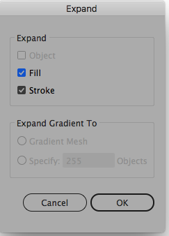
I was able to do it by expanding by going to the object drop down menu - expand - expand fill and stroke - and then just by deleting the parts I did not need with direction selection tool.
Thank you very much!
Copy link to clipboard
Copied
Newsgirl,
With the easy usual ways, such as those suggested, which are fine if the results suit you, you will get a shortening in addition to a thinning.
You can see it clearly if you perform the change on a copy, then move it close to the original (or on top with a different colour).
If you wish to avoid the shortening and have the length and the end angles as close to the original as possible, there is a bit more work to it; below is a description of possible steps for an S (Smart Guides are your friends):
1) Alt/OptionShiftClickDrag with the Selection Tool to move the copy clear of the original, then switch from Fill to a thin Stroke (0.25pt maybe);
2) Change each end segment into an independent straight path with the Direct Selection Tool by deselecting, then clicking, then pressing Ctrl/Cmd+X+F, this will give you two S curves corresponding to the original outer shape and two separate paths corresponding to the end segments, lock both straight paths; if the end segments are perpendicular to the ends of the curved segments, you can just delete them;
3) Select the two S shapes and Object>Path>Offset Path with half the Stroke Weight you used, then use the Direct Selection Tool to delete the end segments, this will leave you with six open paths, then delete the two outer ones at either end, this will leave you with the two that give the thinned shape;
4) Select the two curved paths and Ctrl/Cmd+J, this will give you one closed path, and either/both of the end segments may cross the corresponding locked original end segment so that one curved segment end is too short to reach the original end segment;
5) Extend each short curved segment end and shorten each long one; you may Direct Select the end Anchor Point, then ClickDrag with the Line (Segment) Tool into the Anchor Point and (for a short one) extend the line by selecting the relevant Reference Point in the Transform palette and increasing the W or H value and Ctrl/Cmd+Enter, then with the Direct Selection Tool ClickDrag the end Anchor Point of the curved segment end along the line to reach the original locked end segment (Smart Guides say intersect when you are within snapping distance), then delete the line; or you can just extend the short ones and close the S shapes and then use the original end segments to cut the shape (select each and Object>Path>Divide Objects Below) and delete the unwanted bits;
6) Unlock and delete the original end segment.
You can also judge this solution by moving it close to the original (or on top with a different colour), and compare.
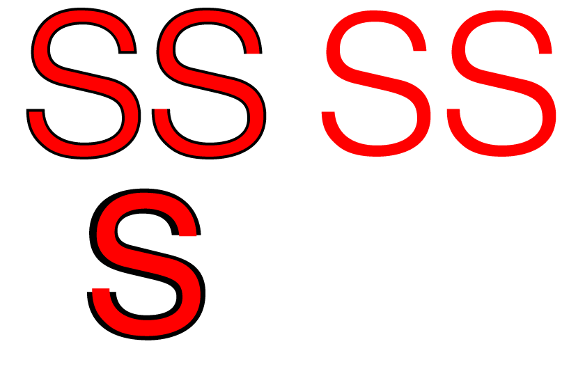
Below is a black Helvetica S with a moderate thinning in red with and without shortening. In the leftmost set the black bits at the ends of the red S to the left form the shortening. In the rightmost set the difference in overall shape/appearance of the two versions is more obvious, the shortened version being clearly more open/loose at the ends and the non shortened version being more closed/tight (and truer to the original shape).
As a curiosity, a Helvetica S is shown in Bold (black) and Medium (red on top in a correspondingly reduced size), and the thinner (Medium) is clearly no shorter but longer so both versions are about as closed/tight at the ends.
Copy link to clipboard
Copied
The quickest way to do it.
Select the object or type with the stroke.
the got to Object>Expand
The got to the pathfinder Shape modes Unite.
Hope that helps. ![]()
Copy link to clipboard
Copied
Type> create outlines
Objects> Expand

Then, from Shape builder Tool
drag the mouse over the expanded stroke and the outlined letter.
Find more inspiration, events, and resources on the new Adobe Community
Explore Now


