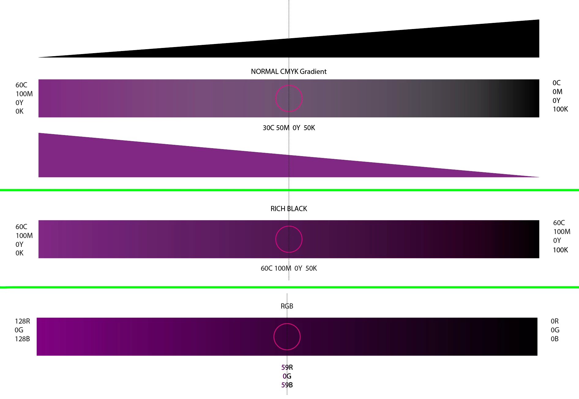
This is most common when you are trying to create a gradient between two CMYK colors, two spot colors, or between a spot color and a CMYK color; you will always get a "dip" in the centre, because remember, at the halfway point it's a mix of half of what your end colors are.
Say your Purple is 60C 100M 0Y 0K and your Black is 0C 0M 0Y 100K. A gradient between these two would have 30C 50M 0Y 50K at the halfway mark, which looks greyish.
As suggested by Ton, you could use a rich black if you are working in CMYK. In my example, you can see how adding the purple mix to the Black end retains a rich center as there's no longer a "dip" in the purple. THis can be problematic in a CMYK workflow as you don't want to get too much more than 300% or so ink coverage at the Black end, Fortunately 60+100+0+100 comes to 260% so you'd be fine.
However, in RGB, the "dip" doesn't happen, because you are working with light and not ink.