- Home
- Illustrator
- Discussions
- Re: How was this done? Any insight?
- Re: How was this done? Any insight?
Copy link to clipboard
Copied
Hi everyone,
This logo was stylized about 10+ years ago. The graphics company is no longer around. I've been trying to emulate this extruded logo so that we have it in svg format (we only have it in .jpg because it was done so long ago). We own the copyright.
For the life of me, no matter what I try, I can't get this particular extruded look. I know there are many of you far more proficient in Adobe Illustrator than I. Any insight as to how I can duplicate this look? I'm stumped. Throw suggestions at me; I'll try them.
I've also tried manually adding the highlights and shadows, but my proficiency for this skill is in TVPaint, which is raster, not vector. I know there's got to be a better way, and someone out there knows how.

Thanks in advance!
 1 Correct answer
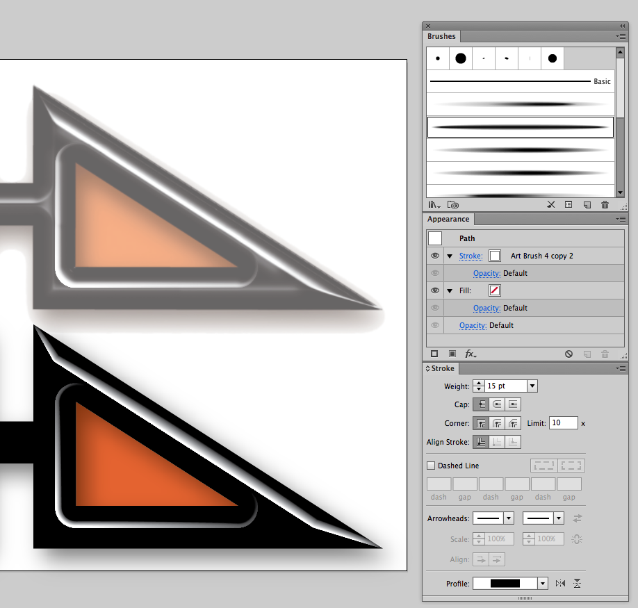
This is a start using custom brushes and stroke profiles. The .ai file is CS5 compatible and contains a number of custom brushes you might find useful when creating such effects without too much bother. They are most effective when used along with custom stroke profiles which will offset the effect to either side of the original stroke.
https://dl.dropboxusercontent.com/u/3910250/EdgeEffects.ai

Explore related tutorials & articles
Copy link to clipboard
Copied
There is no simple way to replicate this in Illustrator.
Years ago in version CS5 you could still use the plugin Path Styler Pro plugin for Illustrator - Shinycore Software
But then the output will also be raster.
Copy link to clipboard
Copied
Thank you, Monika G. Perhaps this logo will have to stay raster.
Copy link to clipboard
Copied
FYI: Since I have CS4 on one of my computers, I downloaded a 30-trial of Path Styler Pro plugin (see Monika's reply) just to see if I could replicate the look. I couldn't.
The creation of this stylized logo remains a mystery...
Copy link to clipboard
Copied
just to see if I could replicate the look. I couldn't.
Because it wasn't done in AI? I mean this abomination has "cheesy Photoshop layer styles" all over it...
Mylenium
Copy link to clipboard
Copied
Thanks for your helpful insight, Mylenium.
Copy link to clipboard
Copied
rcraig - you're the man! Thank you so much. The offsetting-the-effect-to-one-side is key.
(And I concur with your reply to Mylenium.)
Copy link to clipboard
Copied
This is a start using custom brushes and stroke profiles. The .ai file is CS5 compatible and contains a number of custom brushes you might find useful when creating such effects without too much bother. They are most effective when used along with custom stroke profiles which will offset the effect to either side of the original stroke.
https://dl.dropboxusercontent.com/u/3910250/EdgeEffects.ai

Copy link to clipboard
Copied
rch, I'm still dazzled by your lightening-fast reproduction of this logo. But I'm still struggling to do likewise. I would like to learn this.
Would you be kind enough to explain some of the steps you took to get that clean edge to the highlights? I've tried the brush you kindly provided, with the settings you depicted above, but if I don't think I know what I'm doing with the offset tool. I get a fuzzy rectangle. Nothing looks like your imitation.
Thank you in advance.
Copy link to clipboard
Copied
I got it, rch! I overlooked the variable-width profile you provided above, so I was trying to figure out how to make one myself. (By the way, how did you do that?)
Thanks again for your insights and sharing your expertise.
Copy link to clipboard
Copied
Copy link to clipboard
Copied
rch, I'm touched that you took the time to make this video for me. It was exactly what I needed. I had searched and searched in forums and on YouTube for tutorials on one-edged strokes/lines and there was none.
Now there is.
I reiterate what I exclaimed before, "You're the man."
God bless!
Copy link to clipboard
Copied
My pleasure. I've received LOTS of help on this forum. Just giving a little back.

