Copy link to clipboard
Copied
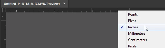
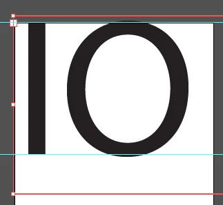
I am trying to set the height of the letters to 4 inches. When I set the height in the transform area it sets the text box height. When I try to change the font size it doesn't match up.
The only way I have found was to convert the text to outlines then resize the height. This doesn't work well as I would like to change the height before converting to outlines. To boot I also need vertical text and it seems to be even harder to set the height of each letter after creating the outline.
Can anyone help?
Type cannot be measured that way. The reason goes back to before computers when each letter was a physical letter on a block. But never mind the reason -- you need a solution for your use.
I would suggest that you add a couple of horizontal ruler guides. If the rulers aren't showing, choose View > Show Rulers. If the units are not inches, right-click inside a ruler and choose inches.
Then select the black selection tool, put your cursor inside the horizontal ruler at the top of the window, press
...Copy link to clipboard
Copied
Type cannot be measured that way. The reason goes back to before computers when each letter was a physical letter on a block. But never mind the reason -- you need a solution for your use.
I would suggest that you add a couple of horizontal ruler guides. If the rulers aren't showing, choose View > Show Rulers. If the units are not inches, right-click inside a ruler and choose inches.
Then select the black selection tool, put your cursor inside the horizontal ruler at the top of the window, press and drag down onto the artboard.
I have a ruler guide at the top of the artboard and one at the 4 inch mark. It doesn't matter exactly where the guides are as long as they are 4 inches apart.
Add the text and increase the point size in the Control panel until the letters are 4 inches tall and match up with the guides.
You'll notice that letters that are flat on the top and bottom, such as an I or H, are shorter than rounded letters like O and Q. That is normal. It is the way that fonts are designed.
Does this answer your question?
Copy link to clipboard
Copied
Select the tet object with the select tool
Apply Effect > Path > Outline object
In Preferences > General select "Use preview bounds"
In the transform panel enter the height you wish to use.
You might want to delete the effect from the text once you're done because it causes the text to be outlined in PDFs you save from that file.
Copy link to clipboard
Copied
A typeface is designed on an imaginary relative space called the em square. When you specify type size in software, you are specifying the height of the em square and the glyphs are scaled proportionally and positioned relatively to it.
The reason is not just an archaic throwback to pre-computer type casting.
Even in a single typeface, not all glyphs measure the same height. Rounded characters are taller than other characters. Ascenders and descenders differ in their heights.
Typefaces are designs. They vary widely in stylistic shape; geometric sans-serifs to flourishing scripts and everything in between. In a line of type, if you change a word or phrase to, for example, the italic version of the same font, the actual height measures often differ from the corresponding regular glyph. So you wouldn't want the specified type size to be an actual measure of the glyphs; you'd want the glyphs of the italics, punctuation marks, symbols, etc. to be correctly proportional to the non-italics.
So the em square serves as the "proportional equalizer" within a typeface. The actual glyph shapes are drawn in relative position to the em square, but are not necessarily constrained to fit within it. A flourish of a decorative script may exceed the bounds of the em square both horizontally and vertically (something not even possible in the pre-digital physical type slugs often cited as the reason for why type size is not specified according to the actual height of the glyph outlines).
The problem with using Illustrator's Use Preview Bounds setting is that it does just that: It simply causes the height and width fields to display measure values of the "painted" result of effects applied to the paths. So using it to set the height of text with the Outline Object effect applied will yield differently-sized results, depending on which characters are typed.
Usually, when someone wants to specify type by the "height of its characters", they really mean they want to specify the measure between the baseline and cap height (two guides within a typeface usually corresponding to the height of non-rounded capital glyphs). This is a common and legitimate need, for example, in the sign trade. CorelDraw provides an option to do just that, and it's one reason why Draw is popular within the sign trade.
JET
Copy link to clipboard
Copied
Thank you everyone for shedding a little light. I found what I needed and then some. 🙂