Illustrator vs Pantone vs Adobe Color CC
I've read through the many [spirited] discussions on color management and read the linked articles.
Here's my situation:
I have the Pantone color I want.
I used the 'Recolor Artwork' option in Illustrator to get the CMYK and RGB values.
Checked the values against the 'Find A Pantone Color' option on the Pantone site.
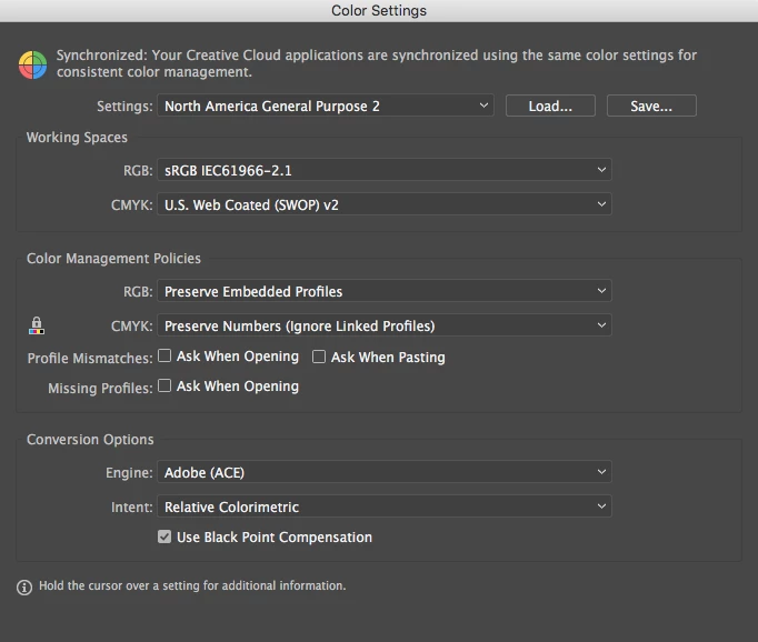
The RGB values are almost always identical...the CMYK numbers are almost always different. I'm only looking at numbers right now, not the colors. [My monitor is calibrated and I have the newest Pantone color books...see screenshot for Illustrator settings]
Went to Adobe Color CC site to set up my project theme. Used the RGB numbers, got the same color as in Illustrator and Pantone [and pretty close to the book, too].
But the CYMK color numbers WERE DIFFERENT FROM BOTH ILLUSTRATOR AND PANTONE. And when I plug in the CYMK colors from the Pantone site, I get different color in both Illustrator and Adobe Color CC.
Then [and this is the really crazy-making part] when I use the swatch from my color theme in Illustrator and click on the color, it gives me new RGB numbers as well.
I feel like a dog chasing my tail.
Since a lot of my stuff is going to print, the CMYK numbers are the most important. For some projects, I'll need PMS—for others, CMYK.
Any advice? The printer my client is using doesn't do press proofs.
Which CMYK value would you use? Aaaarrrrggggghhhh...