Ok...I'm gonna toss my $.02 in here for what it's worth...
First and foremost, trying to do chrome in vectors is...well...a SERIOUS pita!!! The problem with chrome is that it's not a "color", but a reflection of colors...much like a mirror...but chrome if often applied to "shapes" that are irregular, much like a old car bumper for example. Because of this, those shapes tend to bend and distort.
Second to this, trying to use "trace" to make an ACCURATE reproduction of a given image...that's often an exercise in futility at best. No matter HOW you twist those settings, you typically end up with a "stylized" representation, as apposed to an accurate reproduction.
Now with that said...and DEPENDING ON THE IMAGE...here's what I would suggest...
IF this is something that you really want to look decent, I would forget trying to use trace....this is just my own personal opinion, but it really doesn't work THAT well at all. I'd use the pen tool (or even pencil, with the settings tweaked) and draw the basic shapes in, starting with the size/shape of the background, then adding to that. Once you have the larger shapes in, trying adding varying degrees of Gaussian blur to each shape, to blend them a little, one into another.
To help "illustrate" what I"m talking about (pun intended), here's a piece I'm currently working on in my spare time. Please keep in mind that this is NOT finished....still have A LOT of work to do there, but it should demonstrate what I'm talking about...
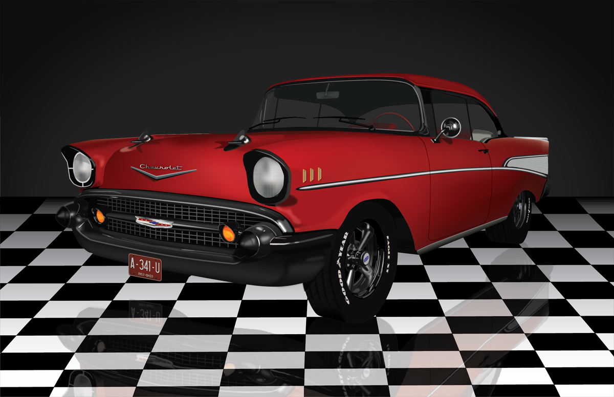
This is actually a vector that I'm creating from a render of a 3D model (the model was originally a freebie download, but at this point I've rebuilt OVER half of it). Yea...I still have A LOT of work to do there, particularly on that front bumper (not to mention the floor reflection, the headlights, etc), but the rims are almost where I want them. In short, that's simply shape after shape after shape, layered and blended together using a tich of blur (sometimes more than a tich). It's tedious...it's time consuming...but hey - no one ever said that anything worth doing has to be easy! After all, it took Leonardo da Vinci some 6 odd years to paint the Mona Lisa :-).
Beyond that, I would simply suggest posting a copy of the image that you're trying to create, but I strongly suspect that you're really gonna end up doing most if it by hand...again the trace tools in Illustrator really aren't intended for accurate reproductions.


 6
Replies
6
Replies


 AdChoices