Image Tracing - Crisp Lines
Is there a way to image trace this:
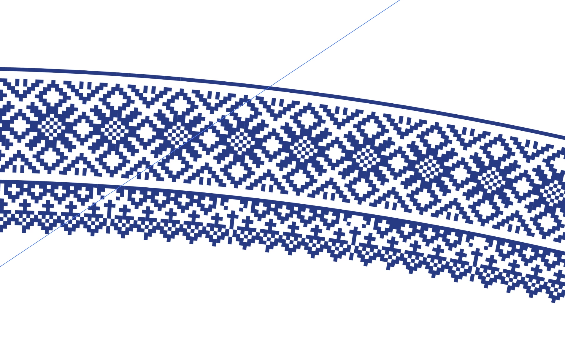
So that it isnt rounded like this?
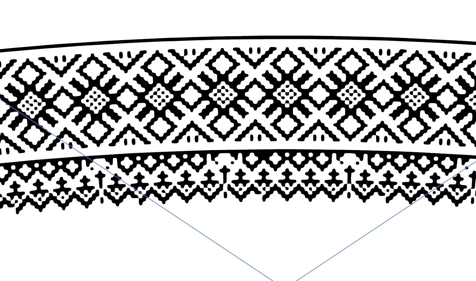
Is there a way to image trace this:

So that it isnt rounded like this?

You can try playing around with the Live Trace settings in this dialog:
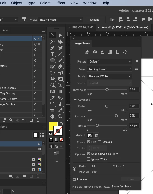
But in my experience, there are no live trace settings you can use that will override a resolution that's too low. When resolution is too low, Illustrator is forced to approximate and interpolate, which leads to rounded edges instead of precise corners. "garbage in, garbage out" as they say..
Live trace is almost never going to be precise.... only if you're tracing highly controlled, high resolution, high contrast images with no compression or anti-aliasing... There is a lot more freedom/range in a raster image to utilize quirks in vision and brain function to trick the eye/brain into seeing something a certain way. Subtle variations in color from pixel to pixel can give a smooth transition of color over a distance. Whereas vector art trades that nuance and subtlety and smooth color transition for precision and scalability.
For the purposes of an analogy, let's imagine an electric smart car (those little dinky 2 door ones) and a sherman tank. Both vehicles are well suited to the task they were designed for. But not at all well suited to swap positions.. A tank would be a terrible vehicle for heading to the store for groceries.. And a smart car would be a terrible vehicle for rolling into enemy territory.
live tracing a low resolution (or simply small. could be high resolution, but small size.. that's fundamentally no different from larger size and lower resolution. as far as live trace is concerned anyway) is like trying to get your groceries in a tank... my analogy is breaking down here. Let's just look at what Illustrator sees when it's doing the calculations to decide where to draw the line.
Now consider that because live trace is a piece of software, it doesn't really have the ability to take a step back and just look at the whole image. It looks through each pixel one by one and determines its color values and the relationship to the color values of its neighbors to try and find "edges" that indicate where a line should be drawn. A rudimentary example would be a completely black and white image (not grayscale) which simply has a black square on top of a white background. all around the edges of the square will be white pixels sitting directly next to black pixels. since this is the only contrast in the document, it's easy to assume the shared edge of those two pixels should represent part of our line segment that will eventually make up a square. essentially, in this example, you can just look for any pixel that has a neighbor of the opposite color and consider their shared edge part of your path. Doing it this way, you could ensure a very good (albeit not perfect) result with live trace.
Now of course we live in the real world where images aren't pure black/white with perfect contrast between foreground and background.. We live in a world where each pixel in an image of 10,000 pixels could be any one of 16,581,375 different colors AND (can potentially) have an alpha value between 1-100 bringing the total number of unique possible configurations for any given pixel up to 1,658,137,500. so for each pixel, in any of 1.6 billion possible configurations, needs to be compared to at least 8 other pixels who each have 1.6 billion possible configurations... Sometimes the comparison might yield stark contrast... sometimes the difference in color values would be imperceptible to the human eye.. How exactly do you decide where to draw a line accurately given a functionally smooth gradient of possible colors. You estimate.. You set thresholds and say "anything between these 2 color values will be considered one color". basically, the image is posterized down to a minimum number of unique color values making it easier to compare neighbors.
But the possible colors don't matter in your 2 color blue on white background image... so what gives? In your case, anti-aliasing is the enemy. Take a look at this zoomed in screenshot of your image:

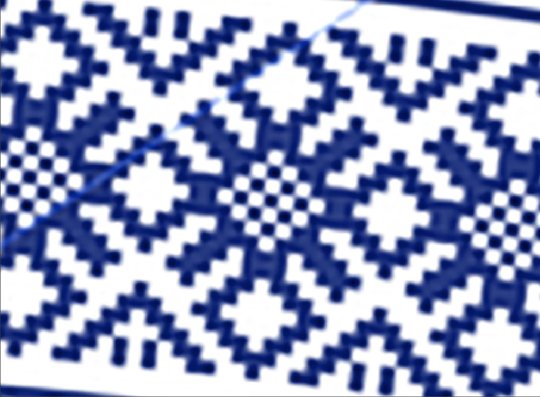
Now I can't know with certainty whether this is how the image looks on your computer.. This is a screenshot of a screenshot after all. But regardless, it highlights the problem that anti-aliasing causes for live trace. You want clean straight lines and 90 degree corners.... But unfortunately that doesn't really exist in this pixel data. there aren't clean lines and 90 degree corners. The antialiasing causes some portions of some edges to appear to stick out farther away from the shape than the rest of the edge.. And in other places, it causes some portions of some edges to appear slightly recessed into the shape.
By taking an image of this pattern into photoshop and artificially boosting the resolution by several hundred percent (using the "Resample" option to interpolate and add new pixels to obtain the new larger resolution), you can actually start to see exactly what Illustrator did when tracing your image. You can see how the computer renders those inside corners and how they all start to round out as a result of the estimation.. live trace is pretty much doing the same kind of estimation, which is why we get similar results:
Long story short... You can't really fool live trace into drawing information that isn't there in the source image or ignoring stuff that is in the image (especially if it looks exactly like some other stuff you didn't want to ignore). You can obtain better results out of live trace by starting with really really high quality images... But due to the nature of the relationship between raster art and vector art... i think a perfect result is at the very least practically impossible, and perhaps even theoretically impossible.
My best advice, if you've stuck with me this far... Is to draw that image that you want to get out of live trace. It's simple 2 color grid based art. You could easily create a grid of squares, then live paint them, using your source image as a guide. Since it's a repeating pattern, you wouldn't need to do very much. then it can be copied and pasted to build the rest of your image, or you could make a pattern brush out of the grid and apply it as a stroke to a circle/arch. This is the only way you'll definitely get clean vector art with proper right angles.
I apologize for the novel above, and I certainly hope I didn't insult your intelligence at all. That's not my intention. But rather to just provide a resource for the future googlers who search "live trace rounded edges" or "live trace doesn't preserve corners" or whatever. I hope the information above was helpful to you, OP.. Or to you, future googler.
Already have an account? Login
Enter your E-mail address. We'll send you an e-mail with instructions to reset your password.