Copy link to clipboard
Copied
Hey,
I am having trouble converting a scanned image into vector. I am using the latest AI CC and when I select the photo the image trace option doesn't pop up. When I go to windows to select the option the options of image trace window is in active and I cannot select the abilities it has. Please help with this problem I have used image trace in the past but never with AI CC.
Thanks
Elton
 1 Correct answer
Hi, If you are facing like this issue. As i shown in image.
Then Go to windows in Adobe Illustrator CC and select the control option as i show it too in the image.
Then you select the Image and image trace option will show up to you.
Thanks.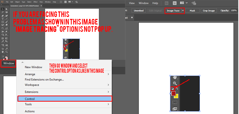
Explore related tutorials & articles
Copy link to clipboard
Copied
Hi Elton, you’ll find the new interface more intuitive and interactive. You also get cleaner lines, more accurate fitting, better color recognition, and more reliable results thanks to the refined technology.
Introduction
Image Trace replaces the Live Trace feature in previous versions of Illustrator. Both Image Trace and Live Trace convert images to vectors (editable line art) and feature presets for easily creating various effects. Beyond the presets in the new Image Trace, you will find that the sliders and check boxes are different from those in Live Trace, both in quantity and often in purpose. And Image Trace produces far better results, more quickly, using intuitive, easy controls. No more struggling with complex options.
This tutorial and guide covers how to use most of the new sliders and checkboxes, and includes a brief overview of the presets. Discover the ease of use of Image Trace by exploring these sections:
Part 1: Orientation: Anatomy of the Image Trace panel
- Presets
- View
- Mode
- Palette
- Colors
- Choose among presets
- Expand the tracing
- Full Tone palette
- Automatic palette
- Document Library palette
- Mode menu
- Noise slider
- Strokes and Fills
- The Corners slider
- The Snap to Lines checkbox
- Abutting versus Overlapping paths
- View
Beneath the Presets menu is the View drop-down menu. This controls what you see after tracing.
- Mode
The Mode drop-down menu provides choices that define basic color versus grayscale modes for your traced artwork.
- Palette
The Palette menu determines how colors will be chosen for the output artwork. These important options will be discussed in detail later in this document, but for now here are brief descriptions:
Automatic—automatically switches between limited palette and full tone for the tracing, depending on the input image
Limited—uses a small set of colors for the tracing palette
Full Tone—best for photos, creates photorealistic artwork
Document Library—uses an existing color group for the tracing palette
- Colors
The Colors slider generates slightly different results depending on the value selected for Mode, but in all cases the traced artwork gets more complicated as the slider is moved from left to right.
- Choose among presets
The row of icons across the top of the Image Trace panel are shortcuts that set the values of all the other sliders to achieve conversion for pre-determined workflow. Here are descriptions of the icons and their effects from left to right:
Auto Color—creates a posterized image from photo or artwork.
High Color—creates photorealistic artwork of high fidelity.
Low Color—creates simplified photorealistic artwork.
Grayscale—traces the artwork to shades of gray.
Black and White—simplifies the image to black-and-white artwork.
Part 3: In Depth: Colors with palette selection
Now that you’ve seen the basics, here are details that you can use to refine your tracing and get exactly the effect you want. There are three fundamental behind-the-scenes steps to convert an image into vector artwork. The first is choosing a palette of colors for the traced artwork.
Under the hood, Image Trace can choose among four different ways to select colors for the tracing palette. They correspond to the four options you see in the Palette pull down menu. These options determine the number of colors allowed in your traced artwork and how they are chosen from the source image.
- Automatic palette selection
Automatic does the choosing for you. It analyzes your image, and in the case of a photo, generally using a palette that is full tone to create a high-fidelity rendering. If Image Trace detects a fewer colors in the image, it will do a limited palette tracing. - Limited palette selection
Limited allows fewer colors in the palette. In cases where there are fewer colors in the image than the maximum, then the number of distinct colors in the image are used. Where there are more colors in the image than the maximum, Image Trace uses two strategies to select colors for the palette:- Chooses colors that have many similar colors, close together.
- Chooses colors that take up the most area, leaving out less-represented colors.
- Full Tone palette selection
Full Tone determines the color palette by grouping adjacent pixels of similar color together in your image to create each filled region in the result. - Document Library palette selection
- Mode menu
The palette choices are available when you are in the Color Mode. If you choose Grayscale or Black and White, your choice of palette menu is removed, but also reveals sliders that allow you to control the way the tones are determined. When you choose Grayscale, the Full, Limited, and Automatic parameters apply as you use the Grays slider. When you choose Black and White, the Threshold slider allows you to adjust the black-to-white transition. - Try it
In your Illustrator document, select the image you have placed for tracing and in the Image Trace panel, ensure that Preview is checked. Set the Mode to Color, and choose the each of the Palette options in turn. Note that the resolution of your placed image determines the speed of the tracing.
- Noise Slider
For direct control over noise and some control over bleeds, see the Noise slider in the advanced section of the Image Trace panel. The values on the Noise slider indicate the smallest number of pixels per region allowed. Regions with fewer pixels than set with the slider will be considered noise and removed from the final traced output.
- Strokes and Fills
In the Advanced panel see two checkboxes next to the label Create, called Fills and Strokes. Most of the time you’ll be in Color Mode and you’ll see that these boxes are grayed out. With color tracings, you always get fills so these parameters don’t apply.
Part 5: Curve Fitting
Once Image Trace completes the color palette and pixel assignment tasks, the groups of pixels are ready for conversion to filled shapes. Jagged pixel boundaries must be replaced with smooth Bezier-curve paths. Because it is often ambiguous as to what the intended or most aesthetic curve would be along a pixelated edge, the advanced options in the Image Trace panel offer some controls over curve fitting.
- The Paths slider

- The Corners slider
- The Snap to Lines checkbox
This checkbox is usually off, but can be turned on if you want to replace gentle curves with lines. It will also cause a line near to 0 or 90 degrees to be snapped to absolute 0 or 90 degrees. This is useful for geometric artwork or if shapes in your source image are slightly rotated. - Abutting versus Overlapping paths
This is a new option for Image Trace that was not present in the old Live Trace tool: the ability to choose results that consist of overlapping paths as opposed to abutting paths. Abutting paths are fills that do not overlap at all — the edge of one fill is exactly the same as the edge of its neighboring fill. If you move one fill slightly you will create a gap and see the white background underneath. With overlapping paths, each fill slightly overlaps its neighbor. And if one fill is completely inside another, there is no hole cut out of the larger fill.
Here are some comparisons between overlapping and abutting paths:
- Anti-aliasing artifacts are not a factor with overlapping paths. With abutting paths sometimes there is a faint lighter color visible on the boundary between shapes. This is because each of the two shapes is anti-aliased against the (usually) white background, producing pixels that are slightly lighter than either of the colors of the abutting shapes. With overlapping paths this does not occur.
- With overlapping paths there are no holes in the resulting fills. Abutting shapes create cutouts.
For example, if your image includes text, you may wish to select and move a fill for the letter “A” without leaving a hole in the shape beneath. Choose overlapping in this case. - The number of resulting paths and control points is about the same for either option with one exception. If the traced result has a large number of fills that are concentric shapes, each inside the other like a target, then the overlapping method will produce fewer paths.
- Occasionally with the overlapping option there are small cracks between adjacent fills. These usually show up as tiny flecks of white and are usually only visible when zoomed in. They are more likely occur with complex artwork when the paths slider is either very far to the left or very far to the right. Cracks can be fixed by expanding your artwork and manually editing the overlapping paths.
Part 6: Wrapping up
Copy link to clipboard
Copied
Hi, If you are facing like this issue. As i shown in image.
Then Go to windows in Adobe Illustrator CC and select the control option as i show it too in the image.
Then you select the Image and image trace option will show up to you.
Thanks.
Copy link to clipboard
Copied
How did you get the image into Illiustrator, Open or Place?
What kind of file format is the image?
Copy link to clipboard
Copied
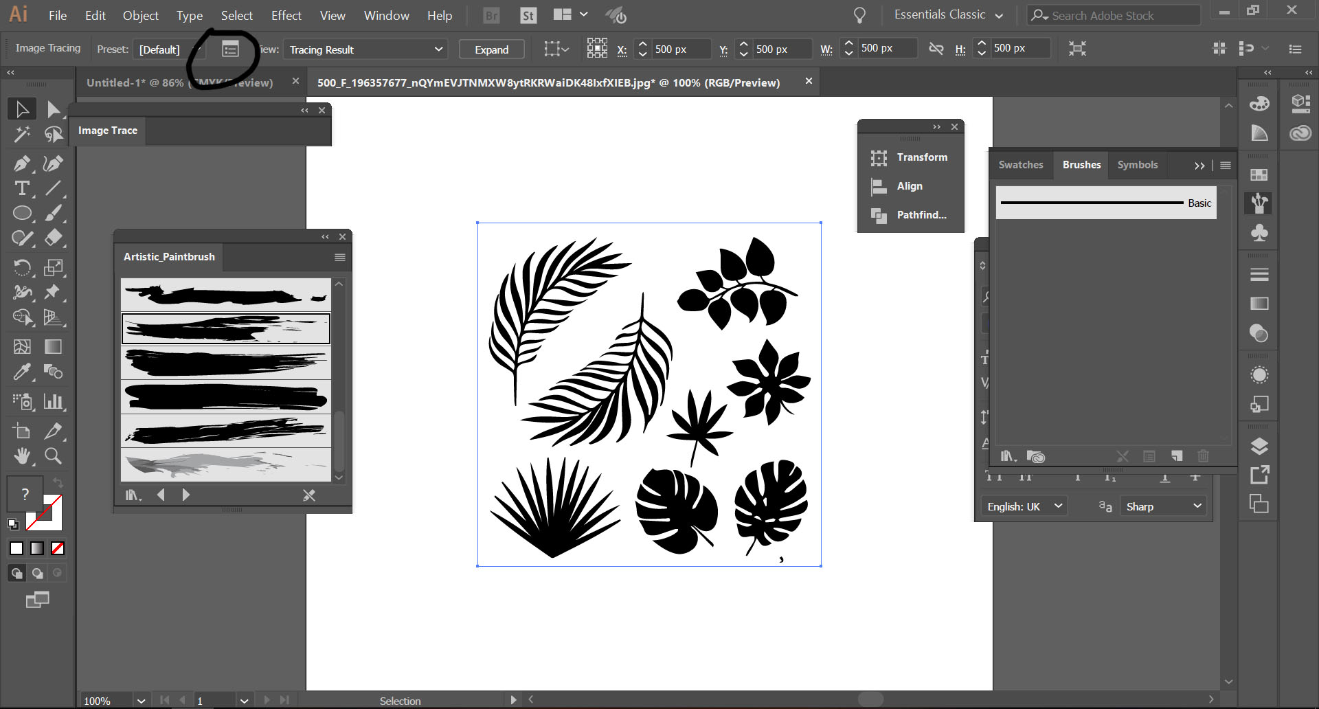
Hi after opening image in Adobe Illustrator and clicking on image trace you have to click on mentioned box to get all options of that tool...Thanks.
Copy link to clipboard
Copied
Hi. I tried the options that you gave, thanks for that, but I continually get the reply that " The operation cannot complete because of an unknown error. [CANT]" I also reinstalled AI 2019CC but nothing changed. Does anyone know what is wrong please?
Copy link to clipboard
Copied
Copy link to clipboard
Copied
the same thing got happend to me could you help me pls thanks
Get ready! An upgraded Adobe Community experience is coming in January.
Learn more


