Inner Shadow missing feature?
Copy link to clipboard
Copied
I'm looking for a better alternative to my current vector graphic applications, mostly to create modern web and application UI's.
So I downloaded the trial version of Illustrator CC, to see if I should make the jump to Illustrator for vector work.
After using about half a day to learn the applicaiton and do some experimentation, I was going to apply an Inner shadow to some text on a button, to make it look indented, and was like "What the.....where's the Inner Shadow Effect?".
I could see the Drop Shadow feature, and there's an Inner Glow feature (can't be offset), but that doesn't solve the problem of making shapes and text look indented.
If anyone doesn't know what I mean, just browse 'Inner Shadow' on google, it's such a fundamental feature.
- Photoshop has it.
- InDesign has it.
- Fireworks has it.
- Even Sketch, the app for Mac has it. And Acorn has it as well.
- Hell, I can even write it in CSS3:
.example {
-moz-box-shadow: inset -5px -5px #888;
-webkit-box-shadow: inset -5px -5px #888;
box-shadow: inset -5px -5px #888;
}
So I looked around the web, and realized Illustrator has no Inner Shadow feature (!!), but there are work arounds. Here's an example:
http://vectorboom.com/load/effects/innershadow/3-1-0-257
(Or this:)
Sorry, but when you are used to applying something so fundamental as Inner Shadow, to make your shapes and texts look indented with a single click (and easily adjust it live and experiment), then it's hard to get used to Illustrator.
And when something so basic is missing, then you can only fear what else will also hinder you, as you continue to learn the application and try to make the switch.
Looking at the forum and others who have requested the same thing, and for so long, it sadly also says something about how much adobe listens to the community.
Sorry but this is a deal breaker for me, and my trial stops here.
I'm sure Illustrator can do a lot of other fancy things, but since it still havent figured out the fundamentals (shadow and indented), I'm not buying.
Explore related tutorials & articles
Copy link to clipboard
Copied
I never noticed that Illustrator did not have one. I am so used to using both Photoshop and Illustrator when I am trying to do text design that it never occurred to me that it would be a lot nicer if I didnt have to be constantly switching programs. I suppose tho that each of the programs has its pro's and con's and if you want it all, you have to pay for it all. Marketing ploy!
Copy link to clipboard
Copied
Yeah Photoshop, and most other vector applications I've tried (even CSS3 stylesheet has it!).
I searched the web and found out this feature has been much requested and needed for many many years.
What I get from that, is that Adobe is not a developer that listens to it's community. And that's what I get from just using the Trial version of their latest software, Illustrator CC...there is no excuse for not having inner shadow in a vector graphics application, especially not one that's this expensive, just makes it embarrising.
Damn, I was hoping to switch to Illustrator...
Copy link to clipboard
Copied
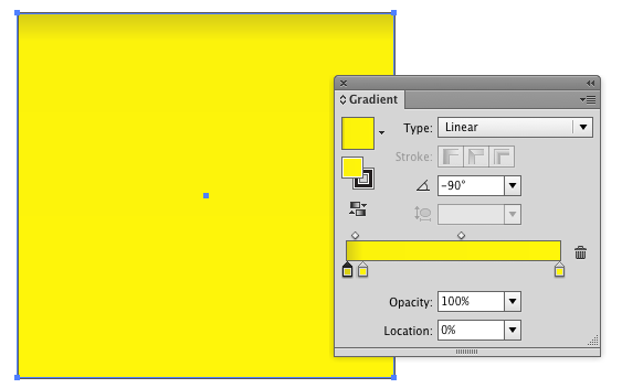
I agree having the effect would be nice. But you can easily accomplish inner shadows with gradients.
Copy link to clipboard
Copied
@Scott
Was this an attempt to get easy solution points? Use a gradient?
It's not a matter of being able to achieve a certain effect. We know that you can always use a combination of multiple tools, or cumbersome steps and tweaks, or settle with inaccurate solutions, to achieve a workaround for Illustrator's lack of the InnerShadow effect.
Copy link to clipboard
Copied
Adobe please add this feature to Illustrator CC! It's a fundamental!
Copy link to clipboard
Copied
scott's working under the assumption that someone making a topic on a forum wants to achieve a particular thing. if you're just making a statement ("Illustrator has no Inner Shadow feature") it's just like, oh... who are you talking to?
Copy link to clipboard
Copied
And as far as I can tell nobody cares about the points anyway.
Copy link to clipboard
Copied
> And as far as I can tell nobody cares about the points anyway.
Did you know that if you give *yourself* points, you are automatically reset to 0? (If this is not true, maybe it's a good idea to make it so 🙂
> It's a fundamental!
Inner Shadow: the Drop Shadow of 2013.
Copy link to clipboard
Copied
[Jongware] wrote:
Inner Shadow: the Drop Shadow of 2013.
no. That's already the flip page effect.
Copy link to clipboard
Copied
Thanks Scott--this is the best solution available and actually very easy for basic shapes at 90º increments.
Copy link to clipboard
Copied
thst's inner shadow on one side. when that's what you need - great, i use it some times. can it replace inner (adjustable) shadow - no. neither can inner glow, in wich you can't adjust the angle.
Copy link to clipboard
Copied
As far as i can tell a nifty little Mac App named “iDraw” is the undisputed king of (even multiple) inner shadows 😉
Copy link to clipboard
Copied
Yep. That feature is and has been missing for years, together with Bevel and Emboss. You have to use a drop shadow on a cut-out version of the shape (on a square) and then clip it with the same shape again and then multiple the resulting clipped shape. It's very annoying. Also, you can even create it with SVG Filters, but there are various issues with these filters when you export them to PDF.
Copy link to clipboard
Copied
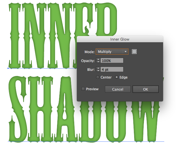
I never really needed as you can use inner glow set to multiply instead.
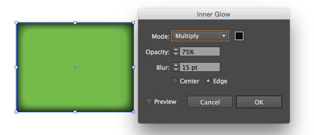
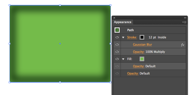
Although I prefer to use an appearance stack. You can control the thickness of a stroke which gives you more control, therefore I rarely use inner glow
 .
.
Or you can use a gradient mesh
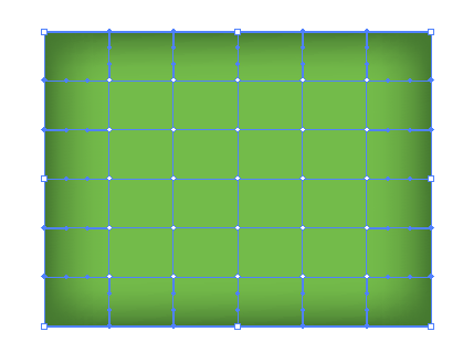
The vector boom link had a lot of steps, extra shapes and outlined their type, I would use an appearance stack.
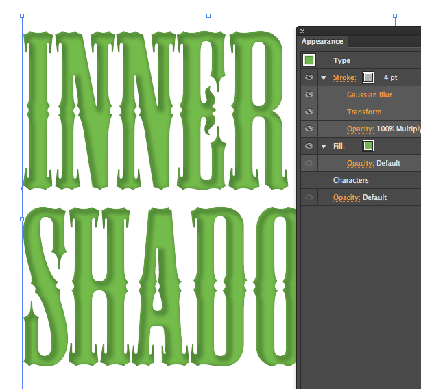
I did have to use a mask to keep the shadow from going out the edge, could not find a way to make knockout group do that for me. But the type is live and less parts.
Not that much control with inner glow, and could not even duplicate the look above.
Copy link to clipboard
Copied
Inner glow isn't the same as inner shadow - it's a different effect (see your second last example). Appearance stacks - that work correctly with knockout groups - can only be used on outlined compound shapes, it doesn't work on editable text at all. This is a huge oversight for Illustrator and every single design package out there including Sketch, Fireworks, Photoshop, InDesign, iDraw (Autodesk Graphic), Pixelmator, Affinity Designer, Affinity Photo can all achieve this simple effect as an effect/fx.
The best way is to use this method using outline compound shapes only (can't be used on editable text).
Dribbble - Illustrator single style live inner shadow by Herman van Boeijen
Copy link to clipboard
Copied
Yes inner glow set to multiply looks different, that was my point as to why I recommend using appearance stacks. You can keep the type live, with a mask from the transparency palette.
Would disagree on the dribble link being the best way as that outline the type. Unfortunately we cannot set a stroke to go outward on livetype and offset path on a stroke has mitering options of which I do not see any working especially on serif/ornate fonts
Copy link to clipboard
Copied
off course you can use gradient mesh. you can also do it in photoshop. or paint it in real life and take a photo... or become a lead programmer in Adobe, read some blogs, for g-d's sake, and add all the features to ALL the apps.
I am starting to consider the last one.
Copy link to clipboard
Copied
This won't work with live text, but you can use the instructions on this page to create an inner shadow effect that you can then create a graphic style for to apply to future objects. https://dribbble.com/shots/878685-Illustrator-single-style-live-inner-shadow/attachments/95011
Copy link to clipboard
Copied
I must disagree, I use multiple stacked effects on LIVE type ALL the time. You must add a new stroke or fill to make it work. The default fill and stroke on text does not allow it. So I make my text layer in black and immediately add a new fill but remember to clear the black fill within character appearance. Not sure why anyone outlines fonts or adds PS effects anymore...and I use offset path on a stroke to move it outside the path and keep the gradient working. Here is an example;
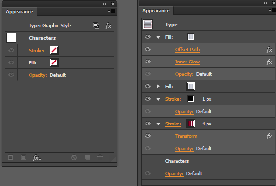
Love the appearance Palette.
Copy link to clipboard
Copied
What I posted won't work with live text because when you add a stroke to live text, even it you place it as the top layer and set it to outside, the stroke from one of the characters covers up characters next to it. The image below has two shapes using the graphic style with one overlapping the other. Below it is live text that also has the graphic style, but since text functions differently than standard objects the stroke applied to each character is overlapping the characters next to it.

Copy link to clipboard
Copied
Did you move the stroke under the fill? I have no problem

Copy link to clipboard
Copied
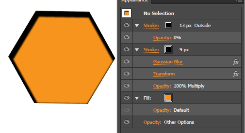
You're using the inner glow effect to get the inner shadow, which works for the effect, but you can't offset it. The example I posted is using only strokes so you can create an inner stroke where the light source appears to be to the side.
Copy link to clipboard
Copied
I kept my type live, but had to add a mask as the stroke goes half in half out on live type. You probably could use offset path, and a gradient stroke.

Copy link to clipboard
Copied
2020 still no inner shadow. It's embarrassing.
-
- 1
- 2
Find more inspiration, events, and resources on the new Adobe Community
Explore Now


