Inspiring
February 11, 2019
Answered

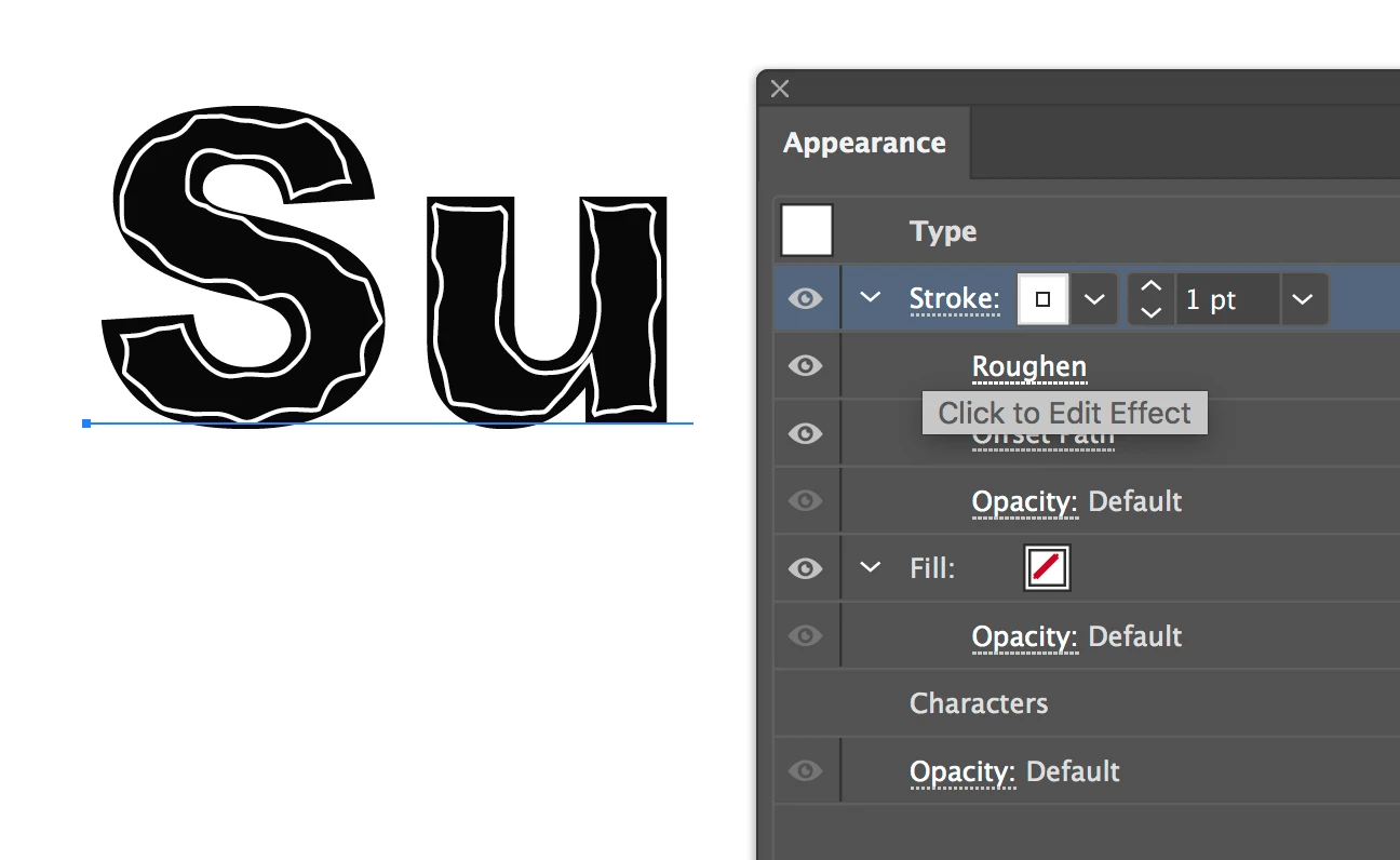
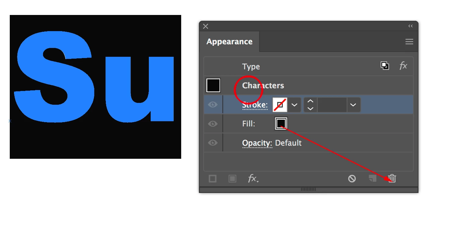
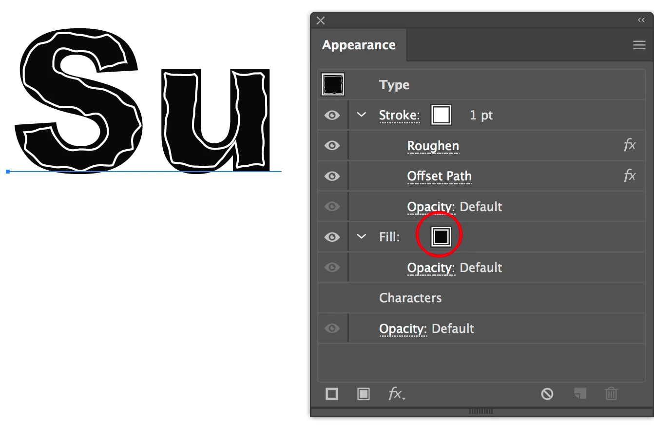
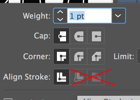
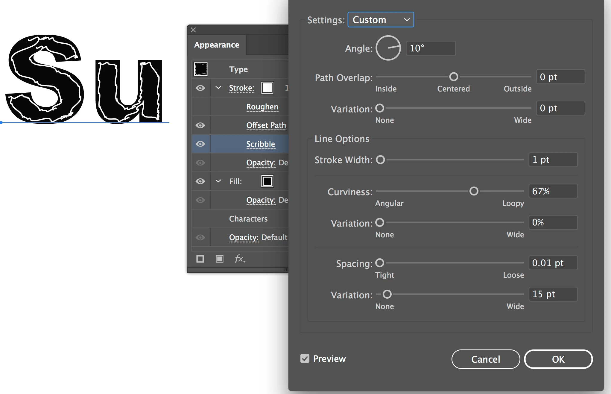
Inside stroke (?) for fat letter forms

  • February 11, 2019
  • 1 reply
  • 572 views

I want to stylize some fat letterforms with what I'm calling an "interior tracing". Here is the concept done in pencil.

That is quite messy (because it was done with pencil). What I'd like is a very neat & tidy line. And I'd like to be able to apply this technique to other fonts, including some fat "script" types, where the lines would have to be quite a bit more complex.

Can someone describe a technique for doing this?

    This topic has been closed for replies.
    Correct answer Mike_Gondek10189183

    Use the appearance palette.

    Add stroke of white, then add 2 effects shown.

    There are a few issues confusing to wkring with tyep and appearance palette. First is that the black fill by default is assigned at characgter level. You do nto have to if thsi is all you want, but if you make mroe complex, you may want to remove this at character level

    An add to the. Now you can see all color attributes of type at saem level, so they do nto conflict with each other if you add more.

    On live type you also cannot use the stroke inside as you can on paths, but you can use the effect >> path >> offset path as I did.

    You can try other distortion effects, but finding scribble has many settings but distorts too much to match your sample.

    A little less detail on what I used earlier for roughen is what I recommend.

    1 reply

    Mike_Gondek10189183
    Community Expert
    Mike_Gondek10189183Community ExpertCorrect answer
    Community Expert
    February 11, 2019

    Use the appearance palette.

    Add stroke of white, then add 2 effects shown.

    There are a few issues confusing to wkring with tyep and appearance palette. First is that the black fill by default is assigned at characgter level. You do nto have to if thsi is all you want, but if you make mroe complex, you may want to remove this at character level

    An add to the. Now you can see all color attributes of type at saem level, so they do nto conflict with each other if you add more.

    On live type you also cannot use the stroke inside as you can on paths, but you can use the effect >> path >> offset path as I did.

    You can try other distortion effects, but finding scribble has many settings but distorts too much to match your sample.

    A little less detail on what I used earlier for roughen is what I recommend.