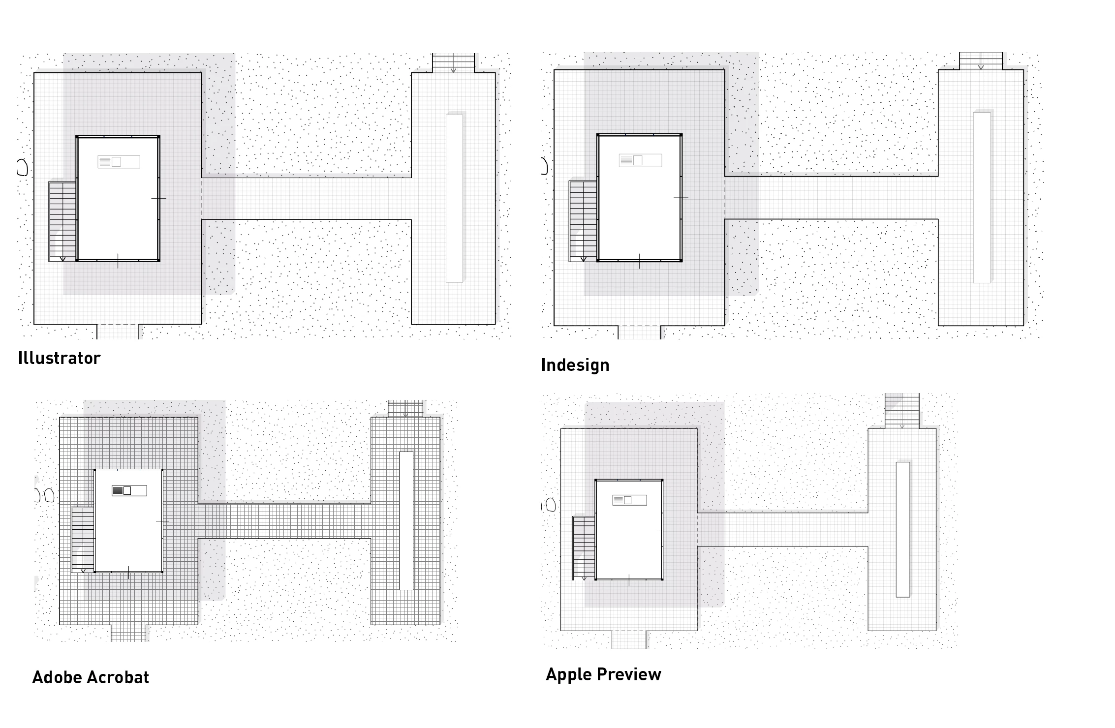
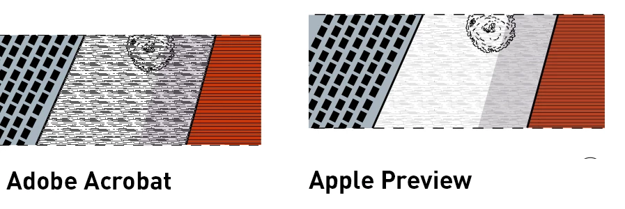
Copy link to clipboard
Copied
Hi,
I'm having an issue with patterns when exporting my file in pdf. The drawing are initially made in illustrator, then put in InDesign as an .ai file (also tried .pdf but no changes), then exported to pdf. When I open the final pdf on Adobe Acrobat, all the patterns are very intense and don't look like on Illustrator and InDesign. I thought something is up with the pdf but on Apple's Preview, the pattern look like the other softwares. I tried making the pattern grey instead of black, playing with opacity, scaling the pattern, and even re-making its but no luck or what happens is that the pattern are too thin then to appear on Apple Preview, looking like a white shape. Did anyone have this issue before? Can't seem to find anything about this online.
Copy link to clipboard
Copied
See if unchecking in Acrobat Preferences "Enhance thin lines" helps.
Copy link to clipboard
Copied
Yes, that fixes the issue! Now: how can I ensure this preference is unchecked for all computers? The file in question is a portfolio to apply for jobs so it's pretty important the drawings look like they're suppose to, not have background elements becoming the main attention. Is there an option I haven't seen when exporting via InDesign perhaps?
Copy link to clipboard
Copied
Unfortunately you cannot set that for other viewers.
Copy link to clipboard
Copied
Okay, thanks for your help already! I found another post where someone suggested to make the lines as outlines or even making the lines thicker. That didn't fix the issue unfortuantely but maybe it does for someone else.
Got to say that it's quite annoying actually so if someone from Adobe reads this, they should really make this a document setting and not one for acrobat.
Copy link to clipboard
Copied
Edit: I see you already found that post.
In this post, Adobe’s Leonard Rosenthol explains the reasons behind the preferences setting.
https://community.adobe.com/t5/acrobat-discussions/enhance-thin-lines-off/m-p/2799770#M5968
And an interesting link in this post suggest adding anchor points to your lines (although I don’t have much luck with that suggestion).
https://www.underconsideration.com/speakup/archives/004301.html
A movie by former Illustrator product manager Mordy Golding also explains the fat lines effect:
Copy link to clipboard
Copied
Can you share a sample Illustrator file that contains the objects you've shown in your initial post.
There may be some other ideas.
Copy link to clipboard
Copied