Exit
  • Global community
    • Language:
      • Deutsch
      • English
      • Español
      • Français
      • Português
  • 日本語コミュニティ
  • 한국 커뮤니티
0

JPEG RGB values are different when exporting from illustrator

Community Beginner ,
Apr 27, 2024 Apr 27, 2024

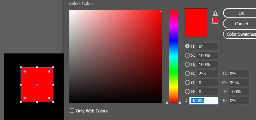
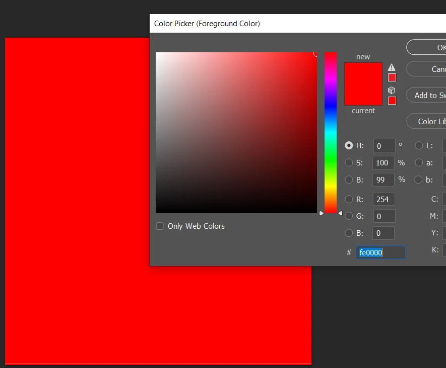
Today I noticed when I exported a JPEG image from Illustrator in an RGB file, the JPEG did not give the same RGB values. For example, the illustrator board had RGB of 255, 0, 0 value and the JPEG had 254, 0, 0 value. I tried a few methods I found on YouTube but none worked for me. Following are the example images to show the difference. Can someone expert explain this to me, please? 
aq1.pngaq2.png

TOPICS
How-to , Import and export
282
Translate
Report
Community guidelines
Be kind and respectful, give credit to the original source of content, and search for duplicates before posting. Learn more
community guidelines

correct answers 1 Correct answer

Community Expert , Apr 27, 2024 Apr 27, 2024

JPEG is a lossy compression type, it will save space by deleting details and averaging colors.

That is what you are seeing, Photoshop will do the same with the same colors and compression quality.

If you want to keep the numbers, use PNG.

Translate
Adobe
Community Expert ,
Apr 27, 2024 Apr 27, 2024

JPEG is a lossy compression type, it will save space by deleting details and averaging colors.

That is what you are seeing, Photoshop will do the same with the same colors and compression quality.

If you want to keep the numbers, use PNG.

Translate
Report
Community guidelines
Be kind and respectful, give credit to the original source of content, and search for duplicates before posting. Learn more
community guidelines
Community Expert ,
Apr 27, 2024 Apr 27, 2024

You will even see this happen from Photoshop. If you do as @Ton Frederiks mentions and export as a lossless format like PNG or TIFF, then open that in Photoshop and save that out as JPEG, you will see similar minor variations. This is the JPEG algorithm for ya... its method for reducing file size does myriads of calculations on all of your original colors based on brightness and chrominance and then spits out revised numbers, but still within the realm of basic human perception. In a continuous tone photo, this would never be noticed, but it can affect flat colors. Again, human perception would never see the differences.

PNG is a much better format for flat colours due the way it (losslessly) compresses files.

Translate
Report
Community guidelines
Be kind and respectful, give credit to the original source of content, and search for duplicates before posting. Learn more
community guidelines
Community Beginner ,
Apr 29, 2024 Apr 29, 2024
LATEST

Thank you

Translate
Report
Community guidelines
Be kind and respectful, give credit to the original source of content, and search for duplicates before posting. Learn more
community guidelines