Participant
April 10, 2023
Question

Letters are crooking when PDF output is opened vai applying flattened transparency in Illustrator

  • April 10, 2023
  • 4 replies
  • 550 views

Hi All,

I hope you'll are doing great!

It would be grateful if anyone provides us with a solution for the below concern.

In the attached output the below letters are crooking which is resulting in smudged output when opened via Flatten transparency in Illustrator.


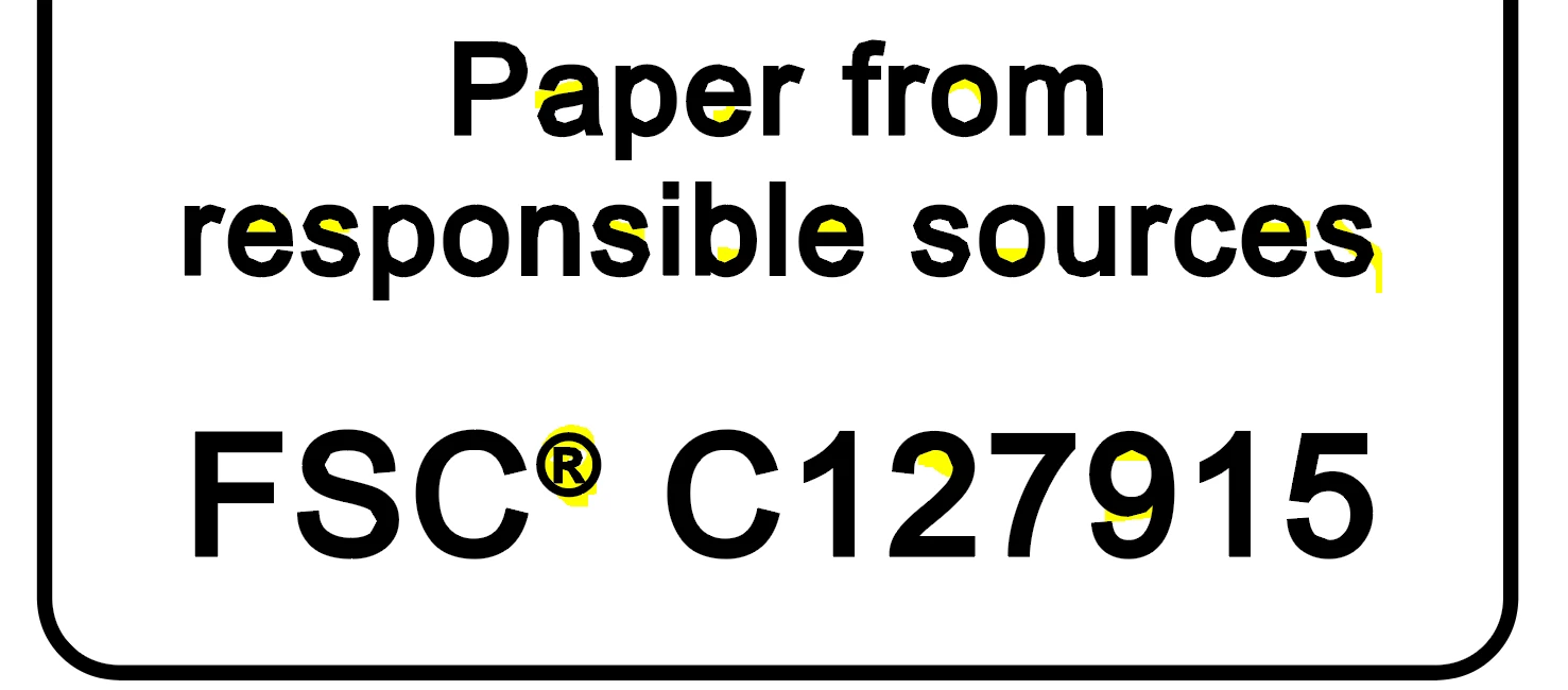
Note: We observed this concern is only impacting tiny objects in artwork.

Thanks & Regards,
Rakesh Devgirikar


This topic has been closed for replies.

4 replies

Brad @ Roaring Mouse
Community Expert
Community Expert
April 14, 2023

What you are seeing is a flatness issue. This is not the same as flattening transparency.


When printed, all curves are actually rendered as a series of straight lines. The flatness setting is a parameter included in the print stream (and PDF) to tell the printer how "accurate" curves (how many straight lines) should be drawn from one point to another. In most cases, you won't see it happen, but on curves at a very tiny size, there's no need to swamp the RIPs processing power by rendering too many straight segments, so some of these curves are replaced with less straight segments within a certain tolerance of pixels that will RIP much faster with no discernable difference to the output.

Looks like when you "Flatten" a PDF inside Illustrator, these "compromises" for print are showing up as baked in on your already-outlined type. I don't know any way to prevent it, as I think it's part and parcel with the compression algorithms when making PDFs. so if you purpose was to extract parts of the artwork, like the the tiny FSC artwork, this is probably not the way to do it.

It's different if you OPEN the PDF in Illustrator, as Illustrator will be able to decode the PDF's curve data back into an proper object and show it to you as you expect it.


If you are concerned about is whether this is affecting your print quality, it really isn't. On a lower-res 600dpi printer, your tiny type is already too small to reproduce crisply and accurately so you will definitely not see the difference. On an high-res output (e.g. 2400dpi imagesetter), it will be beyond the naked eye's ability to discern.


So, that all said, why are you doing this anyway?  yes, there are legitimate reasons to Flatten inside Illustrator, but I'm curious.


Monika Gause
Community Expert
Community Expert
April 11, 2023

That text has been fattened by applying a stroke to it. Maybe that is cusing this.

Alexandre Becquet
Community Expert
Community Expert
April 11, 2023

Hello, I just moved the discussion to illustrator forum. 

BobLevine
Community Expert
Community Expert
April 10, 2023

This is the InDesign forum. Please pose your question in the Illustrator forum. But, on the off chance you're opening an InDesign PDF in Illustrator, that's your issue. Stop doing that. Illustrator is not a general purpose PDF editor.