Inspiring
August 5, 2017
Answered

Line Graph Help: Connecting Missing Values & More

  • August 5, 2017
  • 2 replies
  • 6827 views

Hi all, I am struggling with Illustrator's Graph Tool, hope you could help me with the questions below. Appreciate very much in advance.

I have excel data that needs to be converted into graphs via Illustrator before placing inside an InDesign document. My questions are:

1) How do I set up the graph's category value in excel sheet to appear correctly in Illustrator when copy/paste the date over? Here's what I have on Excel at the moment:

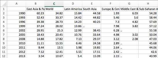
I however did not copy the first column as Illustrator doesn't understand that I want the first column to appear as category value along the x-axis. So I just copy over everything except first column like this:

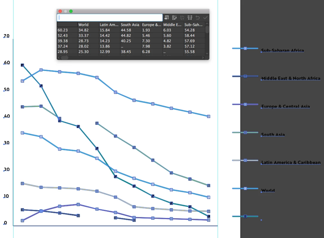
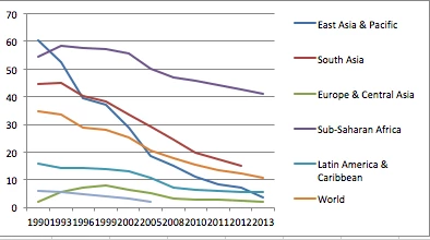
In summary, my question is how do I rearrange the information on Excel sheet so when I paste data over the years would appear along the x-axis like this (below is generated within Excel):

2) How to make the lines connect automatically when there are missing values? As you can see, the original data has some missing values:

When data is placed in Illustrator, the graph looks choppy like below. You can see that the light green and black lines do not connect because of the missing values.

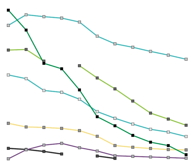
How do I generate lines that smoothen out the missing values like Excel could?

Pardon me if the questions are confusing. English is not my native language.

    This topic has been closed for replies.
    Correct answer Monika Gause

    To get your years into the axes, you need to put them in quotes: "1990", etc.

    Illustrator can't connect your gaps automatically. You would need to do that manually.

    In general it might be easier to create the graph in Excel, save as a PDF and open that in Illustrator to further edit it. The values won't be editable then of course.

    2 replies

    Bill Silbert
    Community Expert
    Community Expert
    August 5, 2017

    Hopefully, the screen shot and explanation below will answer your questions:

    In order for the years to appear across the category axis they must have quotation marks around them as shown in Illustrator’s graph data spreadsheet in the top picture. To smooth the lines “Mark Data Points” (highlighted in red in the bottom left picture) must be unchecked (it is checked by default). The Graph Type dialogs that I have shown here can be found by double-clicking on the graph tool in the tool bar while the graph is selected. I have shown here the three areas the dialog set up offers set up to meet your needs. Note that the Value Axis section shows that Tick Marks are full width to match the Excel style you showed in your last screenshot. If you need to reaccess the Graph Data at any time Go under the Object Menu to Graph while the graph is selected.

    One last thing to keep in mind is that stylizing and/or reproportioning graphs manually after their creation will remove them from further control by the Graph Data spreadsheet. It seems that you can usually get away with some minimal scaling done by applying the scale tool using mathematical increment but even that seems to have its limits.

    Inspiring
    August 6, 2017

    Thank you very much Bill, that was most helpful! I have asked Monika another question, could you please also look into it? Basically I want to know whether it's possible to have the category value automatically generated on 90 degrees, and distributed evenly along the x-axis.

    Also, I have been experienced a lot of crash while working with graphs. Is there a common problem that I should know in order to avoid crashing? (it's always when I try to edit the graph type)

    And also is it possible to use Align tool for graph objects?

    Inspiring
    August 6, 2017

    Yes. I did not realize that the Transform effect that Monika mentioned in her new reply would work with this old feature when so many other later features won't. I am constantly amazed at how instructive these forums can be for us all!


    I am that you are able to learn something new while teaching someone new like me! Appreciate for all of your help so far Bill!

    Monika Gause
    Community Expert
    Monika GauseCommunity ExpertCorrect answer
    Community Expert
    August 5, 2017

    To get your years into the axes, you need to put them in quotes: "1990", etc.

    Illustrator can't connect your gaps automatically. You would need to do that manually.

    In general it might be easier to create the graph in Excel, save as a PDF and open that in Illustrator to further edit it. The values won't be editable then of course.

    Inspiring
    August 6, 2017

    Thank you very Monika, that was most helpful. I have one more question regarding graph, hope that is okay:

    1) Is there a way to do I tell Illustrator to automatically rotate the category values when generating the graph? From inputting data, this is what the current graph looks like:

    As you can see, there are too many categories and it is impossible to read, so I want to rotate them "each" 90 degree so it look something like:

    However the Transform each does not work for me when using group selection tool for graph. When I click Transform each, no dialog box pops up.

    Appreciate for any advise!

    Monika Gause
    Community Expert
    Community Expert
    August 6, 2017

    You could select all the texts with the direct selection tool and then apply Effect > Distort and Transform > Transform. Rotate by 90°

    Alignment of text will then get complicated though, because right or left-align won't work as expected. You could either shift baseline or use the transform effect for that as well. Which will of course be most effective when all the text are of the same length. If you need to align them differently then you will need to select them one by one.