Copy link to clipboard
Copied
Hello,
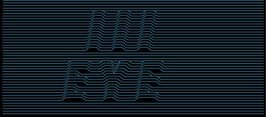
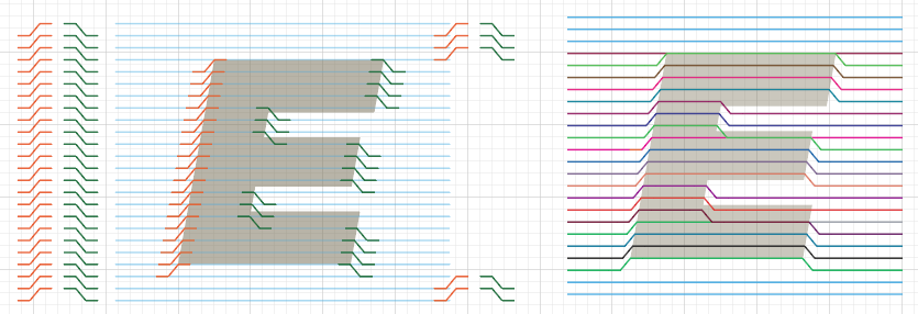
I'm looking to replicate the image below with different text, the original is made up of simple lines with a fill stacked evenly (all vector). I found a script solution that created something similar but its not as exact as the example. Any tips are much appreciated and I also wanted to say thanks for any tips to my previous topics, you guys are a great community.
 1 Correct answer
If the existing scripts don't help you then you will have to contact a scripter to make you different ones. Of course you could do this manually. The Pathfinder "Outline" should help with the cutting. But then there are a couple (or rather much more than that) of paths to delete and re-connect and whatever. I'd rather not clean up this thing 😉
Explore related tutorials & articles
Copy link to clipboard
Copied
If the existing scripts don't help you then you will have to contact a scripter to make you different ones. Of course you could do this manually. The Pathfinder "Outline" should help with the cutting. But then there are a couple (or rather much more than that) of paths to delete and re-connect and whatever. I'd rather not clean up this thing 😉
Copy link to clipboard
Copied
Tnx for the input, I'll do it manually by adjusting the individual lines with a pen tool and direct selection.
Copy link to clipboard
Copied
Set it up like this:
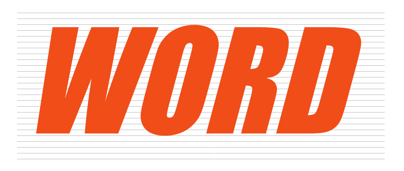
(note: the lines have black fills, not strokes; the actual color doesn't matter)
And then with the pathfinder "Outline" you get this:
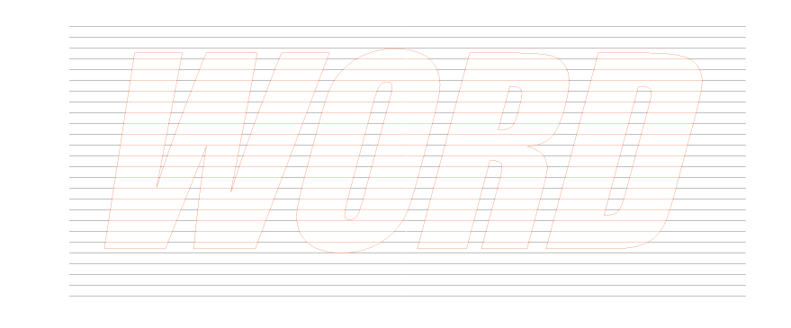
easier to select.
The lines need to be paths, not drawn with the Line segment tool. For me it didn't even work when I converted the shape to a path after drawing it. So I had to draw the lines with the pen tool.
Copy link to clipboard
Copied
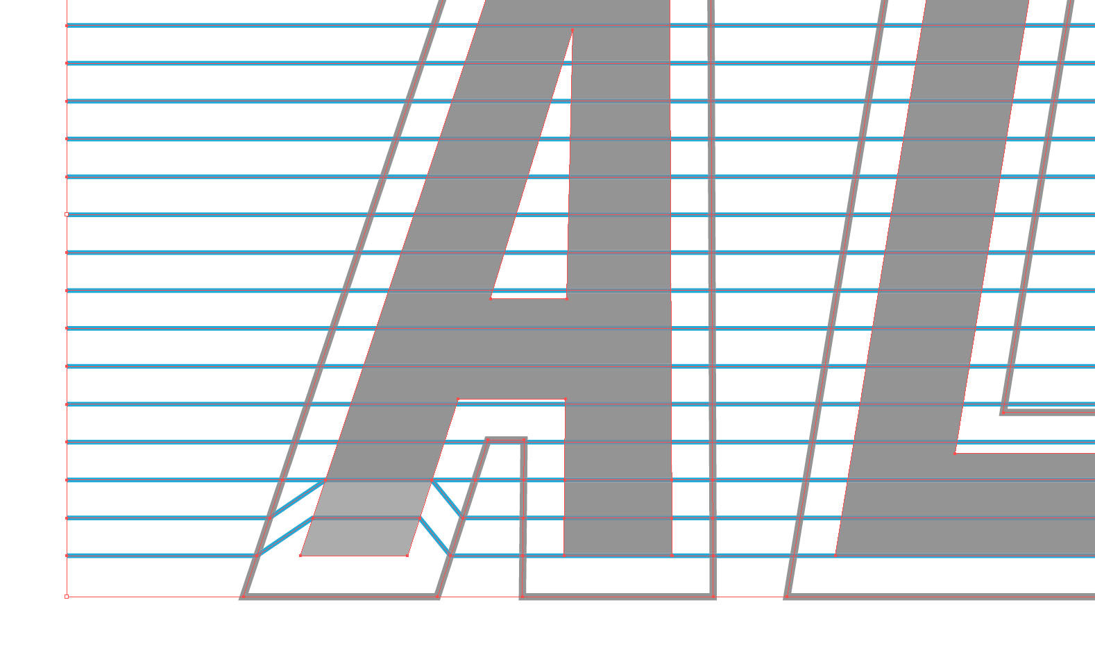
tnx Monika I actually set it up like this, I'm sure I'll run into problematic parts but I'll give it a shot "fully manual style"
Copy link to clipboard
Copied
Very nice inspirational design.
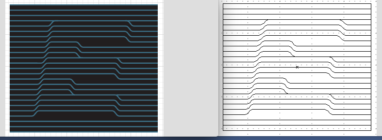
I also chose the manual way.
Yes, can be problematic, depending upon your Font and characters or your design in general.
In short, Effects>Trans was my friend.
Lines then also corners.
Expand Transform, Move over corners.
Live Paint>Strokes. I random colored what would need to later be joined.
Expand Live Paint
Join like colors into one path.
Lasso corners, switch to White Arrow tool, Here I assigned a corner radius of 8 for all.
Recolor all strokes as you wish. Stroke weigh now 2pt.
Added a background Rectangle color.
Perfect alignment and placement. ;-)
K
Copy link to clipboard
Copied
If anybody cares, I built the following

by using two identical sets of lines and an Offset Path outline of the letters and the Shape Builder Tool to generate "inside" and "outside" line segments, then applying this art brush

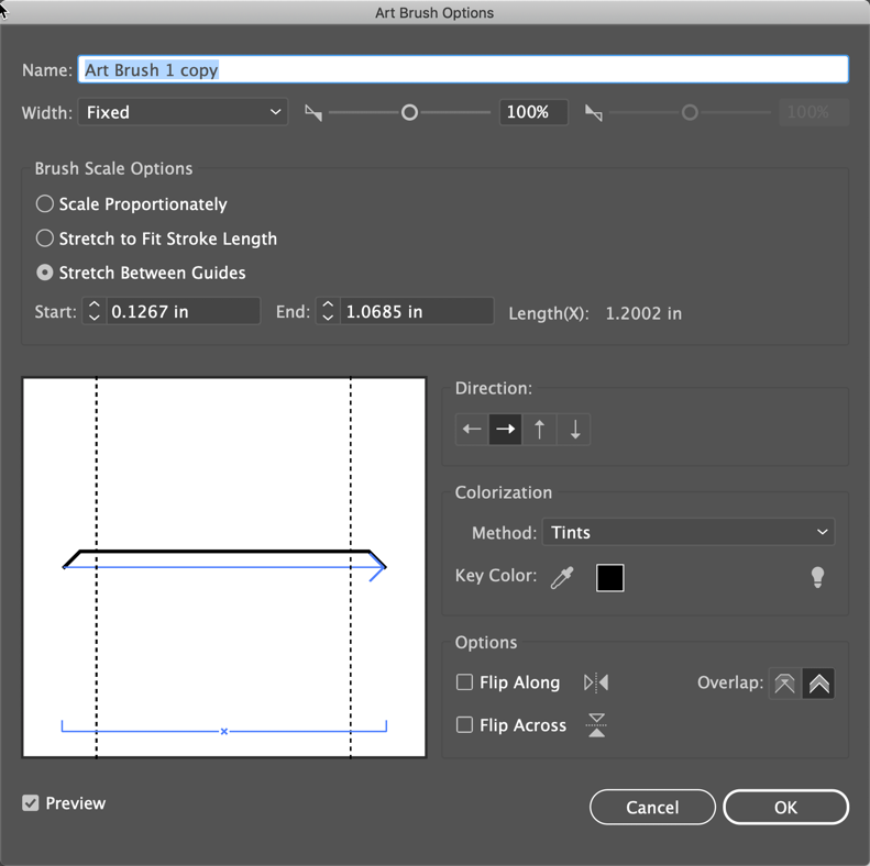
to the "inside" segments, expanding the appearance (and deleting the invisible paths), joining "inside" and "outside" paths, and applying a uniform arc to the corners with corner widgets.
Of course, the process was not as quick and smooth as this description makes it appear: it took me a couple of hours to work my way through it, to fix things that didn't work exactly as I anticipated and accomplish things I had overlooked, but in general it went according to plan.
I'm sharing this not because it was fast, but because it worked, and because it was really fun!
Peter

