Looking to recreate something like this. Can someone point mean the direction or know the style nam
Copy link to clipboard
Copied
Explore related tutorials & articles
Copy link to clipboard
Copied
Create and outline the text.
Put the paw print on top of it.
Use the pathfinder Divide (from the Pathfinder panel)
Color stuff as you like.
Copy link to clipboard
Copied
beans,
In addition to the excellent solution by Monika, in order to create the gaps round the white stroked letter parts where the green background shows through, you can further:
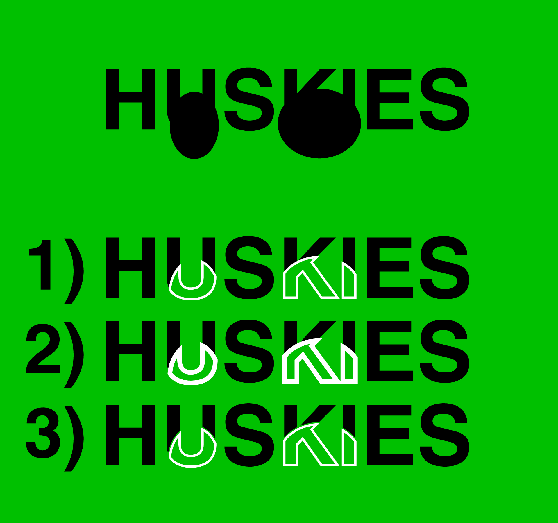
1) Ungroup the letter part Group and create two Compound Paths, one with the black filled letter parts, and one with the white stroked letter parts, with the latter in front of the former; you can use Select>Same to select the two kinds, first the black filled parts and then the white stroked parts, and then with the latter selected you can use Ctrl/Cmd+X+F (hold Ctrl/Cmd and press X then F);
2) Copy the Compound Path with the white stroked letter parts behind itself; you can use Ctrl/Cmd+C+B, then increase the Stroke Weight by twice the desired gap, then Object>Path>Ouline Stroke to have a widened filled version which will cover parts of the black filled letters;
3) ShiftClick the Compound Path with the black filled letter parts to select that as well, then use Pathfinder>Minus front.
This ought to remove the covered parts of the black filled letter parts, thereby creating the gaps.
You could also mask those parts out using an Opacity Mask, but sticking to pathfinder ways throughout is cleaner and covers the full range of possible uses.
Edit: I have added the crude image I made while going through the steps 1) - 3); you can clearly see the gaps in 3) when you get close:
Click/RightClick to get closer, Click again to get closer still
Copy link to clipboard
Copied
beans,
Further to my first suggestion, my immediate impression has been that the original Huskies image can seem a bit odd: the centres of the strokes in the white letter parts correspond to the outer bounds of the fill of the black letter parts, which means that the white letter parts are larger, extending outside instead of being flush with the black ones, as if being squashed a bit by being trod on The gap softens this appearance.
This could be on purpose, and be as you wish, but if you wish an appearance where the white stroked letter parts fit within the original shapes of the black filled ones, a few additional initial steps are rquired, steps 1) - 3) in my first suggestion steps 4) - 5):
So, in addition to the excellent solution by Monika, in order to create the gaps round the white stroked letter parts where the green background shows through, you can further:
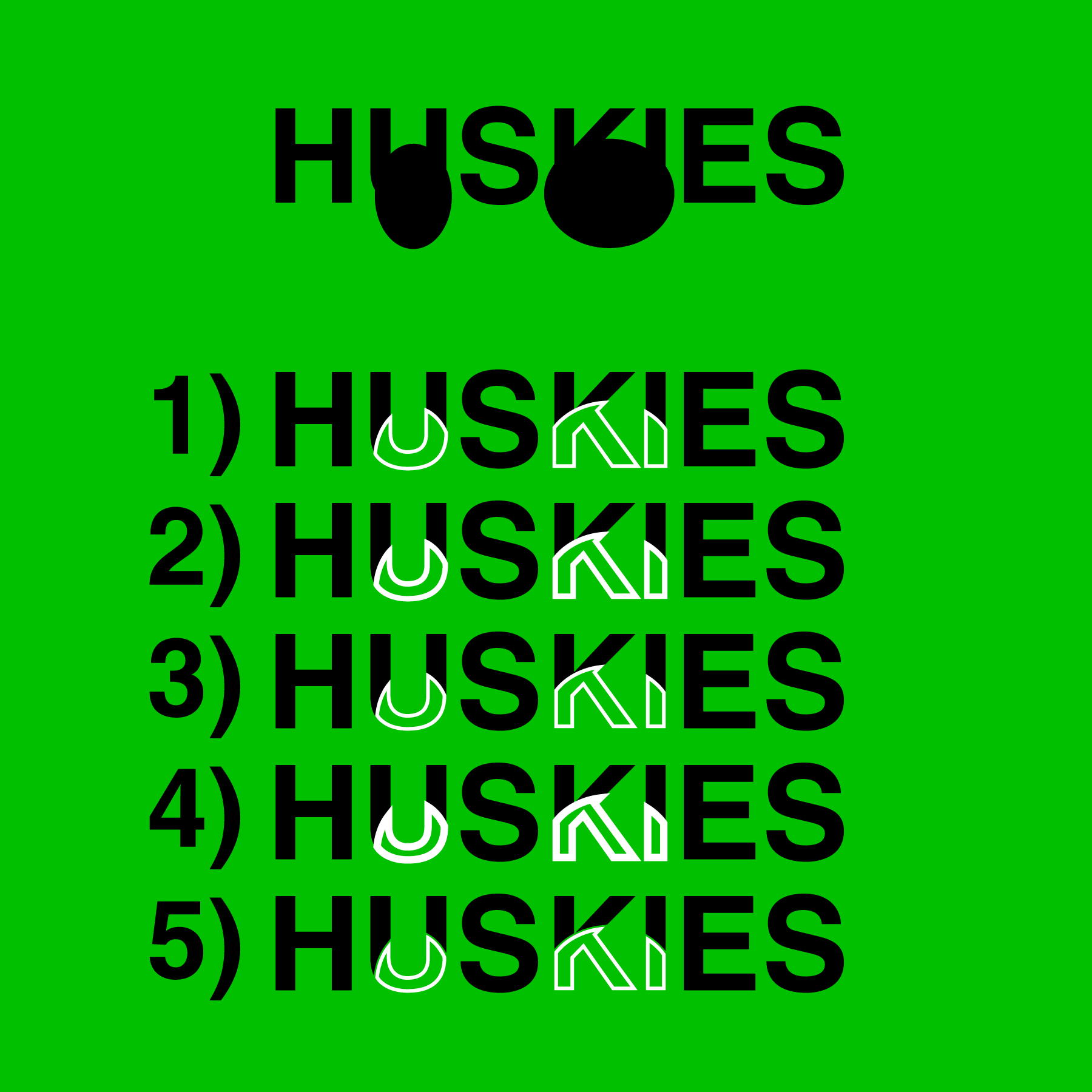
1) Ungroup the letter part Group and create two Compound Paths, one with the black filled letter parts, and one with the white stroked letter parts, with the latter in front of the former; you can use Select>Same to select the two kinds, first the black filled parts and then the white stroked parts, and then with the latter selected you can use Ctrl/Cmd+X+F (hold Ctrl/Cmd and press X then F);
2) With the white stroked letter part Compound Path still selected (or reselected), apply Object>Path>Offset Path with a negative offset of half the Stroke Weight, make the offset paths flush with the corresponding black filled paths;
3) Delete the original white stroked letter part Compound Path;
4) Copy the new Compound Path with the white stroked letter parts behind itself; you can use Ctrl/Cmd+C+B, then increase the Stroke Weight by twice the desired gap, then Object>Path>Ouline Stroke to have a widened filled version which will cover parts of the black filled letters;
5) ShiftClick the Compound Path with the black filled letter parts to select that as well, then use Pathfinder>Minus front.
This ought to remove the covered parts of the black filled letter parts, thereby creating the gaps between the black filled and white stroked letter parts, which have corresponding outer bounds.
You could also mask those parts of the black filled letter parts out using an Opacity Mask, but sticking to pathfinder ways throughout is cleaner and covers the full range of possible uses.
You can compare the crude image here with that of the one from my first suggestion, and decide which is better; and you can clearly see the gaps in the last step (step 5) her and step 3) there) when you get close:
Click/RightClick to get closer, Click again to get closer still


