Participating Frequently
February 7, 2015
Answered

More complex pie charts

  • February 7, 2015
  • 2 replies
  • 11003 views

Hi,
I'd like to create improved pie charts with effects like this without doing them by hand :

I'm bad at scripting in illustrator, but I'd like some effects like the slice's size variations and the text orientation.
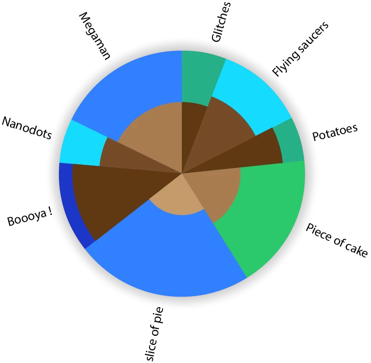
This topic has been closed for replies.
Correct answer Qwertyfly___

Hi again,
I'm experiencing a bug with Pie maker 1.002.
With  the % box unchecked, if the first digit of the inner value is superior to the first digit of the outer value, the inner gets red and the OK button gets greyed out, even if the outer value is by far bigger. In the opposite situation, the inner stays black and the OK button works even if the inner value is way bigger.

This doesn't happen with version 1.

Is it the same for you ?


Thanks heaps for the feedback.

the issue, as far as I can make out is due to me comparing to strings, I have now passed them as floats so it should work now.

the new version can be downloaded from here:

QwertyFly.com

please let me know if you come across any other issues or bugs.

thanks again..

2 replies

Qwertyfly___
Legend
February 25, 2015

‌cheers, code needs a little cleaning up. But I was happy with the result.

CarlosCanto
Community Expert
Community Expert
February 26, 2015
code needs a little cleaning up

+ indenting...but other than that, I love it!! great work

Qwertyfly___
Legend
February 26, 2015

I was playing with ScripUI and put something together.

it's painful.

Whats with the ugly tabs?

also from what I understand I need to use bridgetalk to then get it to talk to illustrator.

this has me stumped.

I can get all the arrays and variables filled.

but then how do I target illustrator to start drawing the Pie?


Silly-V
Legend
February 7, 2015

I have a question: what's the dual colors of each pie slice represent? ex: for "piece of cake", what does the green and the brown mean?

tayzanoAuthor
Participating Frequently
February 8, 2015

Well in this case it doesn't matter, let's say the size of the slice means the quantity and the brown means their temperature. It can be anything. It's basically the same as this kind of bar chart which Illustrator already does :

Silly-V
Legend
February 16, 2015

Hi, sorry I had no internet for days.
This looks great !
For me it's perfect, yet I just realized that it really looks like there's more vanilla icecream than chocolate, but there's nothing to do about it, unless something that calculates the area but that would start to be ridiculous.
So yeah, thank you.

I don't know how to put that in a script but this seems to be the easiest way.


The representation in my image is technically inaccurate because internal pieces of my pie are to be interpreted as if they were straight bars. To have area come into play, you will need to have all the constituents of a slice as percent of a full (imaginary) circle, a circle that's the size of the actual whole pie graph's circle (unrelated to the data which separates the slices).  What you do, is lay on top each of the constituent parts as percent of the circle, as smaller circles, centered on top of the big one, and sorted so that ones with bigger area do not cover the smaller ones. Then after all of the parts of your given slice are represented as circles laid on top of each other, use the sector of the given pie slice as a cliping mask to clip your set of circles into the pie slice.  Now, your areas of individual 'peels' within a slice should be logically representative of the actual number.

The percentages of the circles which will temporarily represent your sections of inner slice data will not be gotten linearly though, you won't be able to just make the parts a percentage of the vertical or horizontal scale of the big circle, the percentages will need to be figured out using Pi & circle equations.  The sample thought process for a single one slice is this:

1) Inside this slice there are 2 numbers: 60 pigs and 40 cats. The total is 100, so let a circle the size of the graph be proportional to the total of these numbers.

2) The area of a big circle is now related to 60 pigs + 40 cats. Now, make one circle on top of the big one.

3) Find the area for the new smaller circle using simpler math: my big circle is X area, so my smaller circle which will stand for 60, will have an area 60% of X.

4) To make the smaller circle have the correct area, figure out the numbers you need for diameter, or scales, which will make the smaller circle end up with an area that's 60% of the big one's area.

5) Now use an existing path (hopefully there will be one) from the pie graph to contain the two circles inside a slice. The smaller circle will represent 60% while the bacground, or the 100% circle that's obstructed by the 60% will now show you 40% in area format.

You can experiment by doing this in a regular Illustrator document with simple circles. Make a 100px tall & wide circle, select it, note it's area with use of this script: alert(app.activeDocument.selection[0].area);, then try and make an approximate circle that's 50% smaller, by shrinking a copy of your original circle until you alert yourself the area which is 50% of your total.  You will see the inner circle's height and width are not 50% of the original circle, and if you take a quarter-slice of the entire group by drawing a square from the middle of the circles, outward and using Divide in Pathfinder, if you select each of the divided components, your areas will be approximately the same.