

- Home
- Illustrator
- Discussions
- Your old file has the Pantone 722 C spec'd with a ...
- Your old file has the Pantone 722 C spec'd with a ...
PANTONE COLOR PROBLEM

Copy link to clipboard
Copied

I have some problems about PANTONE color.
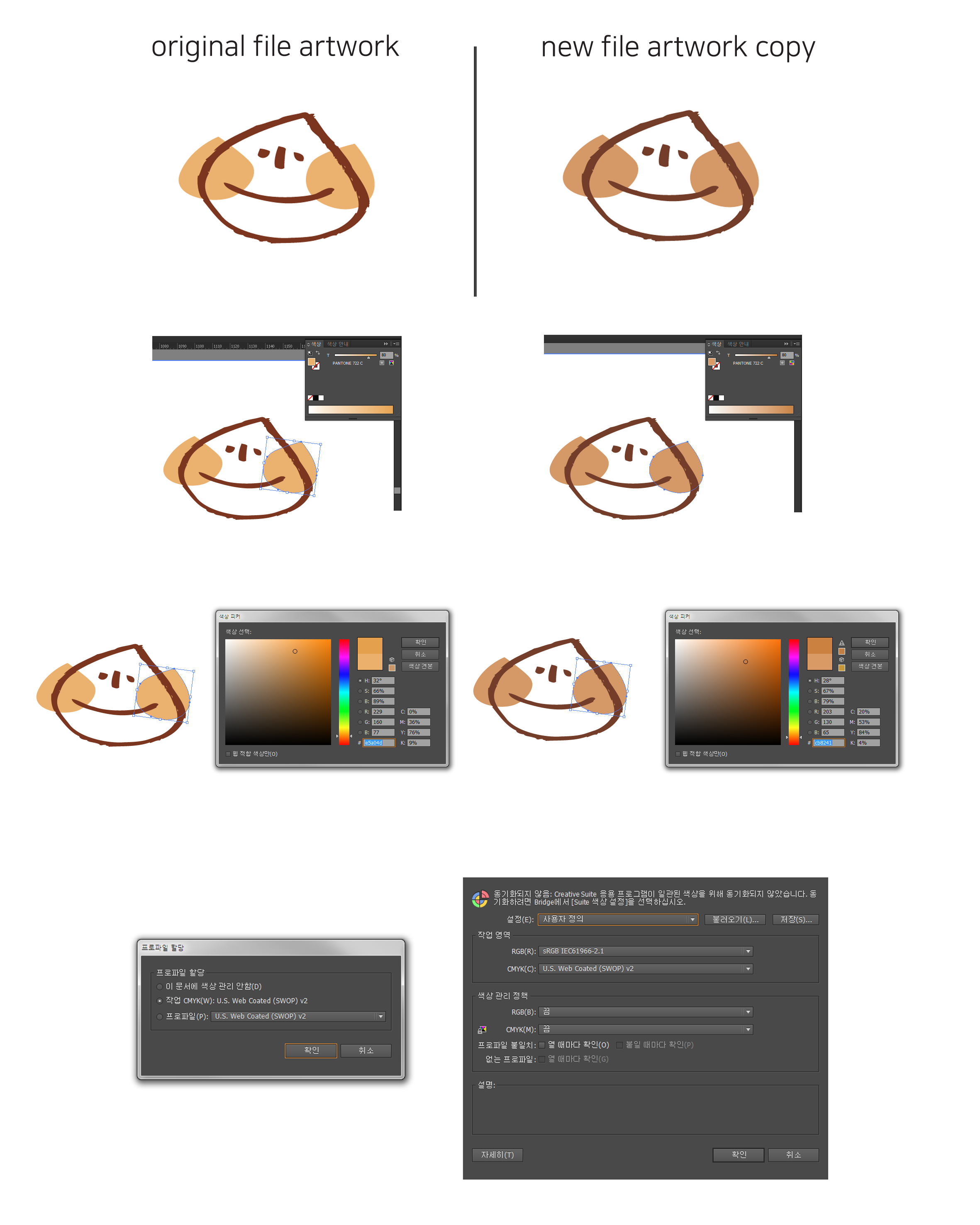
The color changes when the original file art work is copied to a new file.
(Same file color settings, same prefernces settings, just copy and paste)
It looks different on print as well as on monitor.
How can you solve color problems? Please solution comments.


Explore related tutorials & articles
 10
Replies
10
10
Replies
10

Copy link to clipboard
Copied
As i can't read Corean but see the Icon; Your colors are NOT syncronized, which could B one of the 100 reasons.
Go to Adobe Bridge – Color Settings and sync the colors over the entire Creative Cloud Desktop Apps.
And/Or make sure that the original File has the same Color-Space/Profile as your new file.
And also – try to learn something about the physics of color and paper 😉
Copy link to clipboard
Copied
너는 내 질문을 이해못한것같다.
한국어는 모르지만 이해간다고 했으니 한국어로 대답함
Copy link to clipboard
Copied
I have some problems about PANTONE color.
The color changes when the original file art work is copied to a new file.
(Same file color settings, same prefernces settings, just copy and paste)
It looks different on print as well as on monitor.
How can you solve color problems? Please solution comments.

Copy link to clipboard
Copied
If you want to print CMYK, then don't use Pantone spot colors.
In order to solve your problem: Open both files.
In the swatches panel menu go to"Spot colors"
Compare the settings.

Copy link to clipboard
Copied
A long time ago Pantone libraries had CMYK numbers provided by Pantone for the spot colors.
The current libraries do not have these fixed CMYK numbers to simulate the color, but they are calculated using color management.
If you have older Illustrator files, there may be a difference when you copy from the old to a new file.
Copy link to clipboard
Copied
OH
Original file is CS5, new file is CS6.
I checked PANTONE color code(CMYK ver) on two version, it changed.............................I think it'll be quick to re-color it. thanks
Copy link to clipboard
Copied
In the swatches panel menu go to "Spot colors". Check the options and compare in both files.
Don't use Pantone spot colors when you actually want to print process.
Copy link to clipboard
Copied
THANKS I'll checked and keep in mind-use Pantone spot

Copy link to clipboard
Copied
Your old file has the Pantone 722 C spec'd with a CMYK breakdown. The new file will use the current breakdown in LAB when you paste as the new file will look up the name in the current Color Book swatch file. (You can tell the difference by the tiny icon next to the colour). If you are using spot colour printing for the job, this will not be an issue (722 ink is 722 ink no matter what the name/suffix/breakdown). HOWEVER if you are printing process, and it's important to match an existing old process match going forward, a little trick is to RENAME the colour in the old file (like: add a letter: e.g. Pantone 722 CX), then copy and paste. This will add the new colour to the new document with the old CMYK mix. If you are printing spot colours anyway, you will still get a proper separation for 722 on a separate plate. The better approach is to start using the right Color Book for the right job. If your intent is a process printing, Pantone's new set "Color Bridge" have updated process matches that can result in more accurate matches to the actual 722 standard. If you use the new Solid Color coated swatches ("C"), you can certainly print process of that, but the accuracy of the cmyk it converts to is based on all your colour management settings, but guaranteed it will be different than your old mix. You have to remember, Pantone's motive is to assure matches to their INK SWATCHES. This is why they keep changing their methods as technology changes and printing methods get more advanced.
Copy link to clipboard
Copied
Thanks for your detailed comments.,....
I'll change color spot with your explanation(new swatch) really*10 thank you

Find more inspiration, events, and resources on the new Adobe Community
Explore Now
 AdChoices