- Home
- Illustrator
- Discussions
- Re: Problem with vectorizing a hard shape
- Re: Problem with vectorizing a hard shape
Copy link to clipboard
Copied
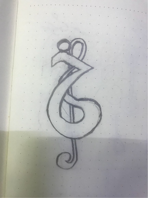
I have tried to design a logo for a traditional song company, and I came with an idea on paper.
So now I want to vectorize that idea using illustrator and that is my problem.
I have tried to use the pen tool, but it didn't look good.
anyone can help? please!
 1 Correct answer
I guess the question would be, what, in the Pen tool-drawn version of the logo don't you like?
- The stroke is uniform — that kind of gives it a cold, technical feel, but can be changed by experimenting with the Brushes panel.
- Some of the forms might seem a little lumpy — those can be adjusted by using the white arrow/Direct Selection tool.
- The black and white form may seem kinda bland — experimenting with fill colors can help you make the shapes stand out.
- Lineart most always looks flat for al
Explore related tutorials & articles
Copy link to clipboard
Copied
What precisely didn't look good?
Copy link to clipboard
Copied
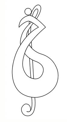
let's say that I'm a beginner to illustrator, so I really don't know how to design this, I used a pen tool so it looked like this:
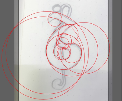
also, I tried to use circles, then use the shape builder tool to design this, but even that didn't work, like this:
Copy link to clipboard
Copied
show please a screenshot of your vectorized logo version, it will allow to say something helpful.
Copy link to clipboard
Copied
sorry, I forgot to share it.
I used a pen tool so it looked like this:
also, I tried to use circles, then use the shape builder tool to design this, but even that didn't work, like this:
Copy link to clipboard
Copied
I guess the question would be, what, in the Pen tool-drawn version of the logo don't you like?
- The stroke is uniform — that kind of gives it a cold, technical feel, but can be changed by experimenting with the Brushes panel.
- Some of the forms might seem a little lumpy — those can be adjusted by using the white arrow/Direct Selection tool.
- The black and white form may seem kinda bland — experimenting with fill colors can help you make the shapes stand out.
- Lineart most always looks flat for all but the simplest graphics — working your way up and down the Effect menu commands might get you some, well, effects, that appeal to you.
We can guess, but you're the ultimate judge here of what looks good and what does not. What don't you like about what you've got? And what would you like it to be? How will it be used? Which ways will you be reproducing it?
I'd suggest making a copy of the original file and going nuts. That way you can always go back to the start if your experiments go awry. Don't be deterred if your first few trys offer no perceived improvement; often finding the perfect combination comes from first learning how you don't want your logo to look.
Good luck,
Randy
Copy link to clipboard
Copied
Thanks for the perfect explanation. I'm sure these points will help me figure it out.
You asked my opinion on the pen tool version design, the problem with that is it feels cartoonish, and the lines don't feel smooth.
Generally, it doesn't feel like how it does on paper.
(btw sorry for my broken English)
Copy link to clipboard
Copied
First off, there's no need to apologize for your English. Heck, you're doing better with it than I am.
Depending on your preferences, I can see how you may feel it's kinda lumpy. Truth be told, I somewhat agree with you. Trying to duplicate the smooth dipped pen fluid shapes of a clef is never easy with Illustrator's pen tools. Calligraphy often doesn't translate easily into technical illlustration tools like Illustrator for novice users — though I'm sure several experienced artists here will quickly challenge me on that statement. So I wouldn't take that too hard. Folks who have tried that and are not too happy with their results are legion.
Working with existing pen-drawn paths is a function split between your Direct Selection tool and various pen/anchor point tools. Adobe offers some great explanations, tips and techniques here. Be sure to click on the links from this link; it'll take you into deep detail on specific parts of this article. If you've got the time to fall down this rabbit hole for a while, it'll help you develop the skills to get you closer to where you want to be.
Hope this helps,
Randy
Copy link to clipboard
Copied
Thanks for the information and the time you spend explaining to me.
I'll try my best to learn to work with these tools.
Copy link to clipboard
Copied
well,
1. Your pen line does not suite the sketch. It's not a tool problem buy just the drawing accuracy.
2. If you want to have non-uniform strokes, you can use a Width Tool (Shift+W) to change the stroke width where you want.
The idea to use circles is very good but, if I see well, you don't want to stylize your image in more geometric way, you're trying to keep the lines a bit rough, so this way is not match to your case.
Copy link to clipboard
Copied
I really appreciate your help. Thanks.
Copy link to clipboard
Copied
The great thing about your pencil sketch is that it is not perfect. My objective when creating a symbol such as yours is to create an illusion of non computer generated artwork. Try focusing your attention to creating an inner line and an outer line set that follows your sketch. This will alow you to define the thickness as established in your sketch. You can try a simple example by creating a circle and then a second circle slightly smaller than the first. Then, move the smaller circle around inside the larger one and you can see how you can change the appearance of the circle itself ( use outline, no fill ). Drawing an artwork is not easy and takes time. But, you can get the rsults you are looking for.
Copy link to clipboard
Copied
Thanks for the offer. I'll try that.
Copy link to clipboard
Copied
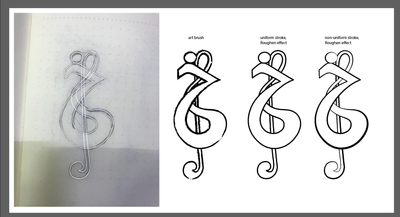
In addition to Randy's post: here are just some quick samples of what you can get using the brushes and effects to change the look of your vector
Certainly, paying more attention to details and keeping the main idea in your head, you'll get the much better result.
Copy link to clipboard
Copied
Anna Thanks for the time you spend to design these for me, I appreciate your help.
I really like the way you worked on the details. but I have a question, according to Randy, he said that I should use the brushes panel to design my art and then use effects to work on it (if I get it right, I'm not that good at English so it's hard to understand what exactly you guys mean). but here on your example, I see that you used the pen tool then made brush art using that pen tool version, am I right?
And also I'd like to mention that working with the pen tool is not easy for me because I'm new to illustrator, you made it really smooth and clean which I tried but couldn't do.
Copy link to clipboard
Copied
You see, Brushes panel is for decorate the existing path. You can draw it using any drawing tool: Pen, Pencil, Brush. If you use Brush tool, you have to select any brush sample in Brushes panel. But, by my experience, Pen is the most universal tool: quite simple, very controllable, and after drawing you can decorate it any way that you can even imagine.
So, I would suggest to draw the shapes by Pen and then experiment with brushes, effects etc.
Important thing: you can change the brush any moment before expanding (converting all effects and brushes to simple shapes to prevent their unwanted changing), but when you've added an effect, you have to edit it from Appearance panel, not by applying the same effect once more.
Make sure to expand the effects (Object > Expand Appearance) at the end of work (but only when you will completely satisfied by result).
Copy link to clipboard
Copied
oh thanks, now I got the main idea of how should I work with this kind of arts.
first of all, I have to learn how to use the pen tool properly.
thanks to you Anna, you helped a lot.
Copy link to clipboard
Copied
Please let me jump in here. If I gave you the impression that you have to create with your Brush tool, I apologize.
Your pen tools are much easier to create art with; it's easy to apply and adjust brush strokes and effects after you've created your shapes and fine-tuned them to your satisfaction. And don't feel bad about taking a little time to get up to speed with using the Pen tool. The good news, though, is once you master it, your skills will serve many masters like creating clipping paths and building combined vector/pixel art in Photoshop. As well as whipping up quick art for your page layouts in InDesign, building better video graphics and touching up flaws in 3-D art as well.
It's a pain to learn how to make the most of pen tools, but it'll pay off handsomely when you get to the top of the learning curve.
Randy
Copy link to clipboard
Copied
Thanks Randy, there is no need to apologize, anyhow I got the point.
it's good to have people like in this community.


