 Adobe Community
- Home
- Illustrator
- Discussions
- Re: Problems with making envelope out of top objec...
- Re: Problems with making envelope out of top objec...

Copy link to clipboard
Copied
Hello,
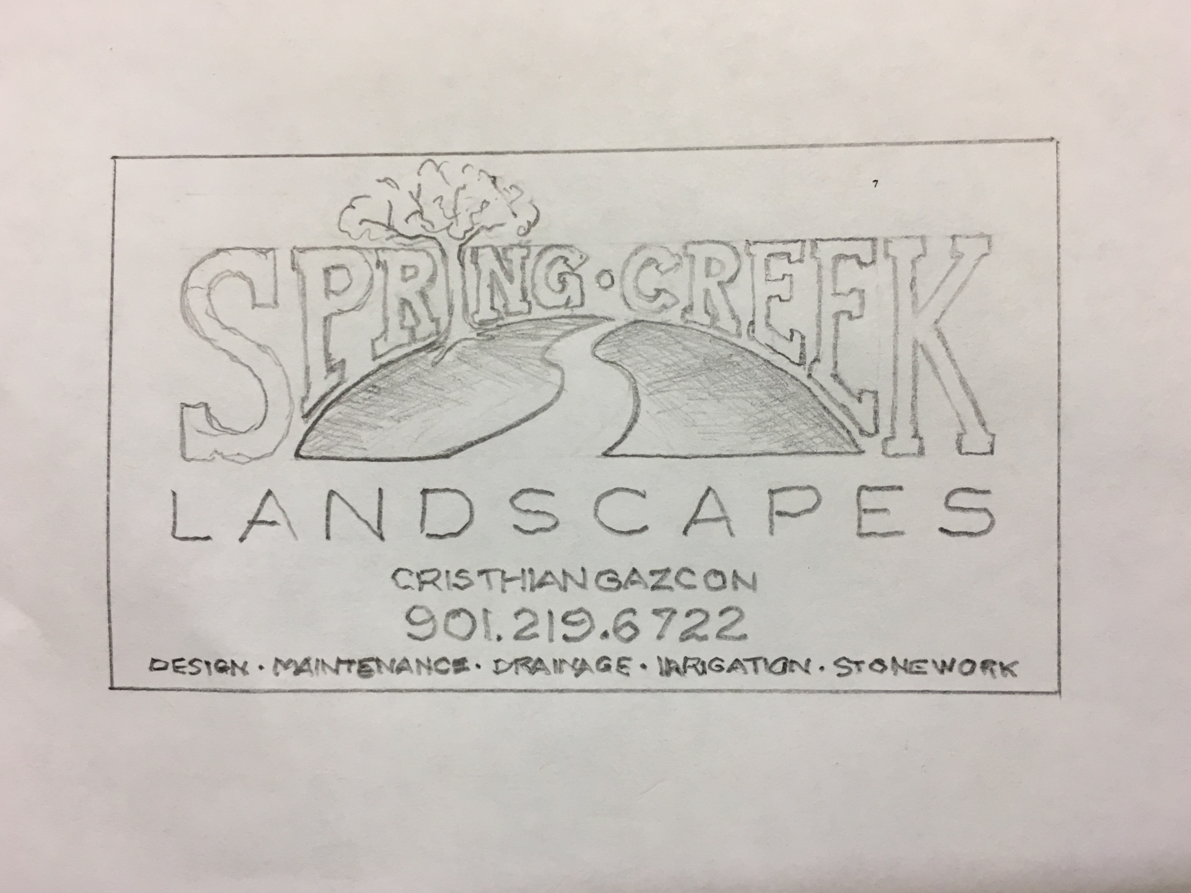
I am a complete novice at this but can tell I will love it once I learn it. I have been trying to create a logo for a business card and I need it asap. I have searched the 2017 handbook and this forum for 2 days and still can't figure some things out. I am trying to create this:
I decided to do what I think will be the hardest first, which is warping the text for Spring Creek. I created a shape with a rectangle and an ellipse like this:
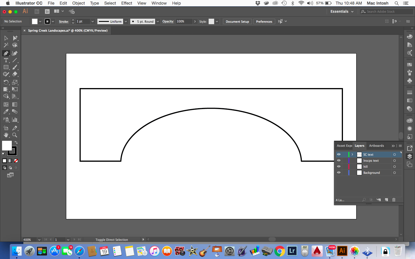
It kept telling me that I could not create an envelope out of the top object because it wasn't a single path or mesh. After a lot of headaches I managed to create a single path (or shape or whatever, not sure) by outlining the object and typing the text. But when I created the envelope, the text warped in a weird way (NOT strait up and down) and definitely not with the shape, and it CHANGED THE SHAPE. The arc went up higher and the inside bottom corners curved.....

Anyway, I see a lot of threads saying to create a shape with the pen tool which I AM NOT seeing what is so simple about that, I cannot understand how in the world to manipulate that tool. BUT I HAVE THE PERFECT SHAPE. I just want the text in that shape!
So I give up. Can someone tell me how to do that, and to help me out because I know I'll be back on here and I need to get this project done asap, just tell me the easiest and fastest way to achieve my logo? I can probably handle the text at the bottom......but then again, maybe not ...
...
Thanks in advance!


 1 Correct answer

Explore related tutorials & articles
 18
Replies
18
18
Replies
18

Copy link to clipboard
Copied
THere's just no way to do this using the method you describe, because you will scale your serifs with the envelope, which is something you absolutely would want to avoid.
You have to build it manually. You will need the pen tool for this, but you will be able to do a lot of the construction work by using shape tools (lines, rectangles, ellipses ...)
Then using construction moethods: pathfinder, shapebuilder, live trace ...
If you insist in using an envelope I would at least only apply the envelope to the part between the first an last letter. That might bet you a slightly better result, but it will be far from the way you want it to look. And far from your sketch.
Copy link to clipboard
Copied
Thank you for all the info.
I'm not insisting on using anything, it's just that the envelope option is the closest thing I can see to do. I am a complete beginner so it is hard for me to reply to your info as I still don't know how to do any of those things yet. The pen tool seems like it should be simple but I am not getting all the weird anchors and points it's giving me and how to manipulate them. I plan on working through the book systematically but I just want to get these cards done for a friend quickly.
Thanks for your help.

Copy link to clipboard
Copied
aks,
Fundamentally, such lettering is hand made.
There have been a number of threads about this or similar.
Here is one from 2010:
There were some closer ones, I will keep looking.
Copy link to clipboard
Copied
Thank you so much for the info.
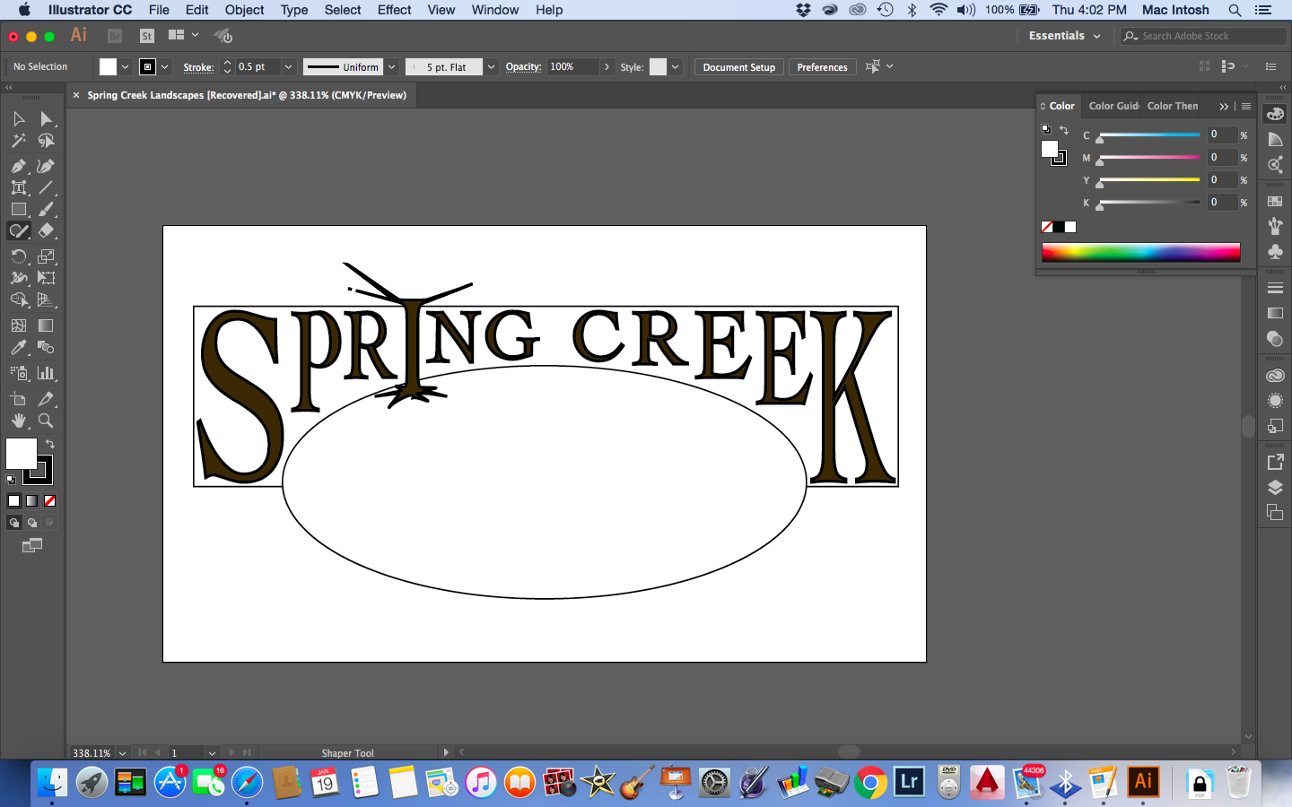
This is what I have now:

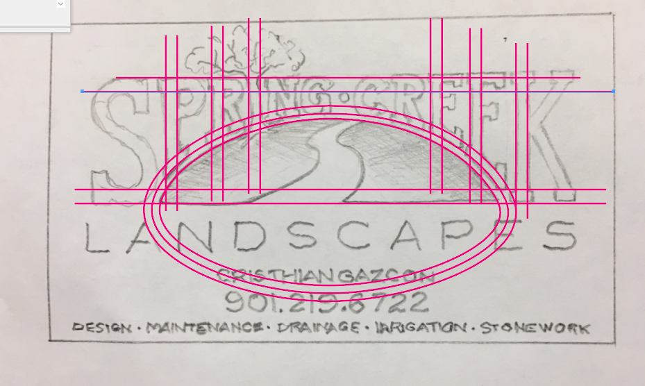
So is there a way to isolate an anchor point so I can drag down only one corner of the letters? Or can I select a few anchors to move in a group? Also, on the tree....what is the best way to make those lines more fluid and create a tree?
Copy link to clipboard
Copied
aks78 schrieb:
So is there a way to isolate an anchor point so I can drag down only one corner of the letters? Or can I select a few anchors to move in a group? Also, on the tree....what is the best way to make those lines more fluid and create a tree?
This is how you go about constructing a logo like this (image shows the principle and I havent made any efforts to draw precisely):
As for the tree: practice the pen tool. You will need it anyway.

Copy link to clipboard
Copied
aks78 wrote:
Thank you so much for the info.
This is what I have now:
So is there a way to isolate an anchor point so I can drag down only one corner of the letters? Or can I select a few anchors to move in a group? Also, on the tree....what is the best way to make those lines more fluid and create a tree?
To turn the "I" into a tree:
• If you have expanded the type, then you can move the anchor points with the direct selection tool. Multiple select with the Shift key or marquee drag.
• One way is to draw another shape on top of the I and then combine the two shapes together with the Pathfinder if you want them to be one shape.
Copy link to clipboard
Copied
How about just distorting the center text and place the S and K separately?

I see Monika already mentioned this option. It DOES keep the text editable. Although that's not really important in this case.
Copy link to clipboard
Copied
Thank you!
So can you tell me how you got to that point? How did you create an envelope?
Copy link to clipboard
Copied
I don't mean to be difficult.....but could you tell me how you went from nothing to what your screenshot shows?
Like:
option>option>option
option>option>option
etc?
THANKS!
Copy link to clipboard
Copied
Copy link to clipboard
Copied
AMAZING!!
THANK YOU SO MUCH!
less than 4 MIN  !!!
!!!
I knew it shouldn't be that difficult otherwise this program is useless....and I know it's not.
I may be back for help on something else but will accomplish this first!
You're the best, thanks!
Copy link to clipboard
Copied
Ok....
I have my text. Can you show me the shortest path to the hill/tree?
I have messed around with it for a while but I think I need to just ask you
Copy link to clipboard
Copied
I would use a similar approach to create the tree. Use the Pencil tool to create an outline of the tree trunk/limbs, convert to live paint and fill. Tweak the paths to edit the shape. There are many other ways to do this as well.
Lots to learn in Illustrator. Have fun exploring.
Copy link to clipboard
Copied
I want it to be a green gradient and I accomplished it previously somehow with mesh when I was playing around with a different document....but now for whatever reason it keeps changing it to black and white and I can't get the mesh to appear and......
Copy link to clipboard
Copied
I would not suggest using a mesh in this instance. Keep it simple by using a gradient. Here's a short video on editing a gradient.
Copy link to clipboard
Copied
I'm so sorry this is belated, but thank you so so much for taking the time
to send me all this!!! I had to take a hiatus but am back to finish. You
are Adobe Wan Kenobe .
THANK YOU!
On Wed, Jan 25, 2017 at 4:22 PM, rcraighead <forums_noreply@adobe.com>
Copy link to clipboard
Copied
 Glad it was helpful.
Copy link to clipboard
Copied
here is my current screenshot: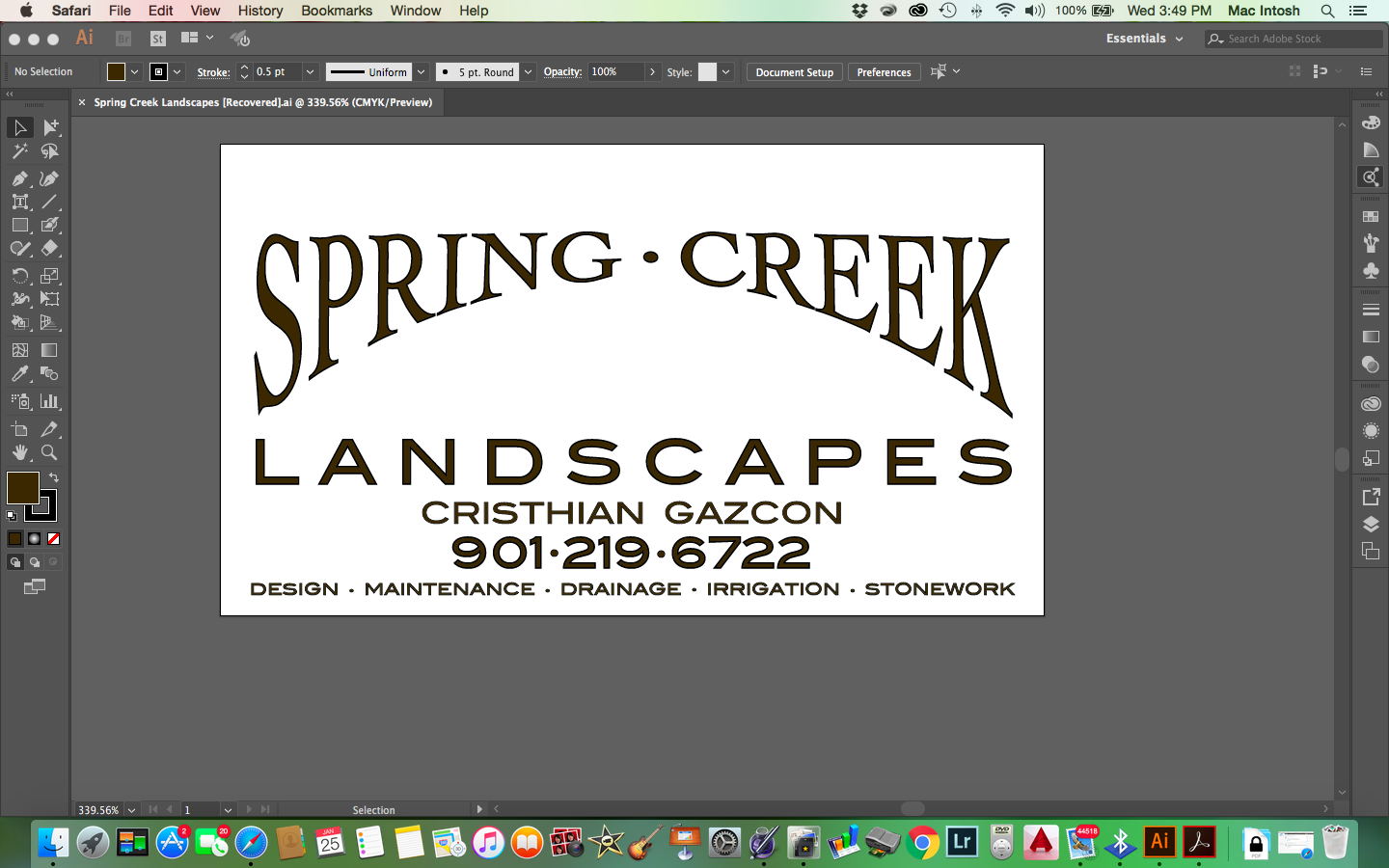

 AdChoices