• Global community
    • Language:
      • Deutsch
      • English
      • Español
      • Français
      • Português
  • 日本語コミュニティ
    Dedicated community for Japanese speakers
  • 한국 커뮤니티
    Dedicated community for Korean speakers
Exit
0

Reason to use only horizontal and vertical handles when lettering with pen

Explorer ,
Jan 06, 2021 Jan 06, 2021

Copy link to clipboard

Copied

I was watching a tutorial on how to digitize hand lettering and noticed the instructor held the shift key to create only vertical and horizontal handles on the anchor points. I noticed that other tutorials also mentioned to only create vertical and horizontal handles as well. What is the reason for this, and is there a benefit to maintaining them and not having them at other angles?

TOPICS
Draw and design

Views

726

Translate

Translate

Report

Report
Community guidelines
Be kind and respectful, give credit to the original source of content, and search for duplicates before posting. Learn more
community guidelines

correct answers 1 Correct answer

Community Expert , Jan 08, 2021 Jan 08, 2021

When it's just a stroke as in your case, it won't matter. But when the stroke has been expanded and it's a shape, then it will be a gamechanger.


This is simple


Votes

Translate

Translate
Adobe
Community Expert ,
Jan 06, 2021 Jan 06, 2021

Copy link to clipboard

Copied

That obviously depends on the context.


It is rather hard to tell anything about it without knowing the reasons for this postulation.


Can you clarify a bit ?


Votes

Translate

Translate

Report

Report
Community guidelines
Be kind and respectful, give credit to the original source of content, and search for duplicates before posting. Learn more
community guidelines
Explorer ,
Jan 06, 2021 Jan 06, 2021

Copy link to clipboard

Copied

Here's a screenshot from the tutorial I was following. I am trying to do the same thing - vectorizing a word I have written by hand using the pen tool. As you can see, the handles present are only horizontal.

Screen Shot 2021-01-06 at 2.28.45 PM.png

Votes

Translate

Translate

Report

Report
Community guidelines
Be kind and respectful, give credit to the original source of content, and search for duplicates before posting. Learn more
community guidelines
Community Expert ,
Jan 06, 2021 Jan 06, 2021

Copy link to clipboard

Copied

It makes some sense with letterings and a lot more sense when creating fonts.

The reason for fonts is a technical one. You can find reasons for that on font design apps' websites, such as: https://glyphsapp.com/learn/drawing-good-paths

http://designwithfontforge.com/en-US/Using_the_Fontforge_Drawing_Tools.html


It also has benefits for designing such as when you want to edit the weight of the line.


In some situations it is just not possible to only have vertical/horizontal handles and also I would never turn it into a religion.

Votes

Translate

Translate

Report

Report
Community guidelines
Be kind and respectful, give credit to the original source of content, and search for duplicates before posting. Learn more
community guidelines
Explorer ,
Jan 07, 2021 Jan 07, 2021

Copy link to clipboard

Copied

Ok, thanks for the info! 🙂 If you wouldn't mind explaining, how does having vertical/horizontal handles help with editing line weight? Sorry, I'm quite a newbie. Thanks!

Votes

Translate

Translate

Report

Report
Community guidelines
Be kind and respectful, give credit to the original source of content, and search for duplicates before posting. Learn more
community guidelines
Community Expert ,
Jan 08, 2021 Jan 08, 2021

Copy link to clipboard

Copied

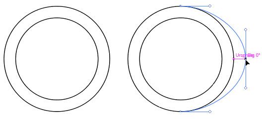
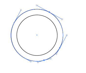
When it's just a stroke as in your case, it won't matter. But when the stroke has been expanded and it's a shape, then it will be a gamechanger.


This is simple


Votes

Translate

Translate

Report

Report
Community guidelines
Be kind and respectful, give credit to the original source of content, and search for duplicates before posting. Learn more
community guidelines
Community Expert ,
Jan 08, 2021 Jan 08, 2021

Copy link to clipboard

Copied

Adobe-Illustrator-CC-2017ScreenSnapz008.jpg

Votes

Translate

Translate

Report

Report
Community guidelines
Be kind and respectful, give credit to the original source of content, and search for duplicates before posting. Learn more
community guidelines
Community Expert ,
Jan 08, 2021 Jan 08, 2021

Copy link to clipboard

Copied

Compared to this:

Bildschirmfoto 2021-01-08 um 16.08.20.png


Sorry for the messed post, but that was my only possibility to post these images at all.

Votes

Translate

Translate

Report

Report
Community guidelines
Be kind and respectful, give credit to the original source of content, and search for duplicates before posting. Learn more
community guidelines
Explorer ,
Jan 08, 2021 Jan 08, 2021

Copy link to clipboard

Copied

Ah, I get it now. Thank you so much! 🙂

Votes

Translate

Translate

Report

Report
Community guidelines
Be kind and respectful, give credit to the original source of content, and search for duplicates before posting. Learn more
community guidelines
Community Expert ,
Jan 08, 2021 Jan 08, 2021

Copy link to clipboard

Copied

LATEST

You're welcome!

Votes

Translate

Translate

Report

Report
Community guidelines
Be kind and respectful, give credit to the original source of content, and search for duplicates before posting. Learn more
community guidelines