 Adobe Community
- Home
- Illustrator
- Discussions
- Re: Recreating Logo from a Photo in Illustrator
- Re: Recreating Logo from a Photo in Illustrator
Recreating Logo from a Photo in Illustrator

Copy link to clipboard
Copied
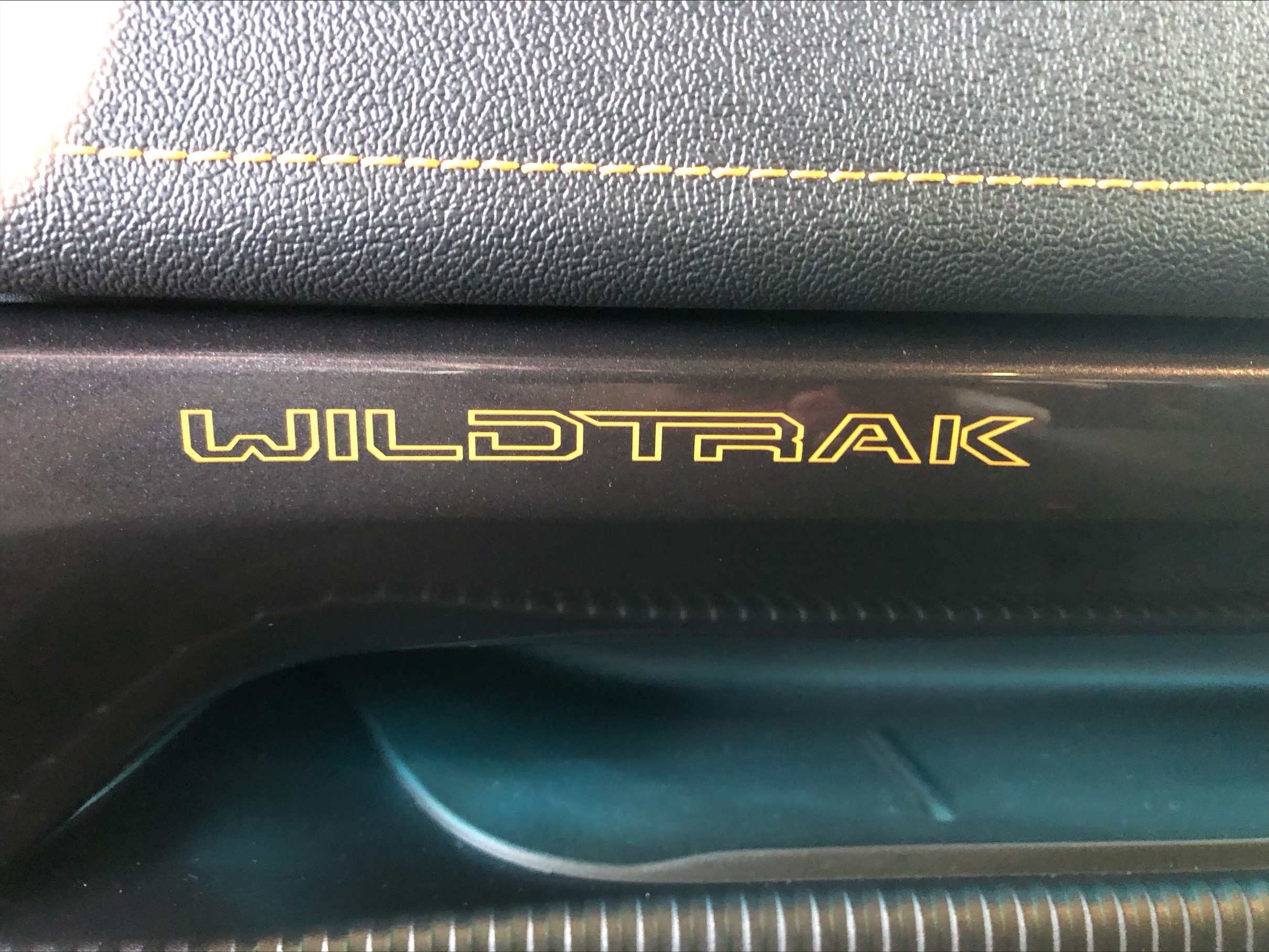
Hi,
I am needing to recreate a decal for someone and only have the attached photos to go off.
The font doesn't seem to exist and I can't find this exact logo online anywhere.
How can I make a vector of the text in this photo so that I can create new decals?
I attempted to image trace, and while it kind of worked, the text was skewed due to the angle of the photo, and the edges came out super wavy.
Any help would be great! Thanks 🙂


Explore related tutorials & articles
 14
Replies
14
14
Replies
14

Copy link to clipboard
Copied
Because wildtrak.jpg is the least distorted, I'd recommend opening it up in Photoshop to fix its distortion and then either use Image Trace on it or manually trace it.
Here's how:
In Photoshop, open wildrak.jpg
- Crop it so that it's mostly the text with a little margin around it
- Enable the Ruler (View > Ruler) so that you can drag out guides
- Drag a guide from the top to align to the top of the text and another to align to the bottom
- Drag a guide from the left to align to the left of the text and another to align to the right
- Go to Edit > Transform > Warp and move the anchor points and handles to align the text visually to the guides

Then use the result in Illustrator to use Image Trace on it (it may need some cleanup though) or use the Pen tool to manually trace it.

Copy link to clipboard
Copied
I use "Lens Correctio" in Photoshop for removing distortion, You can try it in Ps. The result is attached. Also try Match Fonts in Ps for finding similar fonts. https://youtu.be/fbBYfYyfv5c


Copy link to clipboard
Copied
I would not use image trace to recreate this. I would use one of the straightened samples posted above and use the pen tool to create a cleaner final version.

Copy link to clipboard
Copied
When it comes to vehicle branding materials if I'm in a hurry to get a particular vector-based element sometimes I'll have pretty good luck searching thru PDFs available online. Otherwise I have to get the assets thru more legit channels. Wildtrak is a type of Ford Ranger. It's possible an owner's manual PDF or vehicle brochure might have something that can be snagged.
The logo would be pretty easy to re-create though. I would do it by locking a straight enough image on one layer and then building geometric objects over the top of it. I wouldn't simply trace it by hand using the pen tool. For technical looking logos it is very critical for line work to be straight and consistent. Anything crooked or off axis will be noticeable.
Copy link to clipboard
Copied
No reason creating by hand would make this crooked if done correctly. Building geometric shapes then combining with pathfinder seems more complicated.
Copy link to clipboard
Copied
Using geometric shapes will do more to keep things like letter stroke widths consistent and various parts of letters properly aligned.
Copy link to clipboard
Copied
If you use geometric shapes to recreate the letters, then I would recommend using the Shape Builder tool to help combine and/or remove shapes:

Copy link to clipboard
Copied
Not the same, but an older version:
or:
https://www.brandsoftheworld.com/logo/ford-wildtrack
You may find what you are looking for with a longer search.
Copy link to clipboard
Copied
I'm personally not a fan of the Brands of the World web site. While the site may have some authentic corporate artwork a bunch of the stuff that is uploaded there is fanboy re-creations (some of it decent, some of it pretty horrid). I usually have better luck scouring corporate PDFs and harvesting logos from them. And even that approach has its pitfalls. Ultimately the best approach is getting the company to provide its vector art along with color specifications and use guidelines.
Copy link to clipboard
Copied
Much more important than the way you reproduce the logo would be a photo in direct top view. Otherwise you will definitely get a distorted result in height and width - no matter how well you straighten the crooked pictures by "eye".
And please remember that logos are usually protected.

Copy link to clipboard
Copied
My Google search revealed that Wildtrak logo has been updated.
Question, do you need to recreate that logo in vector or just in need of buying a 2023 sticker?
Found a site to purchase that updated logo sticker.
K

Copy link to clipboard
Copied
Copy link to clipboard
Copied
Hi @Swapnil5EFA
… and your question ist?

Copy link to clipboard
Copied
@Swapnil5EFA schrieb:
RE CREATED THIS LOGO
So you have trouble doing it? Which part of that gives you issues?
Please create a new thread.

 AdChoices