Copy link to clipboard
Copied
Hello community,
I am looking for some guidance about type/font and its weight when being resized.
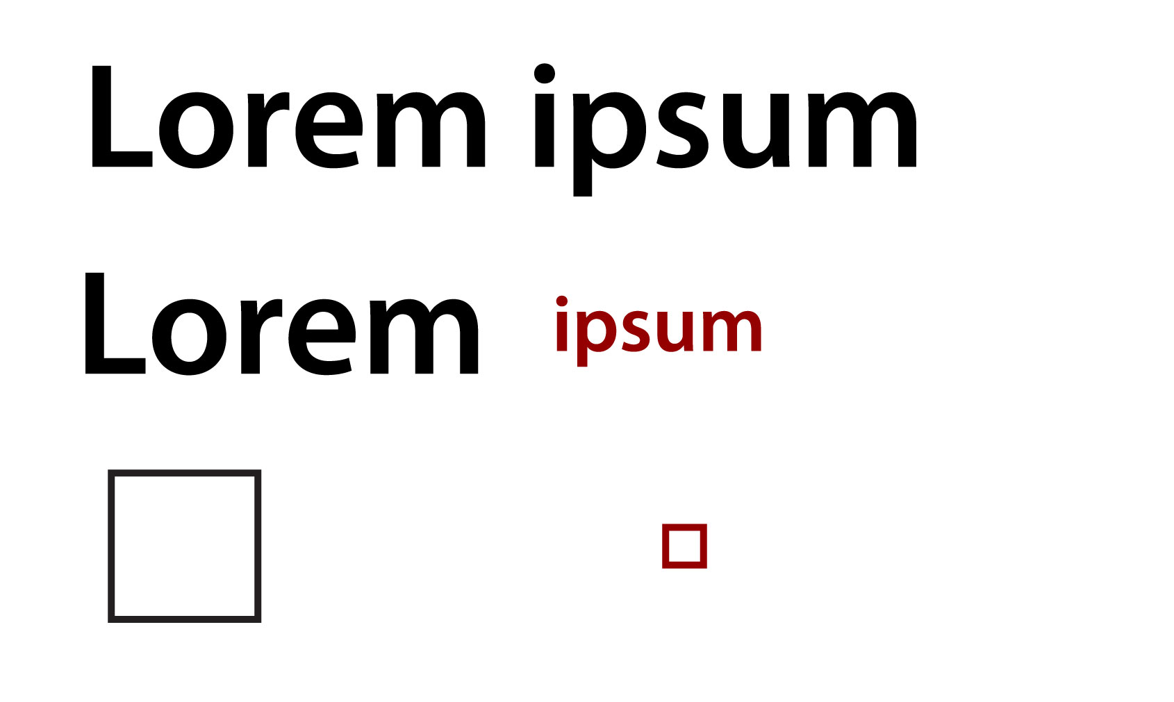
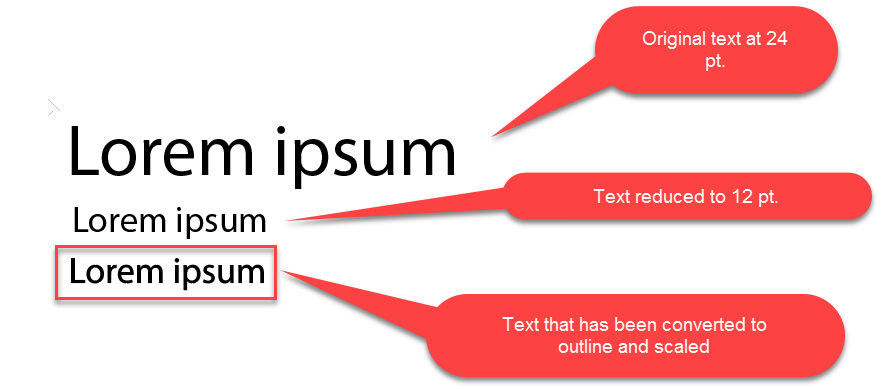
As you will see in my attached mock, I would like to decrease the font size but keep the same weight of the type, much similar to when resizing a stroke.
The stroke keep its weight regardless of the size of the rectangle but the type changes its weight.
Help much appreciated.
Copy link to clipboard
Copied
When you reduce type size, the letterforms get thinner. To increase the thickness, here are two options:
Copy link to clipboard
Copied
Hi Dan
Thank you for the advise although I was looking for more accurate solution, hence my query. If possible I would like the "convert" the type so I can resize in the same way as strokes.
Thanks
Mikael
Copy link to clipboard
Copied
You probably can't do what you like.
At least the type will look very awkward after just making it thicker.
Use a different font.
Copy link to clipboard
Copied
As you don't like Dan Rodney​​ solution...The only other solution I can see that could work for you, depending on the end goal, would be to convert your text to outlines...
The downside of this is that your text is no longer "text" it is essentially a closed path shape...
However as you can see it keeps a much more accurate thickness as per the screenshot below:
Copy link to clipboard
Copied
Outlined text usually is a little thicker, because it gets rendered differently.
But you can't judge from a monitor how much thicker it will be rendered. This might be different, depending on the device and its resolution.
Copy link to clipboard
Copied
Good points Monika to be aware of... thanks!
Copy link to clipboard
Copied
Thanks guys!!
Its not that I dont like Dan solution. I just wanted to explore if there was any other options than outline/stroke or heavier font weight.
cheers
Mikael
Find more inspiration, events, and resources on the new Adobe Community
Explore Now