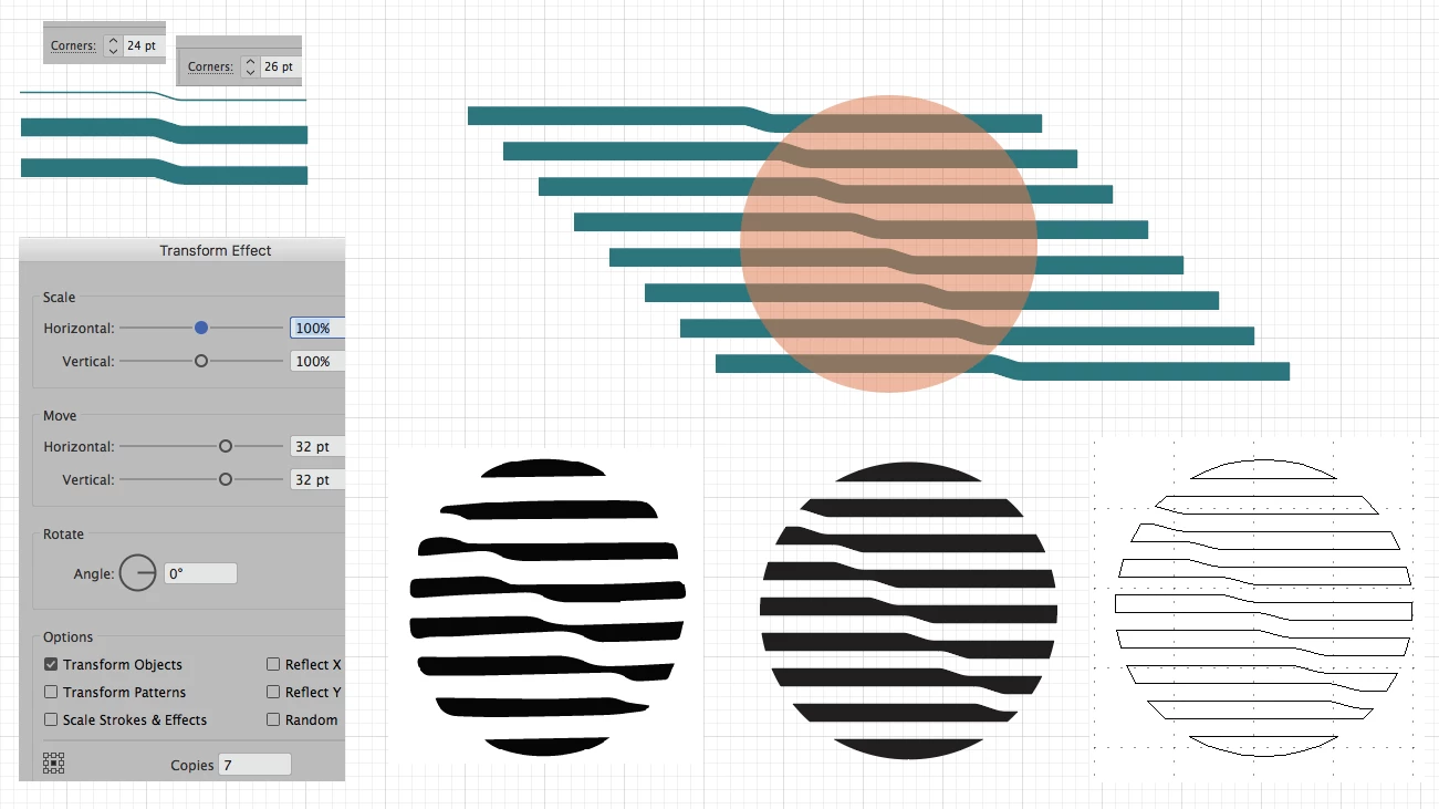
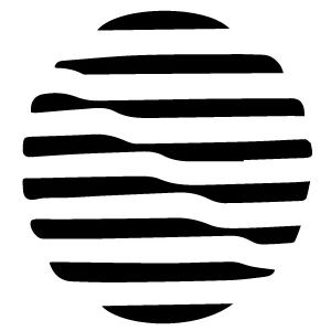
Copy link to clipboard
Copied
I would like to recreate this logo idea in Illustrator to have a play with it, get better symmetry and rigid lines:
My best idea was to recreate it manually. Meaning I create first a black circle. Then I create white "S" shaped lines and copy-paste them and align them along a diagonal.
Is there a better way to create this? A distortion filter along the diagonal or something similar?
This way it could ensure symmetry (which takes a lot of planning ahead to in terms of angles, line thickness, aligning along a diagonal etc.) and be a bit more flexible with trying to create different versions (i.e. angles, number of lines, etc.).
Thank you!
Here is how I would recreate that pattern.
Pen Tool, draw your S shape.
The two anchors in the center, I assigned a corner radius.
Then I gave the stroke a 16pt weight.
Expand, now working with a Fill shape.
Next, Effect>Transform Effect.
Expand Transform.
Then Live Paint with a circle.
At the end, you have a nice tidy clean logo design.
K
Copy link to clipboard
Copied
This is a very interesting, and somewhat organic shape. It almost looks like it was captured on a phone and digitized in Adobe Capture.
You could do some Envelope Distort with Grid on the center area. I would probably first just make the internal guts of the lines the way I want. Then afterward, use a circle to mask it out. Notice the rounded corners on all the shapes? After you mask it, expand the whole thing and then round the corners with shape properties.
Copy link to clipboard
Copied
I would use the 'warp' tool. This is just a series of white rectangles over a black circle. Lock the circle, select all and run the 'warp' tool through. Play around with size and fidelity.
Copy link to clipboard
Copied
Hey!
Warp gave a couple of nice ideas for me to play with, but not my original design. The lines end up on the same height left as right.
The envelope distort was a great idea! Though I still didn't get the desired result, it got me very close. Unless something closer comes up I'll mark it as the correct answer.
So far I stuck to copy paste and skewing. I'll make the "s" shape smoother, and play with the angles, but I think this might get me there.
Thanks for the suggestions!
Copy link to clipboard
Copied
Here is how I would recreate that pattern.
Pen Tool, draw your S shape.
The two anchors in the center, I assigned a corner radius.
Then I gave the stroke a 16pt weight.
Expand, now working with a Fill shape.
Next, Effect>Transform Effect.
Expand Transform.
Then Live Paint with a circle.
At the end, you have a nice tidy clean logo design.
K
Copy link to clipboard
Copied
Very nice! Thank you!
Copy link to clipboard
Copied
Glad I could help.
K
Find more inspiration, events, and resources on the new Adobe Community
Explore Now