Scatter Plot Graph Help
I'm trying to create a Scatter-Plot Graph, and I'm having a devil of a time.
I need to plot data over time (X-axis). Some of the data-points overlap (are on the same date), but have different values (Y-axis). I absolutely cannot for the life of me, figure out how to use the Scatter-Plot tool, and the documentation is slim to almost non-existent.
I've created one Scatter-Plot Graph the old fashioned way: I just drew it.
The comma-delineated data is shown below the image: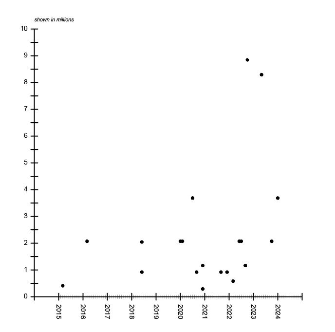
3/2015, 407040
3/2016, 2073600
6/2018, 921600
6/2018, 2073600
1/2020, 2073600
2/2020, 2073600
7/2020, 3686400
9/2020, 921600
12/2020, 1166400
12/2020, 291600
9/2021, 921600
12/2021, 921600
3/2022, 583200
6/2022, 2073600
7/2022, 2073600
9/2022, 1166400
10/2022, 8847360
5/2023, 8294400
10/2023, 2073600
1/2024, 3686400
I need to make dozens of these. I cannot draw each one this way. Any assistance on how to create this kind of graph using the graph tool is appreciated, thank you.