- Home
- Illustrator
- Discussions
- Re: Seeking Designer Opinions on New Photography L...
- Re: Seeking Designer Opinions on New Photography L...
Seeking Designer Opinions on New Photography Logo
Copy link to clipboard
Copied
Good afternoon designers ![]()
I've been in the process of redesigning my photography business, starting with the logo. Here is my old logo/website that I threw together 3+ years ago when I first started (blegh):
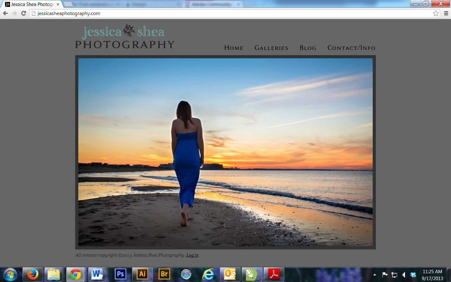
And this is what I've come to after months of messing around with fonts and designs. The plumeria is my favorite flower, and coral my favorite color, so I used it as an icon to represent my brand. My new site design will be much simpler, lighter, brighter, and modern.
I've included a clean version and a version with guidelines that I was using to show spacing areas of concern (between the text and flower, amount of space left on either side of the "Photography."

Now with guidelines:
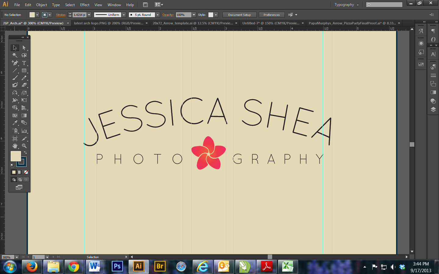
I tend to go with what's visually accurate instead of what's technically accurate, but I feel like every time I make things perfectly aligned, it just looks off once those guides are gone. So I'm curious to see what you all think. Logos are supposed to be darn near perfect, but are there exceptions to that?
I've been staring at this for far too long and now I need outside opinions on it. Not necessarily major changes, just tweaks. I'm really looking to fine tune it, and since my name is uneven, it does look a bit uncentered. Does that bother anyone? Also, I'm debating on keeping 'Photography' narrower than 'Jessica Shea,' as I did try making it the same width of my name but it looked a bit funky since the hook of the J comes out further than the top of it, if that makes sense. Also, since I divided "PHOTO" and "GRAPHY" which aren't the same amount of letters long, I want to make sure they look evenly spaced despite it technically being unbalanced. I'm using Quicksand as the font if anyone's curious.
In summary, I'm looking for opinions on overall design, spacing and balance, and sizing (ex, size of the text, flower, etc).
Thanks in advance for any input!
~Jess
Explore related tutorials & articles
Copy link to clipboard
Copied
Just wondering, you explained the logo aspect in the logomark, but did you mean for the flower to look excatly like a camera shutter? Very smart, considering it's for photography.
Aside, the fact that your first and last name aren't the same length doesn't bother me, and "photography" looks pretty evenly spaced, even though they're not even either. Nice job, I'd say.
Copy link to clipboard
Copied
G. Fether,
Yes, that was intended to be subtle ![]() I'm glad you picked up on it! I feel like the whole aperture thing is so overdone with a lot of photography logos because it's so in your face.
I'm glad you picked up on it! I feel like the whole aperture thing is so overdone with a lot of photography logos because it's so in your face.
That being said, thank you for the feedback. I'm curious to see if others agree with you!
Copy link to clipboard
Copied
"photo" "graphy" looks bad enough when split. changing the spacing makes "graphy" look small in comparison to "photo" and once you notice it, it is all you'll notice.
i would find a different composition that doesnt split up the word.
this is not as big of a deal but the Ss is "jessica" could be rotated CCW just a bit.
Copy link to clipboard
Copied
Jessica,
I was also reminded of the shutter when I first saw the flower, in the other thread.
There are a few issues with the positions and directions of some of the letters, not least the HEA.
I would suggest your trying out the option of using Path Type with possible elaboration, which may include kerning and more. That will place the letters with a common curved baseline, presumably a segment of a circle and ythereby take care of the basic appearance.
There may be different considerations about division/non division of PHOTOGRAPHY and effects on the appearance, and vertical alignment of the flower.
It may be too silly, but you may consider an eyelike appearance with PHOTOGRAPHY as Path Type meeting your name and the flower shutter in the middle.
You may also consider whether the letters are too thin for small size in connexion with letterhead, business card, etc.
Copy link to clipboard
Copied
Jacob,
Thank you for your in-depth response. I had considered the eye-like shape, but I'm overall not a fan of it and the excessive negative space it then creates.
What I had actually done to creat the text path for Jessica Shea was draw an elongated ellipse and used the Type on a Path tool, starting from the center and working across the ellipse. Is this technique not what you meant? I'm wondering why it still looks off, then (the HEA). How would you recommend fixing this? I think it's probably the biggest issue.
Copy link to clipboard
Copied
Jessica,
Is this technique not what you meant?
The very same. There may be something strange about the font. What is the look of it when just typing?
You may use some of the tools in the Character palette, such as the Baseline Shift (you can select the A with the (Path) Type Tool and move it down by setting a negative value and/or move the E up) and Kerning (you may set the cursor between the H and E and move them closer to each other by setting a negative value), and you can go through the whole set and make adjustments.
There seem to be two incompatible sets of letters, each with consistent directions, the A in the middle fitting into either: the J.....A...A seem to fit a more curved baseline, and the .ESSICASHE. seem to fit a less curved one.

Copy link to clipboard
Copied
You're very close to establishing your own identity. The flower is very powerful. However, you are relying too much on the typeface and, my concern is, it is a bit on the light side. When I think of a logo, I ask my self...Can this be duplicated in 5 minutes? By anyone? Yours falls into this category. As a handlettering artist, I try to create my own typeface and for you it would be a snap. I saw your other post where you asked if type could be flat on top and arched on the bottom. You were on the right track. My recommendation is find someone who can achieve something similar ( i.e., original, hand lettered typeface logo ). Try an approach using a thin serif font for "JESSICA SHEA" and a sans serif semi-bold font for "PHOTOGRAPHY". I will followup with a sketch to help communicate what I am thinking which may help you along. I simply do not have time right now. Stay tuned.
Copy link to clipboard
Copied
John,
You make a very valid point. I am relatively new to the design world, and by no means do I consider myself a pro. I just simply don't have the funding to pay one to design my logo, as much as I would love to hand it off to a more capable person and pay them what they deserve. Not to diminish your input, but I feel like I've come this far, and anything is better than my current logo!
I would very much apprecaite any visual aids you could provide to help me along with my logo. I'm constantly drawn to these thin fonts, prior to this design I had used Code Light and tweaked it a bit:
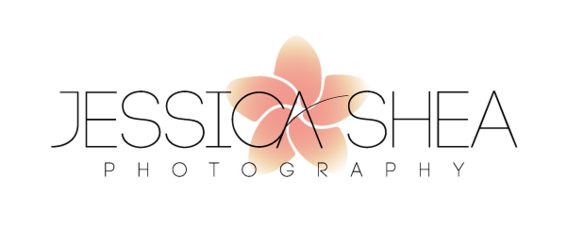
but I've had an even harder time with that^^ one because the flower was somewhat transparent, and I'm just not 100% in love with it. I LOVE the color scheme I have going with the deeper coral flower and tan bg as seen in the original post. I really want something more modern, something that obviously says professional but is true to me. This post on Behance was very inspirational to me:
http://www.behance.net/gallery/Vintage-LogoInsignia-Collection-2/8997889
I'm not a wedding photographer, so I don't want cutesy. More magazine. Something that will stand the test of time, and as much as I LOVE these retro logos I'm seeing right now I don't know if that's appropriate or relevant for my business. Anyway, I digress.
It's funny you say to use a serif font, I always thought that wasn't preferable when it comes to a logo?
Thank you again for your time and effort.
Copy link to clipboard
Copied
Jessica,
Referring back to your other thread,
http://forums.adobe.com/message/5674096#5674096
a shaping of the bottom part of the name (and possibly of the top of the P word) could be made in quite different ways, other than just an arc; the way(s) referred to in its post #3 gives full freedom to create customized shapes forming frames to the shutter/flower with as much or little negative space as you wish. And that would certainly move it beyond quick duplication.
Copy link to clipboard
Copied
Jacob,
I think I see what you mean. At this point, I wouldn't feel comfortable customizing the type, nor would I even feel confident it how to shape it to make it more unique. I also feel as though a lot of the logos that I love, as listed in the link right above your post, would also fall under that "could be duplicated in less than 5 minutes" design. Either this is because it's just that well done, or it's supposed to be that simple.
I understand that what I have now needs to be more unique, and for the most part that's why I wanted advice. I'm approaching getting burnt out on my own logo!
I've played around with the placement of the flower, and I'm not hating putting it in the middle above PHOTOGRAPHY (used the same font for now...that seems like a whole other feat). I also added a stroke around the text. 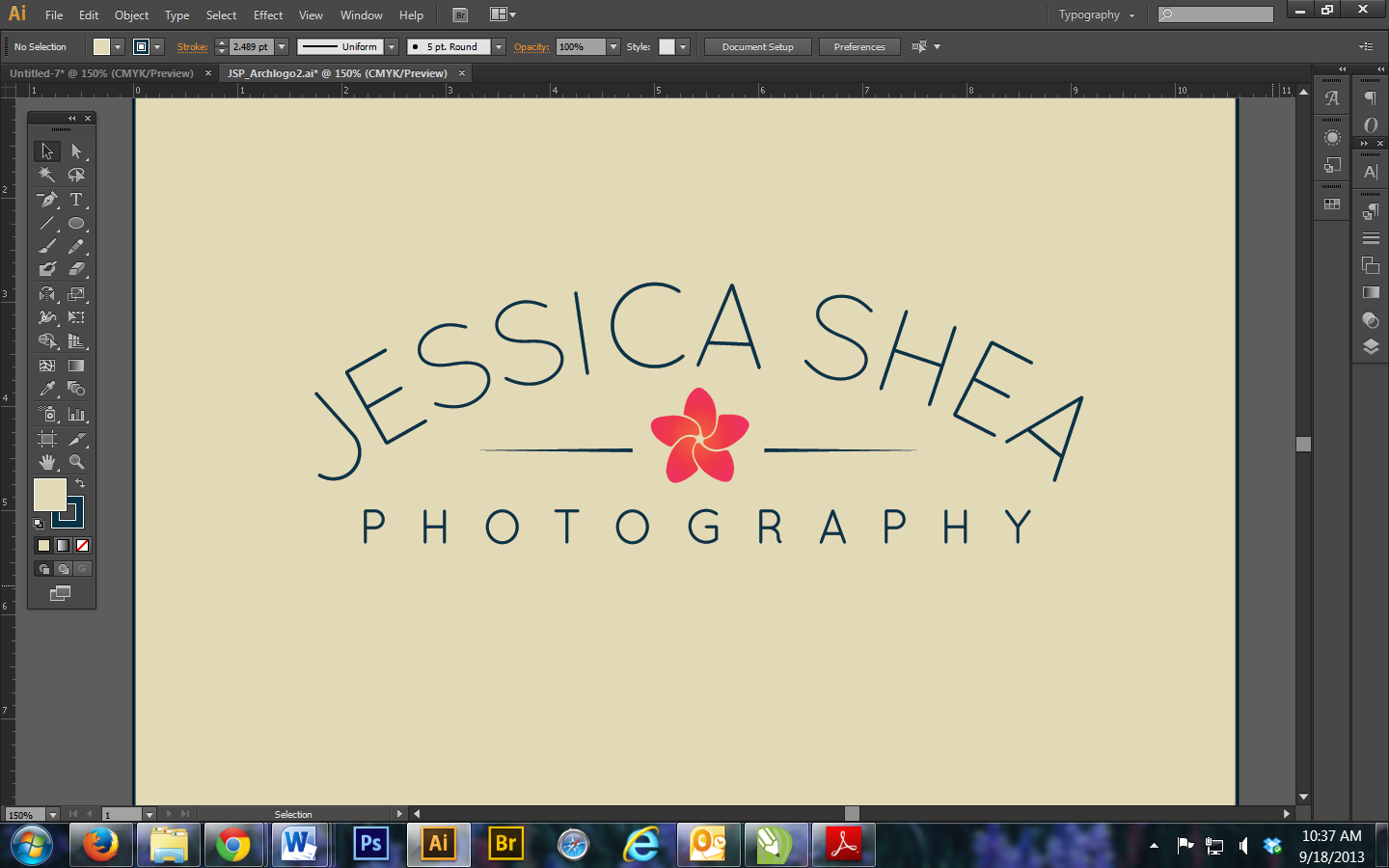
Any font suggestions are welcome, since Quicksand clearly doesn't like to form to an ellipse very well. But man do I love it! What are your thoughts on using a thin serif font in a logo, as John was mentioning?
Believe it or not, all of your feedback is truly helping. I do wish I were better at this, but I'm still learning ![]()
~Jessica
Copy link to clipboard
Copied
The simplicity of this doesn't bother me. I think the layouts you've chosen (first post and most recent) are interesting and different layouts. It's nice to see something other than logo on the left, wordmark to the right- justified left, rag right.
I also think the thinness of the font is appropriate. It's delicate and clean. You could absolutely look for something a bit meatier, and/or with a serif, but I think you're in the right direction with what you've chosen. I wouldn't go with anything too heavy or too big a slab serif, ect.
Also, this layout, with your name arched only is (I find) much more successful than the previous attempt with the straightened top and curved bottom.
I'm not sure the stokes on either side of the flower are necessary, but that's just me.
Copy link to clipboard
Copied
Thanks for the feedback, G. Fether. I agree with what you said about the font being clean. That was my purpose, I want less clutter and more simplicity this time around.
In regards to the lines beside the flower, their purpose was mainly to fill the negative space. I know I keep referring to the link above, the whole three part series:
(http://www.behance.net/gallery/Vintage-LogoInsignia-Collection-3/9365955
but, when are lines and dots etc. really needed? I always felt like they were for added detail/decoration, to tie it all together. But that, too, is just my opinion.

Copy link to clipboard
Copied
Jessica, don't feel bad about where you are right now. That's actually pretty normal ( i.e., burn-out ). Sometimes it pays to take a step back, perhaps going to a local bookstore and glancing through some logo design books and photographer branding guides ( if you can find any ). Here's what I was thinking...
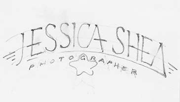
...and, the more I think about it, the flower would look great somehow nested within your name and "PHOTOGRAPHY BY" could be placed above your name following the arch. I wonder if the ip of your flower could be inserted into the bottom of the "A" in your first name. It's a matter of a cross between a symbol and typographical logo. The latest screen shot with the flower "inside" the arch is a step forward. The font style in my sketch might be found in a font, but may have to be hand lettered. This would solve your "unique" problem. I also think that you could create a symbol using the flower and your initials "J" and "S". Your full name could be implemented in your stationery where appropriate. Just food for thought. I encourage you to continue thinking and exploring. When you "hit" on what you are looking for, you will know and won't need us anymore. Good luck. Believe it or not, this is the fun part.
Copy link to clipboard
Copied
Thanks so much for putting all that time and effort into my logo, John!
I've actually been at this for about 6 months now, because of all the time I've had to take to step away from it. I've done a lot of research on typography, fonts, logos and design in general, and I feel as though I've narrowed it down to this. Trouble is, a lot of what I like and am inspired by are often one word companies and don't help me at all with my brand, haha.
And I agree, I've been endlessly trying to figure out a way to combine JSP with the flower for a true symbol of my brand. I'm loving the flower encircled like this, but how to incorporate the letters is where I always get stuck:

My only hesitation with using "Photography by" is that people might then google it that way, when my business name is "Jessica Shea Photography."
So with your sketch, you're thinking of arching both Jessica Shea and Photography? And what you drew almost looks like the font Znikomit ![]() I really like how the HE are combined in Shea.
I really like how the HE are combined in Shea.
I'm just so anxious to get my new brand going...and I obviously can't move forward on designing a website fully until I get the darn logo set! I have no business cards, a crappy old website, and am currently shooting for my new brand/look. That makes it really hard to deliver product, too, with an online proofing gallery and watermarks, etc.
Anyway, thanks again!
Copy link to clipboard
Copied
Jessica,
I also like the version in post #10.
There are a few ways to get the individual letters into place, so there is no need to leave your Quicksand font. You may choose between some calculation (and rely on the ability of the font to behave when it clearly misbehaves in the obvious easysolution that should have worked) and some more intricate drawing.
In any case, it would be useful to see how the lettering behaves when you just type the JSP (straight).
You may use the circle version in post #14, which I also like, as the actual logo, with the JSP underneath, or, depending on how heavy a circle you can stand, you may consider the JSP as negative space in it; the latter may present an even greater challenge in getting the lettering clear and visible, especially in connexion with small size use, as mentioned in post #4; the challenge consists of actual size and, depending on colours or rather inks, in getting a clear shape (a rather short version: if you have more than one ink (solid colour), especially normal screening will leave you with dots that will blur the edges, stochastic screening (FM) will be better, but you cannot rely on using it for all purposes).
By the way, the clearness may also present a challenge in the versions shown so far because the lettering seems to be non solid colour/ink.
Copy link to clipboard
Copied
Jacob,
Do you mean because the flower has a gradient that it won't print well? I'm afraid I don't completely understand your advice with the colors.
JSP by itself looks like this (just threw the flower in there for fun):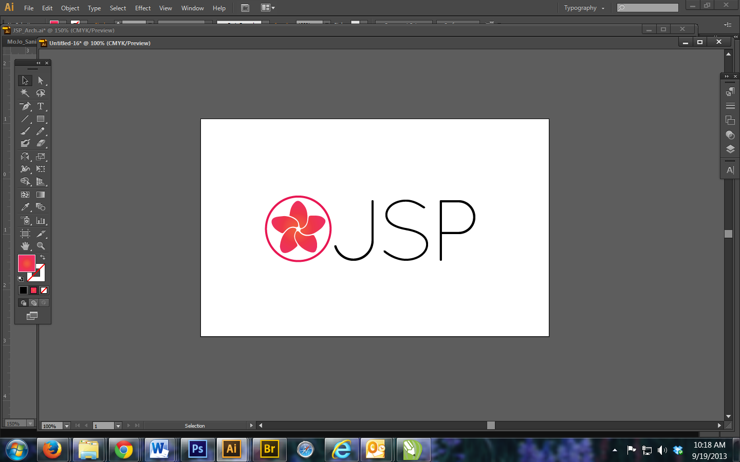
Copy link to clipboard
Copied
Jessica,
I meant the Jeccica Shea and photography written out with the Type Tool so it just has a horizontal baseline, to see how the letters behave under such circumstances.
My suggesting your using the encircled flower/shutter as the actual logo would mean that it could be used by itself, and with the JSP (and other stuff) added when appropriate, just like any other non letter logo, some of which are among the most powerful. I believe that was also what John meant in the corresponding part of post #17.
The colour/ink babble was about the fundamental difference between a solid (100%) colour and a non solid colour, the latter with or without colour transition.
The former may be printed at a far higher resolution (spots) than the latter which normally relies on halftones (dots), and which may distubingly blurred and even effaced in places.
Imagine a very fine line made up by a pattern of dots, or as negative space, a very fine line made up of spaces between dots, which have spaces between them.
You may have a quick read here:
http://en.wikipedia.org/wiki/Halftone
http://en.wikipedia.org/wiki/Stochastic_screening
That far high resolution is one of the advantages of using spot colours rather than CMYK blends for exquisite prints.
Copy link to clipboard
Copied
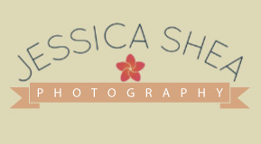
Like Fether, so far I like most the one in post #10 except the lines, although it could feel a little bit empty without them. If you have to put something and you want to go more vintage style I would try something more curvy. Along with the shutter flower it could remind of the top side of a wooden ornaments frame.
Jshea22 wrote:
John,
... I really want something more modern, something that obviously says professional but is true to me. This post on Behance was very inspirational to me:http://www.behance.net/gallery/Vintage-LogoInsignia-Collection-2/89978 89
...
Its vintage style inspired logos used in a modern context which appears to be appealing to a lot of people. If you want to go in that direction you can try something like this.

Copy link to clipboard
Copied
Jessica, I am sorry for recommending you do more research. I should have realized that you have done your share already. I like the flower symbol with the circle around it. It works as your symbol. Simple and easy to identify. On the other sample where you have some space being used for lines, think about some type of flourish artwork instead of the lines, althought the lines aren't bad either. I like that version because all of the elements are somewhat encapsulated.
Copy link to clipboard
Copied
John,
I'm happy to hear you like the flower symbol. I do too, but I feel that it by itself is not strong enough to represent my brand. I have tried on more than one occasion to combine the JSP in a unique way, but I'm not at all skilled enough to do it and have it look professional. The J and P are perfectly curved to fit into the swoops of an S, if done correctly.
Here are some sketches of what I mean:
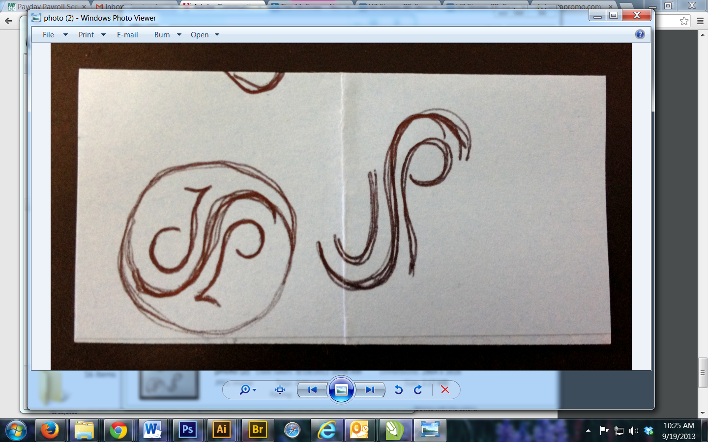
But it quickly looks like a ying yang if I put a circle around it, which I'm not a fan of. The left one works both right side up and upside down, but is more in your realm of custom type. I'd love your input on that, to see what you think and if it would even work. I had given up on it since I couldn't make it work digitally, not to mention incorporating it with my flower symbol.

Copy link to clipboard
Copied
Jessica, I've been fooling around a bit...
for some reason I cannot post 2 PNG files to show you. Perhaps if you start a new thread in the Adobe Community > Design forums > Design" forum, I will be able to attach them there. I've taken the flower symbol and did two versions that could give you some ideas.
Copy link to clipboard
Copied
John,
I sent you a PM with my email, feel free to send your ideas there! I can't wait to see what you came up with.
(Thanks, Jacob ![]() )
)

Copy link to clipboard
Copied
Jessica,
I'm lost with any forum options. I sent you a message to your web site contact e-mail.
Copy link to clipboard
Copied
Jessica,
You may wish to delete your email address as soon as possible, to avoid/reduce spam.
I have avoided replying to your latest post to avoid locking it.
Usually, the best way for such information is to (announce and) send a Private Message. You can just click the intended receiver and click Send Private Message under Actions (top right).
It is better to keep everything else in the thread so eveyone can contribute, and learn.
-
- 1
- 2
