- Home
- Illustrator
- Discussions
- Re: Spot Color Monotone linked images from Photosh...
- Re: Spot Color Monotone linked images from Photosh...
Copy link to clipboard
Copied
Ok, let me try to articulate this to the best of my ability. I am creating spot color background textures in photoshop using Pantone Color Bridge Spot Color (Pantone CP). When I choose the spot color in the photoshop monotone window, I can see that the CMYK color values match the values shown in my Pantone Color Bridge book. When this image is placed as a link in Illustrator and the spot color swatch is added to my swatch palette it is using the LAB value not the CMYK value. I need Illustrator to recognize and preserve the CMYK values not the LAB values as these two numbers are different. The end result is the RIP unit for our digital press is not printing the image accurately because the CMYK values of the background are being shifted somehow. Please respond with any advice how to reconcile this difference. It is important that the press operator not have to change/edit spot colors in the RIP.
See attached images below.
Photoshop creating monotone image:
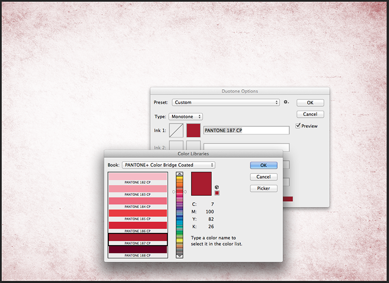
Monotone image placed in photoshop as a link, spot color is recognized:
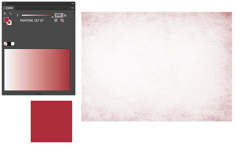
When I click to convert spot color to CMYK (just to check values) values are not the same as in first image.
This is the CMYK values that my RIP is also seeing, where the values should be 7, 100, 82, 26.
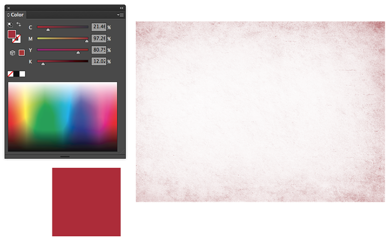
Any help is greatly appreciated, thanks all!!
 1 Correct answer
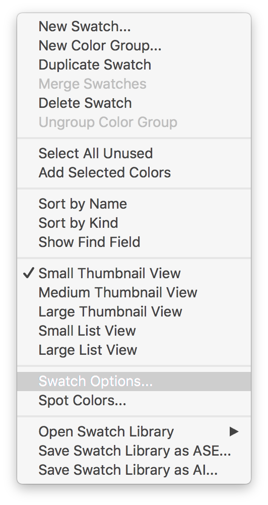
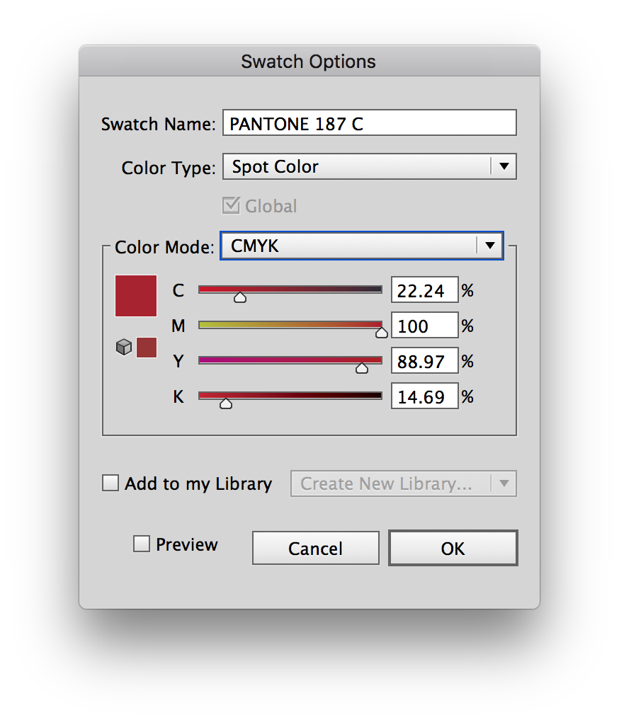
1. Select the color swatch in the swatch pallette
2. Swatch panel drop down menu (top right corner)
3. Swatch options
4. Change color mode from LAB to CMYK
5. Set CMYK values to desired values.
Explore related tutorials & articles
Copy link to clipboard
Copied
If your final intent is to do spot color separations, does not matter what the CMYK values are as that will use the spot ink when printing, expect for before you go to final and are printing for example color laser prints. If you do not like the LAB values edit the swatch in Illustrator.
If you have more questions you need to let us know exactly what inks/plates this job is printing to, and if indeed you are doing spot colors, or using spot colors for global colors for CMYK printing. Even if you are printing to a large format Hi-Fi color, you need not worry about what the CMYK breakdowns are.
Copy link to clipboard
Copied
Make a copy of the spot color image file in PS > covert to CMYK ( Image > Mode > CMYK ); save using a different name > place the CMYK file in Illustrator ( instead of the spot color file ).
Copy link to clipboard
Copied
1. Select the color swatch in the swatch pallette
2. Swatch panel drop down menu (top right corner)
3. Swatch options
4. Change color mode from LAB to CMYK
5. Set CMYK values to desired values.


Copy link to clipboard
Copied
Thanks so much!! I haven't tested this through the RIP unit yet but I believe this should be the fix. Thanks again!!
Copy link to clipboard
Copied
Just be sure that the colour name matches the colour name in your link file so that it sees it as the same colour separation in your RIP software.
Copy link to clipboard
Copied
PS - Glad I could help!
Copy link to clipboard
Copied
FYI, This was Adobe's response:
"Jason, I would like to inform you that this is expected behavior of the software. if you will create a image in PS and place in AI, then you will get different CMYK values"
I have a hard time believing that this is a desired or intended outcome. I would expect the color to be the exact same, especially considering that the linked file is a .psd Adobe native file!!
If that is the case, why does photoshop show the accurate values in the monotone image as shown in the first image of my post…?
I don't buy that response.
Again thanks for the tip, now I have to spend days sifting through flexo plate files and shifting colors to the accurate bridge values. ![]()
Copy link to clipboard
Copied
First add the swatch to the Swatches panel and then Link the Monotone file when placing.
This will merge the swatches and keep the original values.
If you do add the swatch to the Swatches panel and then place the Monotone file embedded, I get very weird results in the preview and a corrupted file that cannot finish previewing when switching between previews.
But why bother to make a monotone in Photoshop when you can just add color (or a Pantone swatch) to it in Illustrator?
And why convert a Pantone color to CMYK when you can just use a CMYK swatch in Illustrator?
Copy link to clipboard
Copied
Hi Ton and thanks for the response. The first part of your answer is correct and I get the expected result.
You will have to explain to me how to "add color" to a linked image in Illustrator. I have never been able to change the color of a linked file by clicking a swatch in Illustrator. We do not embed images in our files because most of the time these files are used to make printing plates and we do not get the same results with an embedded image. We seem to lose some resolution and details in the screened areas of the plates.
To your second point:
The reason to "bother" with Pantone color is that I work for a professional printing company who takes brand integrity very seriously. The customer has specified exact colors to be used in conjunction with their brand. The RIP software that outputs to our high speed digital press has Pantone matching/color management and needs to recognize the "Spot" color to output the color accurately through the media profile.
Alternately, if this were to be printed on our flexo presses, the operator would have to mount 4 plates and pour four inks (CMYK) as opposed to just one station if the color is a spot color background, not including the rest of the colors in the art. That wastes valuable production time in the make ready phase of the job. Then back to the brand integrity. It is very hard to achieve consistency and repeatability when printing a 4 color process image that is supposed to represent and exact Pantone color.
Copy link to clipboard
Copied
Hi Jason,
if you place a linked grayscale psd ot tiff file in Illustrator you can colorize it by clicking or dragging the swatch from the swatches panel.
Because you used the Pantone Color Bridge as an example (which gives a process color simulation) I supposed that you used the cmyk values.
Copy link to clipboard
Copied
Ton - I LOVE you!
You've just saved me from pulling my hair out - I've been trying (and failing miserably) for two days to save an image as DCS spot colour in Photoshop for importing into Illustrator for a single colour print job!!!
"if you place a linked grayscale psd ot tiff file in Illustrator you can colorize it by clicking or dragging the swatch from the swatches panel."
So simple, I did it in two minutes flat!
Thank you, thank you, thank you......x
Copy link to clipboard
Copied
Good to hear that worked for you.
You could have done it in Photoshop by choosing Duotone and make a Monotone with a single Pantone color.
Doing it in Illustrator saves a step (but does not give you the curve control that you have in Photoshop).
Copy link to clipboard
Copied
Yes, I did try that many times, but the colour looked different from Illustrator's Pantone colour when output to PDF...
Copy link to clipboard
Copied
I see that too, but it should print correctly according to Acrobat's Output Preview an Illustrator's Separation Preview.
Find more inspiration, events, and resources on the new Adobe Community
Explore Now
