Inspiring
February 13, 2019
Answered

Type doesn't look perfect in web graphics

  • February 13, 2019
  • 3 replies
  • 1006 views

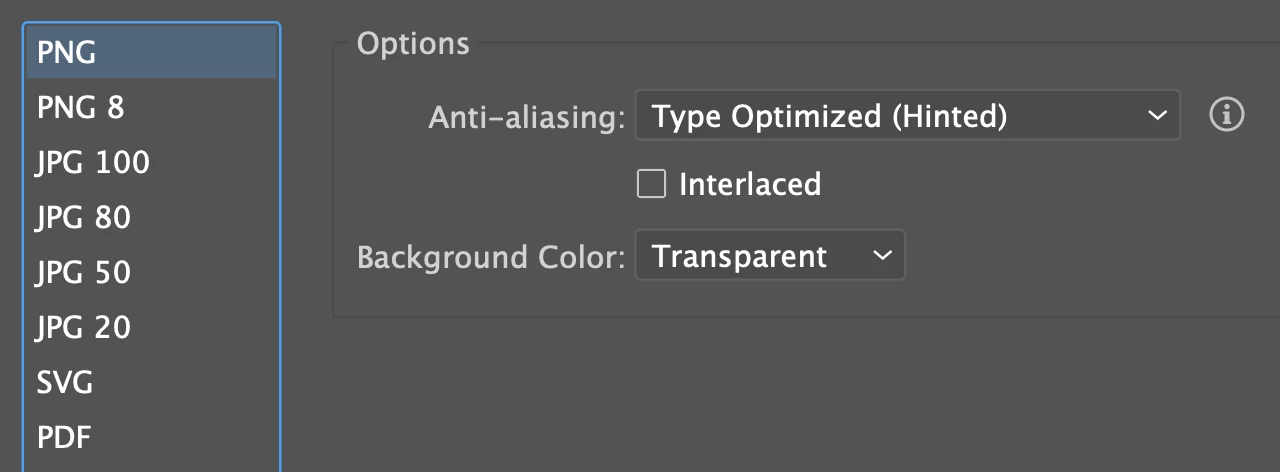
I'm making some web graphics. They are 768px wide, which is what the website calls for; they are saved as 1X pngs using "Export for Screens".

The type in my graphics (black on white) is noticeably mushier than the crisp black type of the surrounding headings and copy on the webpage.

Any suggestions as to things I could try to improve it? I'm using the same fonts I would use in a print project.

    This topic has been closed for replies.
    Correct answer Monika Gause

    PS: In case it is relevant - that screen shot is from an iMac with a 5K Retina display. These were settings used when making the png, which is 600px wide.


    A sans serif font that doesn't have a lot of line thickness contrast will look better. Also it shouldn't be as condensed so it has better legibility.

    3 replies

    Daniel E Lane
    Inspiring
    February 13, 2019

    You can always make the graphic larger in Illustrator or Photoshop, export at actual size, then resize to smaller on the website via HTML code or if its a wordpress site, just using their resize abilities on image placement.

    Jacob Bugge
    Community Expert
    Community Expert
    February 13, 2019

    Marie,

    Have you optimized for Type/text?

    Is SVG an option?

    Inspiring
    February 13, 2019

    SVG is not an option - only png or jpeg.

    I have not optimized. Should I? How do I do this?

    jane-e
    Community Expert
    Community Expert
    February 13, 2019

    Hi Marie,

    When you make a web graphic with text, you are converting it to pixels. What Zoom level are you using to preview it? It should be 100%. If you are zoomed in more, it will look worse.

    ~ Jane

    Inspiring
    February 13, 2019

    I'm not previewing it. I've exported the file and it has been uploaded to webpage.

    Monika Gause
    Community Expert
    Community Expert
    February 13, 2019

    The type surrounding your image is real text. The type in your image is just pixels. What you're seeing is as expected.