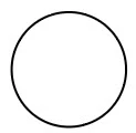
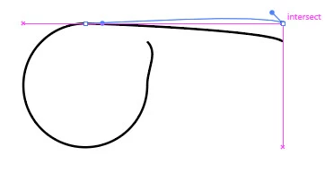
If it's the case that you want to try out different fonts to see what makes it more readable, I would recommend the Text on a Path approach. To make the baseline path, you could start with a circle.
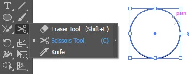
Use the Scissors tool to cut it between the top and the right anchor points.
Use the Direct Selection Tool to move the bottom part of the cut to right to align with the right point
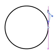
and the top part of the cut to the right and align with the top point.
Use the Anchor Point Tool (Shift + C) to click on the ends to reset the handles to straighten the ends.
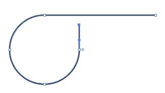
Use the Text on a Path Tool to click on the vertical part to start the text there.
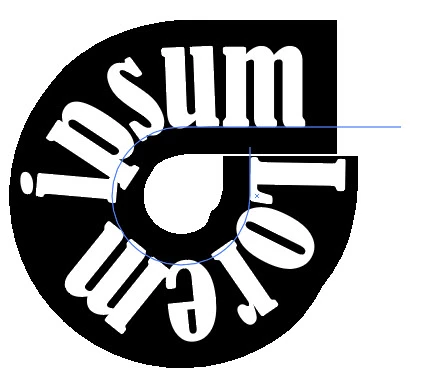
Then you can try out other fonts to see what fits and is readable.

Then you can adjust the kerning to get the letter spacing you want.

And if you wanted custom letters, you could then convert to outlines (Type > Create Outlines or Shift + Ctrl + O) and modify the shapes of the letters.