

Typography effect

Copy link to clipboard
Copied
Version: CS5
Machine and OS: Mac Pro / OS X 10.7.2
I see this trend a lot but can't figure out how to do it. Screenshot attached because I don't quite know how to describe it effectively. Essentially, it seems like a thin stroke line that traces the center of each letter. I tried recreating this by creating outlines of a black font, adding a red stroke and adjusting its thickness until you could only see a bit of the black and the effect was similar but it was not clean by any means.
Any help? 


Explore related tutorials & articles
 81
Replies
81
81
Replies
81

Copy link to clipboard
Copied
Oh really Talmage, you're one to talk.
There is no center trace feature in Image or Live trace and it what you call center trace is not even close to such a feature.
And you can try to confuse the situation all you want no one is going to buy it.
No soap buddy!

Copy link to clipboard
Copied
Wade,
OK, I tried it in AI CS6. I see that by converting a copy of the text to outlines, creating a stroked copy, and re-positioning that stroked copy, one can then modify the strokes to get the original effect. It also means deleting a lot of path segments...
I did this on just 3 characters, which was enough to see how much work is involved. I learned something -- if I need to do this, I'll save a lot of time by using CDR's centerline trace to get a centerline that I can modify. I found out that copying the CDR centerline path to the Clipboard and pasting it over the text created in AI works great -- all paths and anchor points, etc., are fully editable in AI. Good stuff.
Ken
Copy link to clipboard
Copied
A centerline feature woould be handy for a lot of purposes

Copy link to clipboard
Copied
You can select to trace "Strokes" instead of "Fills". You'll have to edit the options associated with it and then you'll have to expand the trace and make the strokes lighter.
How does the tracing method work in AI? I don't see an option for "Centerline" trace.

Copy link to clipboard
Copied
Let's keep this forum's atmosphere upbeat and helpful shall we? No drama. Oh no no drama. Yeah, I just used a Fergie reference. That just happened.
This is definitely a custom work thing.
As already stated, you have to use a typeface with letterforms that faclilitate it in the first place - ones with uniform width.
Not that we haven't beaten this dead horse well enough . . .
One manual trick that may help could be to draw lines across the shapes, perpindicular to each letter's width, drawing the line across the width, and giving them centerpoints. This would create a framework of lines you could then draw on top of, with the pen tool, and draw your own center lines.
And I'm reminded of hard chiseled bevels - how they give that metal, roman lettering look where the very middle of each letterform is raised and tapers down towards the each letter's edge, like a sword blade. I thought, hmm, maybe that's a decent way to find the letter-shapes' centers. At least a rough starting point if you're serious about the "center-line look" for your dressed up type.
Photoshop results (using two weights of Myriad Pro and Bodoni)

Illustrator results (using same fonts. click to enlarge)
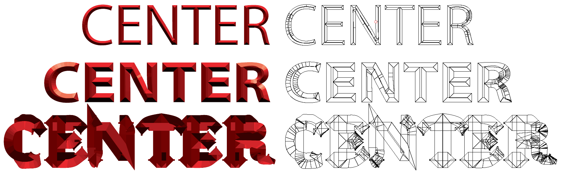
If you're wanting something to trace, Photoshop is by far superior. If you Expanded one of the Illustrator results to use as a starting point, the amount of clean-up required would be very counter-productive.
This whole thread is interesting, but I think the subject is being over-analyzed a bit.

Copy link to clipboard
Copied
I would approach this (as a starting point at least) as monica sugested in the very first reply post.... This would also allow for the text to remain live.
If you wanted cool effects (depending on what exactly) then you may have to outline the text and negatively offset path as your starting point. But this technique is very shape dependent. In type for example, to achieve the best results you would have to use a fixed width, sans-serif font.... (as in the examples you posted)
If you are using a font that is not fixed width then manual is best. See 2 egs below:
Fixed Width

Same technique non fixed width font, notice the top "bar:" of the inside stroke a different thickness... and fonts that have greater variation in the glyph widths will return even worse results.

non ideal fonts even worse results.

in cases like the one above, manual is best.
and an accurate way to do this is:
1. Outline the font
2. Offset to negative (not as an effect) untill small as possible but that you can see all the slabs still

3. Then delete points you dont need/use as a guide/make the inset path a guide whatever you prefer. Draw lines aligned etc, Offset for thicker lines if you want like so: (then you can apply this to even non ideal fonts)

and then work on the effect you want:
G

Copy link to clipboard
Copied
For intricate lettering effects I don't leave typefaces active/editable. I'm not placing such lettering effects into body copy on a printed page. It usually resides in some kind of big title or logo; in that kind of graphic it's far more safe to convert the lettering to outlines in order to prevent alterations to the lettering. Someone on a different computer may not have that typeface. You can provide a copy of the typeface, but that often will violate the license of that typeface. Even if the other person has a copy of the same typeface he may not have the same exact version of it. Some typefaces have numerous version releases and perhaps releases from more than one vendor. Throw in various clones, like the Swiss 721 or Nimbus Sans clones of Helvetica. Throw in differences between Type 1, True Type and OpenType versions of the same typeface. Add to that the differences in how the typeface may be treated as the design jumps between Mac and Windows platforms. Finally, a graphic with live lettering designed in an old version of Illustrator or CorelDRAW with certain letter spacing may see that letter spacing change (sometimes radically) when opened in a later version of the same program. I've certainly seen things like text on path effects made with something like CorelDRAW 6 get totally hosed when opened in CorelDRAW X5.
I can understand the need to keep type active from the perspective of certain very geeky web developers. Active type on a web page and "@FontFace" techniques will make a web page more search-able. However, it's also possible to append data to graphic images to make them search-able too. If I work hard embellishing a logo or lettering with a complex effect I'd rather have it converted into "finalized" vectors or even a raster-based image to keep it from being altered based on another user's fonts and/or software.
Anyway, that's just my opinion. Others can do whatever they like. 🙂

Find more inspiration, events, and resources on the new Adobe Community
Explore Now
 AdChoices