Known Participant
August 29, 2017
Answered

Uneven right side in fully justified paragraph

  • August 29, 2017
  • 2 replies
  • 717 views

Hi,

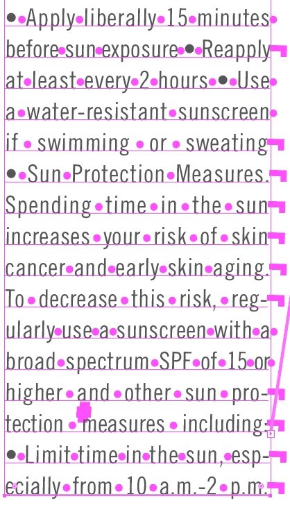
In the paragraph in the attached screenshot, when printed the right side doesn't look entirely even. Are the soft returns or something else causing this? How can this be resolved? Thanks!

    This topic has been closed for replies.
    Correct answer Mike_Gondek10189183

    There was extra space after the periods in your screenshsot, some other letters also. More important is what exactly  you like to see better on your type.

    Wanted you to try another font to see every font is programmed differently, especially on finer details, which are sometimes improved on version updates.

    Roman Hanging Punctuation (Notice the periods after minutes and sun hang over the edge in my previous screenshot)
    Controls the alignment of punctuation marks for a specific paragraph. When Roman Hanging Punctuation is turned on, the following characters appear 100% outside the margins: single quotes, double quotes, hyphens, periods, and commas; the following characters appear 50% outside the margins: asterisks, tildes, ellipses, en dashes, em dashes, colons, semicolons. To apply this setting, insert the cursor in the paragraph and select Roman Hanging Punctuation from the Paragraph panel menu.

    Optical Margin Alignment
    Controls the alignment of punctuation marks for all paragraphs within a type object. When Optical Margin Alignment is turned on, roman punctuation marks as well as the edges of letters (such as W and A) hang outside the text margins so that the type looks aligned. To apply this setting, select the type object and choose Type > Optical Margin Alignment.

    2 replies

    Mike_Gondek10189183
    Community Expert
    Community Expert
    August 29, 2017

    Thanks for the screenshot. Try another font looks like the periods especially have extra space. You can also turn on Roman hanging punctuation (I added extra periods to show how that looks).

    Lastly select your type with pointer tool and  Type >> Optical Margin Alignment

    Known Participant
    August 29, 2017

    Thanks Mike.

    I have to use that font. Where are you seeing extra space on the periods?

    And what does the Roman hanging punctuation do? It worked great on that paragraph, but then I tried it on another and it made a good paragraph look worse.

    Mike_Gondek10189183
    Community Expert
    Mike_Gondek10189183Community ExpertCorrect answer
    Community Expert
    August 30, 2017

    There was extra space after the periods in your screenshsot, some other letters also. More important is what exactly  you like to see better on your type.

    Wanted you to try another font to see every font is programmed differently, especially on finer details, which are sometimes improved on version updates.

    Roman Hanging Punctuation (Notice the periods after minutes and sun hang over the edge in my previous screenshot)
    Controls the alignment of punctuation marks for a specific paragraph. When Roman Hanging Punctuation is turned on, the following characters appear 100% outside the margins: single quotes, double quotes, hyphens, periods, and commas; the following characters appear 50% outside the margins: asterisks, tildes, ellipses, en dashes, em dashes, colons, semicolons. To apply this setting, insert the cursor in the paragraph and select Roman Hanging Punctuation from the Paragraph panel menu.

    Optical Margin Alignment
    Controls the alignment of punctuation marks for all paragraphs within a type object. When Optical Margin Alignment is turned on, roman punctuation marks as well as the edges of letters (such as W and A) hang outside the text margins so that the type looks aligned. To apply this setting, select the type object and choose Type > Optical Margin Alignment.

    Bill Silbert
    Community Expert
    Community Expert
    August 29, 2017

    In the attached screen shot I tried to replicate your problem.

    I tried to copy what you did as much as possible but somehow all of my text lines up really well. I used 38 point Trade Gothic LT Std (Opentype)  with forced justified justification. The tracking was mostly set at 5 to match your look but some lines had to be tracked tighter and some looser. Compare my settings to what you used and see if there is a difference.