 Adobe Community
- Home
- Illustrator
- Discussions
- Re: [Feedback] Usefulness for below types of fancy...
- Re: [Feedback] Usefulness for below types of fancy...
[Updated] Usefulness for below types of fancy fonts and hybrid glyphs.

Copy link to clipboard
Copied
-Updating the description
Some key aspects:
1. Glyphs can be partitioned into any number of segments
2. There is no convert to outline. Text remains live and editable
3. User can control the thickness of the bold and slant angle of the italics.. something like variable fonts
Hi Everyone,
We wanted to know if there is any usefulness to generate custom fonts whose glyphs are a combination of bold and italic typeface. We call these glyphs “Hybrid Glyphs”. So, to say, each glyph is segmented into regions and each region may have a different typeface replicated.
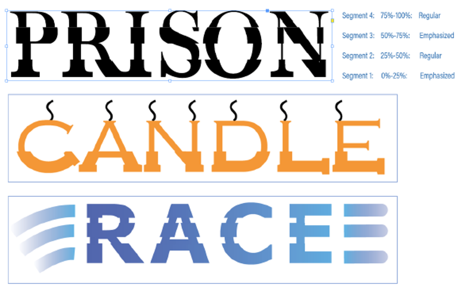
In terms of workflow, the user selects the font, say regular, and defines the segment marks in terms of how low it is from the font ascender line. Let say he marks two points at 20% and 50% above from the fonts descender (total font height=ascender-descender). This will generate three segments. For each segment he then may choose a different typeface to be replicated. For example, he may choose Bold-Italic-Bold. This will even be possible if the designer does not have the bold and italic typefaces of the font. In such cases, it will replicate a false bold in the first segment, a false italic in the middle segment and a false bold in the third segment. In case the user has the required typefaces of the font family, then that portion of the glyph will be taken from the corresponding font. The user may choose any typeface like semi-bold, semi-italic, condensed etc
We primarily want to know...
- Will this "feature" be useful to designers?
- How often will you use this capability?
- Under which scenarios and product will this most likely be useful? (maybe for Logos in AI? and titles in InDesign?)
- Do you see any missing aspects to this which can increase its usage?
- In light of the latest typography advancements (SVG fonts, variable fonts) how do you place this capability?
PS: This is not something we are implementing in any product for now. We just want your opinions and feedbacks.
-Aman


Explore related tutorials & articles
 18
Replies
18
18
Replies
18

Copy link to clipboard
Copied
1.Will this "feature" be useful to designers?
I don't know, was there demand for such things?
2.How often will you use this capability?
Given the number of fonts, I doubt.
3.Under which scenarios and product will this most likely be useful? (maybe for Logos in AI? and titles in InDesign?)
Custom titles, but still
4.Do you see any missing aspects to this which can increase its usage?
It could be useful to be able to determine other axis: left-right, corners...
5.In light of the latest typography advancements (SVG fonts, variable fonts) how do you place this capability?
Very low, I'd prefer Adobe to work on trying to help standards, like variable fonts integration, common interfaces etc.

Copy link to clipboard
Copied
It might be useful to someone, but I've never come across a scenario where I'd want this.If I ever wanted to achieve this absurdly niche effect, I could do it manually.

Copy link to clipboard
Copied
It may be very occasionally useful.
If we were able to stack additional fonts in the Appearance panel and to add masks to them, this effect could be achieved and the ability to add masks in the Appearance panel could be useful for other objects too.
Copy link to clipboard
Copied
Yes, I'd vote for masks in Appearance, rather than this idea that might give shivers to Typographers and Type Creators 😉
Copy link to clipboard
Copied
That's a much better idea Ton.

Copy link to clipboard
Copied
No real every day use whatsoever. Occasional and experimental in the extreme.
Sorry to be so blunt. All IMHO.

Copy link to clipboard
Copied
May be usefull for some designers but I cant imagine a lot of people using it..
Copy link to clipboard
Copied
Hi,
This is a personal research work that I am working on.
Want to know the feedback of expereinced and professional Adobe users like you regarding how useful can having such font morphing ability be?
for logos? For generating a different typeface of a font? For creating effects? Posters?
Would also like to add that in this idea, the text remains perfectly live and editable. There is no convert to outline step in this process.

Copy link to clipboard
Copied
This is already a very specific solution you're describing there. But maybe you can give us a more abstract outline of your research and then maybe we can come up with more practical applications of your research to our daily design workflows.
Copy link to clipboard
Copied
Done. Updated the description.

Copy link to clipboard
Copied
Yes.
This feature clubbed with variable font can do miracles. but it will give designers the freedom to distort glyphs which might be undesirable at times.
I would want to explore it for sure.
I will definately use it

Copy link to clipboard
Copied
- Considering the complexities i like this feature. Can come handy
- As a designer i may try and use it once or less a month, but would love to experiment what can be achieved with this.
- What is missing? Would have liked to see how the gradient of false bold and false angle of italics can be varied.
- It is also nice to see how each segment starts and end at the same axis rather than having them start and end at different axes.
- In a product, this may not be a must have.. but a good to have
- More close to master fonts than variable fonts
Copy link to clipboard
Copied
Hi,
Thank you everyone for your feedback.
As stated before, this is only a personal research and experimental idea am working upon and has no link to any feature/bug fixes that are done by the team.
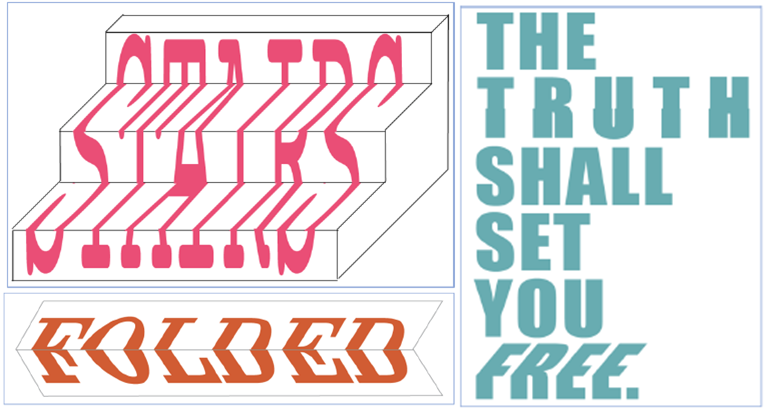
Adding some few more use-cases and designs which can be accomplished with this capability.
Looking for more feedback.
Thanks,
Aman

Copy link to clipboard
Copied
This looks interesting. So much happening.
Can be useful for print media.
Can be used once a while.
Can be tried. How does this work with SVG fonts?
Copy link to clipboard
Copied
Thanks everyone for the feedbacks.
To illustrate the workflow we have a small video for you:
This is only a sample video to give you a glimpse and feel of the concept

Copy link to clipboard
Copied
I can see only limited needs where such effects would be needed. The task of warping a text object to run down some graphical stairs might require the text object to be converted to outlines to get accurate results. The same goes for some of the examples at the top of the thread. The effect would only be good for a logo or headline, so there's not much harm in converting those type objects to outlines to fine tune the effect.
I find layered and chromatic typefaces more useful. For instance the Rig Shaded and Rig Solid type families (available in Adobe Fonts) are great examples. You can quickly build up a layered 3D type effect by typing a text string in different weights of this type family and stacking the type objects on top of each other. The half tone patterns on the "shading" weights are great. There's a growing number of chromatic and layered type families out there. Any application that can support standard OpenType fonts will be able to display these type families. There's not nearly as much desktop application support for OpenType Variable and SVG fonts. I'm hoping for the OTF Variable standard to catch on though. I liked the old Type 1 Multiple Master fonts back in the 1990's. OTF Variable can one-up T1 MM with its expanded character sets.
Copy link to clipboard
Copied
BobbyH5280 schrieb
I find layered and chromatic typefaces more useful.
Me too.
I cannot see any use case for segmented type.
But there are a couple of use cases for distorting type. There are countless threads on how to do all sorts of monograms. Or text in the shape of arches, banners and whatnot, which the envelope function addresses awfully poorly.
So if precious developer time could be invested in useful stuff, a lot of people might be very thankful. And a better envelope function would be useful not only for text.

Copy link to clipboard
Copied
Having a look at the video, I might try this out.
I may use this occasionally. I am not sure what all is achievable with the option but this idea is cool for sure.

 AdChoices