


Copy link to clipboard
Copied
I have some curved type (type on a circular path) that I want to do a solid vector drop shadow on.
The standard duplicating and offsetting creates an uneven drop shadow, unlike a normal straight baseline text that comes out even.
I wan the drop shadow to be down and to the side of the original type. It looks fine at the top of the curve, evenly down and to the side. As it gets farther from the center (center most type is perfectly vertical), the shadow becomes uneven.
Is there a quick way in Illustrator to have the drop shadow appear even, as if it was created on a normal straight horizontal baseline and then curved with the shadow exactly parallel and perpendicular to each letter?. I know I have seen this with more of a 3-D effect, where the each letter of the shadow seems to point to an imaginary center of the circle making the curved type.
I could outline the curved type and shadow and then adjust the position and rotation of each shadow letter but that seems like more work.
Thanks,
Mike


 1 Correct answer

Ton,
That was almost what I thought when I wrote the first post, with the added option of rotating the shadow path type (which can be done with your way), and keeping it the same size.
Harvest over here, earlier than anyone can remember, and heat has lifted a bit, at least until Wednesday which may prove to be the hottest.
Explore related tutorials & articles
 12
Replies
12
12
Replies
12
Copy link to clipboard
Copied
Mike,
As I (mis)understand it, you may try to copy the type behind itself (Ctrl/Cmd+C+B), then give it the negative Baseline Shift to get it right, with the desired underlap if any; obviously at some value, the dropped shadow letters will start over/underlapping one another.
Edit: I overlooked the to the side bit: you may rotate (the right way, +/-) until you have the desired side movement along the circle.
Edit edit: Just a comment: the copying will copy the Path Type and hence the underlying circle, which is what ensures the pure rotation.

Copy link to clipboard
Copied
Without seeing what you find problematic, did you try to use the Effect > Stylize > Drop Shadow and set the Blur to 0?
This creates a flexible vector drop shadow.
Copy link to clipboard
Copied
Thanks for the tips. My problem is that with using a standard horizontal baseline (not on a curve). when you offset the under layer with the shadow color say by 1/16" down and 1/16" right, you get an even shadow on the bottom and the right. When you do the same to type on a curved path, only the center top letters are even. On the lower left side of the curve, the shadow is thicker on the bottom. On the lower right side of the curved type, the shadow is thicker on the right. This happens even if you use the Effect, Stylize, Drop shadow. Try it and see. If I could start with a drop shadow on a standard horizontal baseline, convert to outlines and group each letter with its shadow and then paste each letter as an inline graphic into the curved text line that might work but I don't think you can do that in illustrator. I know there are display fonts with a built in drop shadow but those would be in one color only.
It looks like I might just have to outline the curved text with its drop shadow and adjust each individual shadow letter to be even on both the bottom and right.
Copy link to clipboard
Copied
Mike,
As I (mis)understand it now, it is even simpler than suggested in the first post: you may try to copy the type behind itself (Ctrl/Cmd+C+B), then simply give it the desired offset (with the shadow color say by 1/16" down and 1/16" right).
Copy link to clipboard
Copied
PS.
Is there a way to post a pdf or jpeg illustrating my problem?

Copy link to clipboard
Copied
Use the icon in the Reply dialog highlighted to add a raster image. PDFs and .ai are not accepted.

Copy link to clipboard
Copied
Something like this?
Copy link to clipboard
Copied
Ton,
That was almost what I thought when I wrote the first post, with the added option of rotating the shadow path type (which can be done with your way), and keeping it the same size.
Harvest over here, earlier than anyone can remember, and heat has lifted a bit, at least until Wednesday which may prove to be the hottest.
Copy link to clipboard
Copied
Without a good example picture, we keep guessing.
It is hot 28/29 degrees and we have to wait for rain till the end of next week (but they keep postponing that).
Since yesterday we have officially a shortage of water.
Copy link to clipboard
Copied
Here is an example of the problem drop shadow. The straight drop shadow is evenly down and to the right.
The curved type shadow is not. I had been trying to upload an image with the link icon instead of the insert image icon!

Copy link to clipboard
Copied
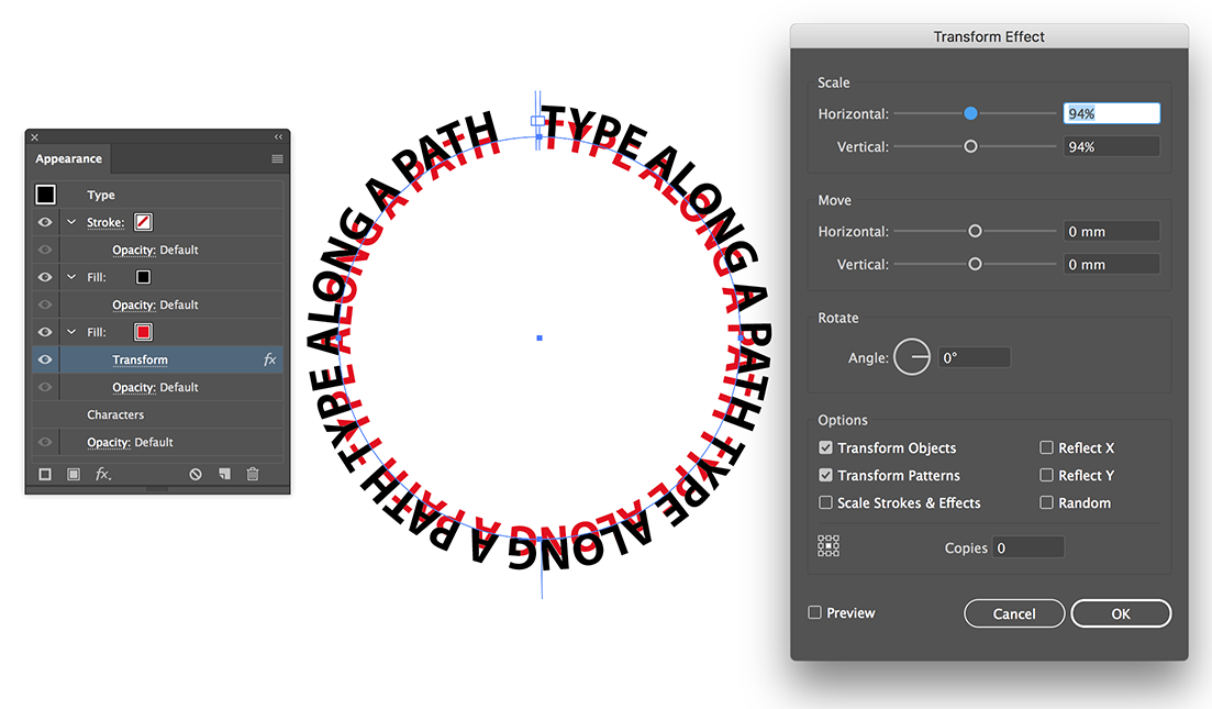
Here is the curved drop shadow without having to outline and manually position. I used the rotate tip and also scaled down the drop shadow on center and the produces a very even drop shadow.
Thanks for the help.

Copy link to clipboard
Copied
For my part you are welcome, Mike.
Your scaling the drop shadow down just the right wee bit is a crucial part.
Thank you for sharing.

Find more inspiration, events, and resources on the new Adobe Community
Explore Now
 AdChoices