Mr. Met
Inspiring
July 7, 2022
Resuelto

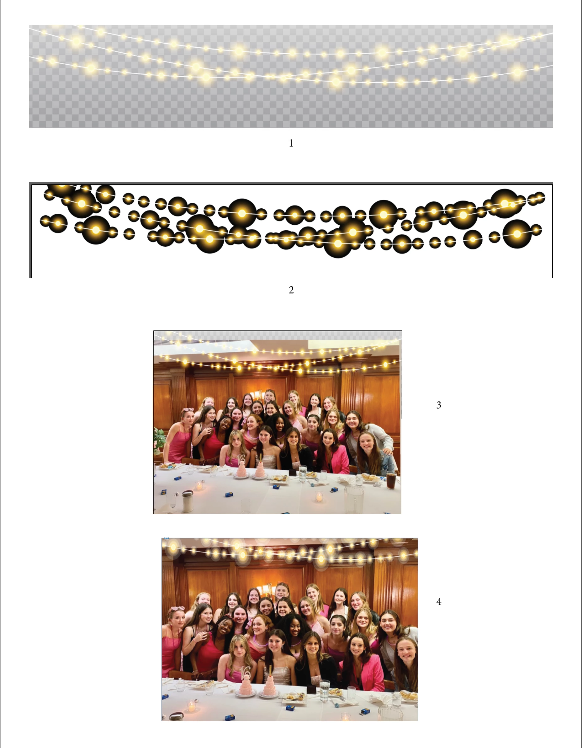
Vector File contains checked background that is live art

  • July 7, 2022
  • 2 respuestas
  • 1032 visualizaciones

Have to add a string of lights to a photograph so I purchase a vector file. But when I go to used it the checked background is part of live art (#1). I turn off the background and get a mess (#2). So I insert my photo between the background and the lights and it previews fine (#3) but when I print I get a mess with poor gradation in the lights (#4). How does one use a vector string of lights without the checked background which defeats the purpose of the lights. I thought there might be a lighs brush in the brush library but if it exists, I can't find it. Thanks in advance for your help.

Este tema ha sido cerrado para respuestas.
Mejor respuesta de Anna Lander

The lights have a Screen mode which works when something is placed under them. So you see the mess when nothing is under the lights and a good look when your photo is in its place. But no all printing modules work correctly with the blending modes, so you have this mess on the last image. If you printed it on the usual desktop printer, it was expectable.
So the easiest, fastest, and best way to solve the problem is to follow Monika's recommendation.

Another way is to select all lights, and change their gradient end stoppers to the same color as a start one (or the nearest on the gradient line) and 0% opacity. In this case, you can change the blending mode to Normal. But I'm not sure that you need so deep editing 🙂

2 respuestas

Anna Lander
Anna LanderRespuesta
Inspiring
July 8, 2022

The lights have a Screen mode which works when something is placed under them. So you see the mess when nothing is under the lights and a good look when your photo is in its place. But no all printing modules work correctly with the blending modes, so you have this mess on the last image. If you printed it on the usual desktop printer, it was expectable.
So the easiest, fastest, and best way to solve the problem is to follow Monika's recommendation.

Another way is to select all lights, and change their gradient end stoppers to the same color as a start one (or the nearest on the gradient line) and 0% opacity. In this case, you can change the blending mode to Normal. But I'm not sure that you need so deep editing 🙂

Mr. Met
Mr. MetAutor
Inspiring
July 8, 2022

Thanks. I'm just surprised that a purchased vector image would need all these runarounds to work. Wasn't expecting that.

Mr. Met
Mr. MetAutor
Inspiring
July 18, 2022

Modern versions of programs like Illustrator (since CS) versions use transparency effects to make these glows happen. Unfortunately (and really, out of technical necessity) most of the companies that supply stock images like this have to provide them in a format that "everyone" can use, hence they require stock creators to save their artwork backwards to older formats. As Monika mentions in her video, it's usually to be compatible with no newer than Illustrator 10 EPS format. This includes any artwork done in programs other than Illustrator (e.g CorelDraw).  Unfortunately, that level of compatibility does not supporrt the same lovely native Transprenecy, so these effects are converted to a manner that will work at that level, hence the gradations involving Black (0R 0G 0B) and use of the Screen effect. And, as mentioned, these only works if there is something behind it, even if it's white; The Screen effect needs something to comapre to. When there's nothing to compare to, the result stays as is, in this case: Black.

Even more unfortunately, they only work properly in their actual color space, usually RGB. If you convert to CMYK, the "Black" is no longer 0R 0G 0B, it could be something like 63C 54M 34Y 90K (depending on your colour settings), and this creates a completely different result when the Screen effect is applied so you get weird banding and bad gradations. This is what I think is causing your bad printout.

The best approach is to compose this image in Photsohop in RGB, so the effects are rendered properly, then export a new rendered image from there.

If you intend to layer these in Illustrator, stay in RGB mode. If you convert your document to CMYK, the garadtions will go to crap.

Similarly, If you layer these in InDesign, make sure your Transparency Blend Space is RGB, otherwise the same problem will occur.

Of course, it would be nice if the stock complanies smartened up and offered unadulterated .AI versions with proper Transparencies intact, but we're not there yet. Plus, many of these stock artwork may have been made years ago before we had better ways of doing it. It would be nicer if these companies offered to option of downloading an unadulterated .AI version, but I wouldn't hold your breath that they will go back and "upgrade" every piece of art they sell.

Regardless, I am sympathetic to your plight. It's a pain to have to do so much fiddling with something paid for and thought was foolproof.


Maybe because I specifically purchased from Adobe Stock, I expected it to be professionally ready to go as is. But in hindsight, designers sell/upload same art to multiple stock sites hence the art is dumbed down to lowest common denominator.

Monika Gause
Community Expert
Community Expert
July 7, 2022

To improve the printing, can you try and:

- Save this as an PDF (or "PDF comaptibe"), open in Acrobat and print from there

- or export as a JPG (preferable high resolution) and print that


This is how these files work: https://www.youtube.com/watch?v=Tiqm5hdQA5A

Mr. Met
Mr. MetAutor
Inspiring
July 8, 2022

I did save as a PDF. I'll check the links momentarily.