Copy link to clipboard
Copied
I would like to do a text style similar to the one in this poster, but when I use arc lower or envelope distort, the text gets all weird and angled. Any ideas?
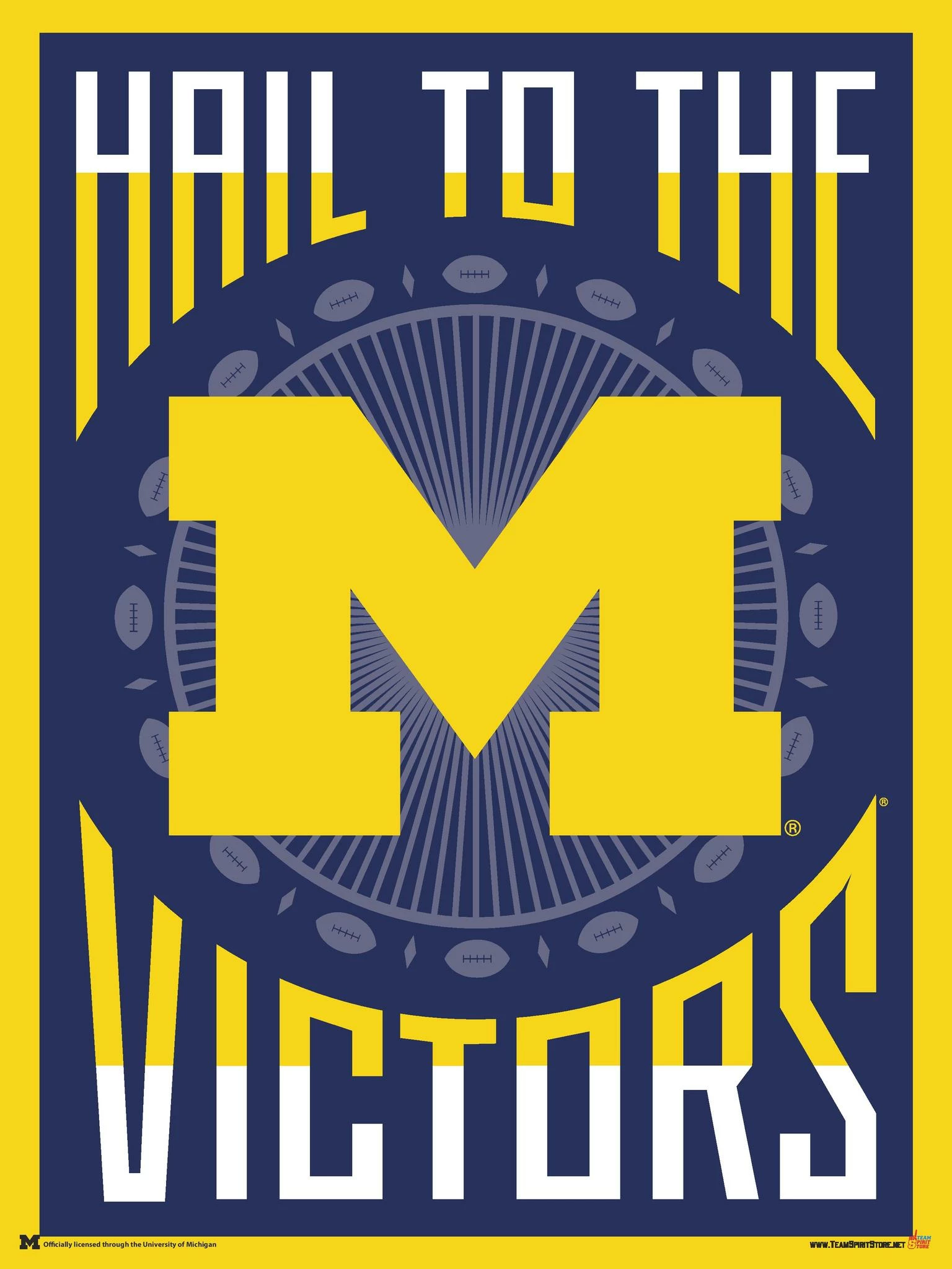
1 Correct answer
Convert font to outlines, then manipulate the anchor points yourself. Any use of envelop distort will "distort" the text. Use a circle and grid as a guideline. Not easy to do, but with patience you can pull it off. Good luck.
Explore related tutorials & articles
Copy link to clipboard
Copied
The text on the poster was drawn that way.
Copy link to clipboard
Copied
Convert font to outlines, then manipulate the anchor points yourself. Any use of envelop distort will "distort" the text. Use a circle and grid as a guideline. Not easy to do, but with patience you can pull it off. Good luck.
Copy link to clipboard
Copied
select your text, go to Object - envelope distort - select make with warp. Hope this helps
Copy link to clipboard
Copied
select your text, go to Object - envelope distort - select make with warp. Hope this helps
By Kezia29504117peb8
Warp won't create text as in the example.
Copy link to clipboard
Copied
The "effect" in that poster has to be created manually. A squared "constructivist" typeface will make the task much easier. The lettering that poster looks custom drawn though. It's a combination of dragging anchor points on the vertical stems of the letters, laying down circles in the desired locations then using pathfinder operations to trim or weld letter parts.