

- Home
- Illustrator
- Discussions
- Re: WHY can't I align the text on this logo?!
- Re: WHY can't I align the text on this logo?!

Copy link to clipboard
Copied
Hi Everyone and thank you for taking the time to try to help me!
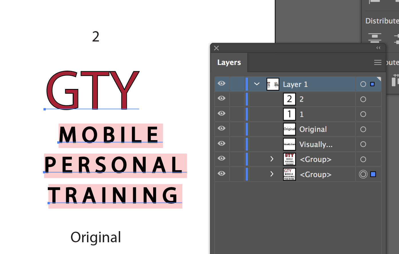
My problem is related to text alignment. I am currently making a logo for a client in the health and fitness industry and I can't seem to properly align the text in their logo for some reason.
First I tried to use illustrator's alignment option on the font I used, but due to the kerning or something else, the automatic alignment looked really off.
Next, I turned the words into objects and tried using the same alignment options and the words looked a lot more aligned, however, when I check the spacing I find that there is a 4-pixel distance from one side and more than 10 pixels on the other side, making it uneven.
I attached the AI file, so you can have a look for yourselves and see if you can find a solution to this alignment issue.
Here's the link to the AI file: Visually Even.ai - Google Drive
Thanks in advance!


 1 Correct answer

radoslava645 wrote
Yeah, I was talking about the last option.
The original is the way I aligned it at first, while the text wasn't turned into objects.
The client said that it seemed off and requested me to align it better visually, that's why I created the other version "visually even"
As I said in my first post. With end letters so different it always comes down to personal observation as to whether what is centered under them looks right visually.
Explore related tutorials & articles
 10
Replies
10
10
Replies
10

Copy link to clipboard
Copied
Try Ungrouping the objects before aligning.
Copy link to clipboard
Copied
Thanks for the tip, but I have already ungrouped each word. I attached the file, so you can have a look at it yourself.
Copy link to clipboard
Copied
radoslava645 wrote
I have already ungrouped each word. I attached the file, so you can have a look at it yourself.
I downloaded it and looked before commenting. When I opened it, the whole logo was grouped. (I don't have the fonts, but you can still see that it's grouped). Maybe that is due to a version difference or something. (I'm on 23.0.3 Mac)
Copy link to clipboard
Copied
In what way are you trying to align your type? Do you mean that you want the baselines of the letters in each word to align? Or are you talking about the space between letters? Or are you trying to center align all of the text under the "GTY"? If it is the last option then the fact that the shapes of the "G" and "Y" are so different means that alignment will always look a little off and should be adjusted, as best you can, visually.
Actually, the example. you've marked as "Original" looks more comfortable to me than the one that you've labelled "Visually Even".
Copy link to clipboard
Copied
Yeah, I was talking about the last option.
The original is the way I aligned it at first, while the text wasn't turned into objects.
The client said that it seemed off and requested me to align it better visually, that's why I created the other version "visually even"

Copy link to clipboard
Copied
Geometrically centered is not the same as visually centered. And that's it.
Copy link to clipboard
Copied
Huh, can you explain the difference and how I can visually center the design?
Copy link to clipboard
Copied
radoslava645 wrote
Yeah, I was talking about the last option.
The original is the way I aligned it at first, while the text wasn't turned into objects.
The client said that it seemed off and requested me to align it better visually, that's why I created the other version "visually even"
As I said in my first post. With end letters so different it always comes down to personal observation as to whether what is centered under them looks right visually.
Copy link to clipboard
Copied
https://forums.adobe.com/people/Bill+Silbert schrieb
As I said in my first post. With end letters so different it always comes down to personal observation as to whether what is centered under them looks right visually.
This.

Copy link to clipboard
Copied
The problem is with the GTY which is never going to look centered optically like GTO does because of the "Y" at the end. That is why your "visually centered" version looks better. Forget about getting it literally centered. Set the three lines of text as a centered paragraph. Try not to mess with the three lines of text.

 AdChoices