Why does Pantone Color Book color differ so substantially from RGB values?
Hi all,
Just a question that has thrown me into a quick panic.
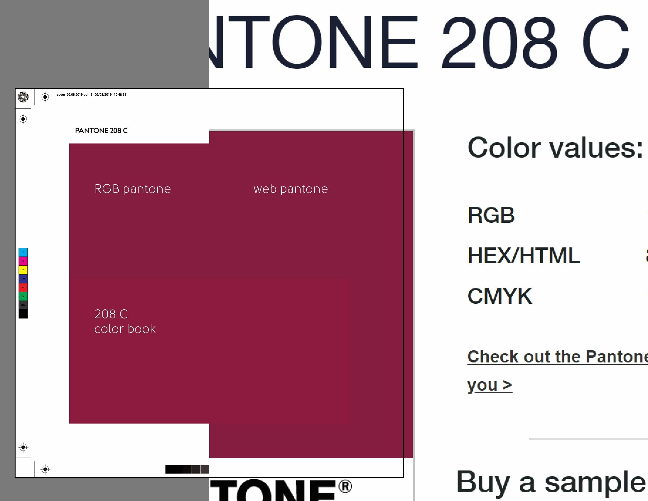
When using the RGB values for a Pantone color listed on the website, why is the color so vastly different than when using the RGB values? When prepping something for print and sending to client for final check, the difference is actually quite noticeable, and for somebody not familiar with the process, they might be asking why the color now looks so different.
I'm attaching an example of what I'm talking about. The "Web Color" is the swatch directly from the Pantone website. The "RGB Pantone" is the color when using the RGB values from the Pantone website (identical to the Pantone swatch). The "208 C Color Book" color is what Illustrator shows the color to be when selecting the 208C color swatch in Illustrator.
Is this something that has some specific purpose, or is it just the way Pantones are represented in digital space? Thanks.