Copy link to clipboard
Copied
Just take a look at the following screenshot of the Illustrator UI, and PLEASE do your job or quit!
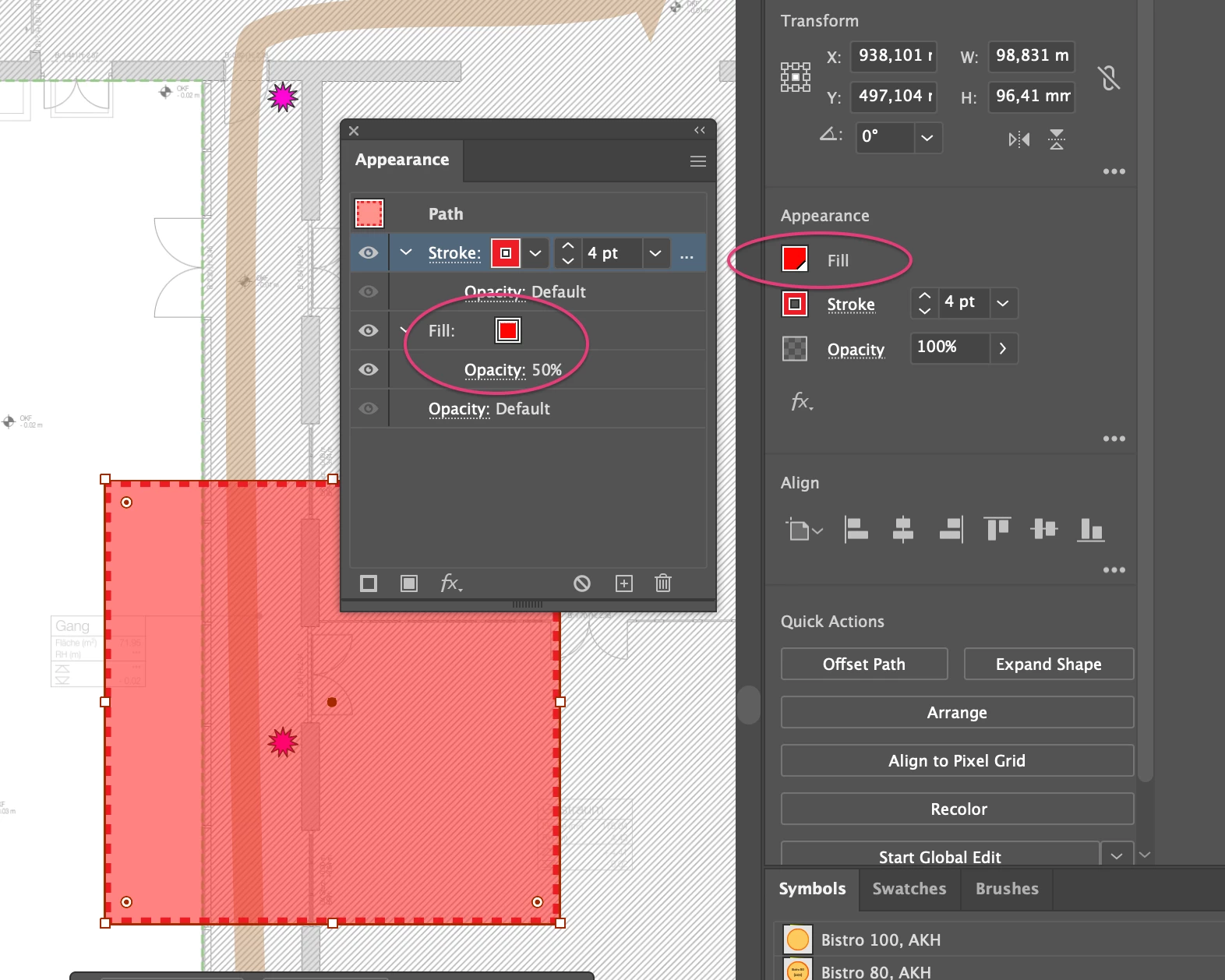
Why is this both called "appearance" but why I only have access to advanced options of strokes, and why do you throw your properties and options all over the place and not f*kn consolidate them so that I can find the bl**dy function that I am looking for all in the same place!?
I had to search on the open sea of the internet - the help community search is just weak - for 15 minutes to learn how to change the fill opacity of a simple rectangle! WHY!?! it is the most simple object around! Why do I need to look up such simple manipulations somewhere in some random dude's illustrator guides?!
I moved away from Illustrators several years now - I was very proficient user and I was always hoping it would at some point be fixed.
But no! It keeps getting worse and worse and worse. Adobe products are the anti-thesis to a good UX and, unfortunately, that a company will not survive on bad UX. But adobe proves us wrong time after time after time.
Please fix your UX! It stinks! And you know it.
Copy link to clipboard
Copied
Just use the Appearance panel. Ignore the Properties panel.
Copy link to clipboard
Copied
Thanks, Doug... that's exactly the point I was trying to make.
I'm not going to continue being sarcastic below.
Tell me, how often do you feel frustrated about the UI of Illustrator? How much time does it cost you to dig into a new feature or an old one you haven't been using in several years? How much effort should it be to understand basic manipulations of shapes and colors? Do you want your tool to be an impediment to your work or to you want it to support your workflow? Do you want your tool to get your job done or do you want to do a research on how to use the tool before you get your job done?
We pay a good yearly fee to a company that does not work on improving things for you. They bloat the software with new half cooked features, even paste a toolbar right in front of your workspace for an AI-Gen for shapes and some other non-contextual tools to the effect that this leaves the impression of an old school banner obscuring the view on my work - and they do not cater to their users' needs with that money. They invest into the Adobe Marketing Cloud, probably syphoning data for their own uses, I am assuming ignoring privacy issues on the go and presenting us with tools that just suck when you need to use them a few times a year. Google did a better job on that - and their tools are mostly for free. Not to mention figma.
The outcries that went through the figma community when they announced the deal with Adobe do have their reasons.
The UX is pure frustration - and I do not see the investment that was done during the years of transition from local software to creative cloud. Those were the times when I had hope. But what I see now feels like a scam.
Copy link to clipboard
Copied
You are probably using Figma day in day out and you are using all the features every time. So how hard will it be to un-learn something?
As for Illustrator: it's a professional tool. If you put in the effort to really learn how it works (and not just watch a 2:30 tutorial about the steps leading to an effect you want to get), then you'll be able to do it again and again. It's like learning to ride a bicycle.
Copy link to clipboard
Copied
Hi @HänkSchuh
We hear you and understand your frustration. We'll certainly pass your concerns on to the relevant team. In addition, I kindly request that you share this suggestion on our UserVoice page. This will allow other users to upvote your feedback, and the more votes it receives, the higher the priority it will get for future updates.
Thank you for your patience and understanding.
Regards,
Srishti
Copy link to clipboard
Copied
InDesign is a POS. After 25 years it still crashes constantly, the UI breaks, it corrupts files. It's an amateur joke. I wish I never had to use the trash Imdesign ever again.
Copy link to clipboard
Copied
For starters, user interface design is a very subjective thing. One person's idea of a good user interface might be pure garbage in the eyes of someone else. Not everyone thinks the same way or is going to go looking in the same places within an interface to find a function. Illustrator does have several stock workspaces and those workspaces can be customized a great deal.
The first version of Adobe Illustrator was released 37 years ago. Its user interface has slowly evolved through all of those years. There are many long-time users of Illustrator, people who have been using the application for 20 years or more. For better or worse many of us are used to how the application's UX is arranged. Any sudden, big changes (or "improvements") may throw off the work-flow for a lot of people and get them pretty angry. If the developers of Illustrator want to make any big changes to the user interface they have to walk a tightrope when doing so. For example, look at all the user fury that occurred when Apple released Final Cut X.
The situation is compounded by Adobe's many applications sharing a similar user interface theme. Are there things that can be improved in Illustrator's UX? Sure. But it's easier said than done.
None of Illustrator's rivals (such as CorelDRAW, Affinity Designer, Inkscape, etc) are perfect. They have their own strengths and weaknesses. I wish I could replicate the very fast/easy CorelDRAW keyboard shortcuts for object alignment/distribution within Illustrator. So far I haven't been able to do so because every "recipe" I've tried creates conflicts with a bunch of other existing keyboard shortcuts. Likewise, I wish the Bezier tool in CorelDRAW didn't suck so bad compared to Illustrator's Pen tool. Again, it's a matter of keyboard shortcuts plus a much smoother artwork preview in Illustrator.
Copy link to clipboard
Copied
"For starters, user interface design is a very subjective thing. One person's idea of a good user interface might be pure garbage in the eyes of someone else."
Errr... no. With your comment you invalidate the whole field of UX research which has a proven record of improving digital and physical product design and subsequently driving business-decisions.
I work as an interaction designer for about 15 years (and a user of adobe products for 20 years), I have had my good share of usability tests in which my assumptions about how things should work were shattered and invalidated and in which we found aligned behavioural patterns among users.
I am aware of the legacy discussions in UIs of software and that you want to keep it accessible/usable for as many users as possible. I am confronted with that actually at the very moment.
Would you still like to work with an old school UI as from Windows98? I tried that a while back and my assumptions about how things should work were hardly compatible anymore. We do evolve as users in our understanding of interactions and we change in our expectations. Phone UIs are another strong example. Nokia did a great job on their hard button phones but struggled on their stylus and touch devices, of which already existed before the iPhone. Apple managed to establish quasi-standards on what should be possible with touch devices - especially multitouch. And I am sure a whole lot of people transitioned from Nokia to iPhones and they got used to it and there was no legacy. Yeah, this comparison is not that sleek as it is about a transition from one company's product to another one's company and also inbetween device classes - the point is we do evolve and are able to evolve.
But what you see above is just a sloppy UX job - both sections in the panels do have the same name but they do not offer the same options. Is that legacy or an error in the UI?
And as mentioned above I am a user for about 20 years, I saw the partial consolidation of Adobe product UIs in the early 2000s and ever since I was hopeful that they would get things on the right track.
I am so enraged about this apparently tiny mistake in the UI because the money we stick into this company does not end up with us users. The forums are full of bug reports and features that are confusing. The problem I posted before was asked about in 2017(!).
They do not care!
Think of the yearly fee we pay as a tax... would you like your state/country to use your money and put it into more oil rigs to pollute your local beach or into banks to be rescued because of mismanagement; Or would you rather have some wind power plants set up to get your electricity more sustainably to keep your habitat intact for the future or have your country invest into schools that teach kids the ethics of investment so that the chances of a financial crisis are being lowered in the future?
Copy link to clipboard
Copied
"Errr... no. With your comment you invalidate the whole field of UX research which has a proven record of improving digital and physical product design and subsequently driving business-decisions."
That judgment is way overboard (as is the subject line for this discussion thread). I stand by my earlier comment. Do you expect me to believe everyone who works in user interface design thinks exactly the same way or agrees with each other 100% of the time?
I've been using Adobe Illustrator in my work for over 30 years. I have seen numerous other creative applications come and go since the late 1980's. For many years I've participated in forums like this one and others going back to the days of Usenet. A common topic is people arguing over user interface features. In the past, those discussions were often framed in app versus app comparisons, like Freehand versus Illustrator. Forum participants would complain how things were arranged in the existing UI. And then they would complain even louder when something in the UI was changed or moved as a result of an application update.
Many elements in the Adobe Illustrator user interface have wound up being stuck in place -even if it seems like those elements are in the wrong place. That has happened for multiple reasons, with the biggest reason being there is a large, established base of long-time users who are familiar with that flawed UI. Big changes to an existing UI can also "break" a lot of things, such as third party plugins.
I do not agree with the statement Adobe doesn't care. Many of their creative applications are very mature, which also means there isn't a lot of big changes they can make to a certain application without utterly disrupting the work flow of many existing users.
Generally speaking, it's easier to get an application's functions and user interface "right" when the developers are starting over from scratch. That's kind of what Adobe did when they stopped development of PageMaker in the late 1990's and shifted over to InDesign.
Copy link to clipboard
Copied
The problem is that Adobe have been there since the start and have clung to old design practices that other newer platforms never adopted. Sometimes, it's good to start from scratch. I've been using PS since the late 90's (Photoshop 5) and in essence very little has changed in their UXUI.
Different with Lightroom. Lightroom CC was a clear departure from old design practices, just badly executed. Instead of finishing the job, they just created two separate versions of Lightroom. With different feature sets. Horrible.
Change is always hard, but having to guide new people through a 25+ yo design methodology is painful.
Copy link to clipboard
Copied
@EmeraldSkies schrieb:
Sometimes, it's good to start from scratch.
Uhm, no.
That would mean to be in 1.0 status with important functionality for years. It would mean to break compatibility of old files (pretty much everyone has archives goinf back decades). It could mean that functionality gets abandoned.
Copy link to clipboard
Copied
None of that is related to what I'm saying. Starting UXUI from scratch, not functionality. They are not one and the same. File compability has nothing to do with UXUI so not sure why you're bringing that up.
Copy link to clipboard
Copied
Changing a user interface most definitely does affect functionality. The tools, menus, keyboard shortcuts, etc. all represent functions of the application. File compatiblity is an unrelated topic. Monika brought up the "1.0" number as a metaphor of an application having to start over from scratch with its functions. Look at what happened to Apple when their Final Cut Pro 7 application went to Final Cut X. It was a disaster.
In specifics, what in the interface are you demanding to be changed? It's easy to say generalized statements like, "Adobe hasn't being doing anything to improve the UI." It's more difficult to get down into specifics.
Copy link to clipboard
Copied
I'm talking from a software POV - if you're backend and frontend are properly organised, you can change elements on the UI level much more easily, or simply "disconnect" them without having to remove them from the code.
A big bug bear of mine across Adobe products has been the fact that there are hundreds of options, drop downs and tiny icons strewn across the interface resembling a cockpit. What's worse is that regardless of their importance, they all take up equally as much space and attract the same attention. Here's a screenshot of After Effects' Export panel:
The amount of nested elements is unnecessary and pointless. "Started", "Render Time", "Comments" and "Notify" sit on the top layer taking up precious space. I doubt these details are important for the task at hand. Render and output settings are on the second layer, but bunched together so tightly that it's easy to miss the output settings. The next layer down simply displays the current render settings, which you could also access through the dedicated settings "links", so it's redundant. The UI here is just disorganised and a visual nightmare. When I want to export a composition, make that part easy and quick. There are no visual clues on how to clear old renders, the list just fills up. I can delete them by hitting the delete button, but nothing would prompt me to do so.
The UI was likely developed by software people that just added and added functionality and just fit things anywhere. It's time to clean things up. I don't use AE very often, after a few months, I need to start from scratch and relearn. Nightmare.
Copy link to clipboard
Copied
They do not introduce things because they just feel like so. It's always because someone asks for it. As a causal user that is not you. But there are other users as well.
Copy link to clipboard
Copied
That's not how product management works, sorry. Not everything is user driven, or else they wouldn't be in the mess they are in. The reason Lightroom CC and Classic exist is because they listen to the wrong user feedback. Adobe once was ahead of the game.
These messy designs are typical of early-day software development, where developers were in charge of UI and simply put things where they fit. And we've moved on from that. UXUI designers need to be part of the team to prevent bad UX. Better yet, management need to get their heads out of their behinds and do what's right. Focus on quality.
Copy link to clipboard
Copied
I'm talking from a software POV - if you're backend and frontend are properly organised, you can change elements on the UI level much more easily, or simply "disconnect" them without having to remove them from the code.
By @EmeraldSkies
You're still not saying anything specific about what you specifically want changed in Adobe Illustrator. Going into hypothetical territory about Illustrator's source code (back end, front end, etc.) is really saying nothing. You're complaining yet being vague at the same time.
If you want Adobe to throw out its existing code for Illustrator and start over then that would mean a "1.0" re-fresh of the application, which would threaten to break very many things -including backward compatibility with the files of very many existing customers. Some of us have been using this software for over 20 or even 30 years and have files dating back that far. Look at the rage Apple induced with Final Cut X when they didn't make it compatible with project files made in the previous version, Final Cut 7. Do you really think Adobe wants to go there?
As for the user interface seeming overly complex, I have to say that's nonsense. I'm not going to claim Illustrator has a perfect UI. But the UI in Illustrator (and various other Adobe apps) can be customized a great deal. Illustrator has several stock work space presets available. Various panels can be torn off, minimized to a mere icon or removed from view. You can build custom tool bars with specific functions you want on it. Many elements in the UI can be dragged to additional monitors. Apps like Premiere Pro and After Effects are easier to use with multiple monitors. In Illustrator you can press the Tab key to hide or show the user interface. Additionally, Illustrator has great keyboard shortcuts for many of its tools. Its keyboard shortcuts for zooming in/out or panning the view are superior to any rival vector graphics app. The same goes for its Pen tool; I can manually draw paths and edit anchor points while I'm drawing that path and still be able to zoom in/out and pan the view at the same time. That saves me a lot of time from not having to mouse back and forth to tool bars and menus. I can't do that nearly as well in CorelDRAW or Affinity Designer.
I don't know your amount of experience with Illustrator, but out of so many posts I've seen where people complain about the UI in Illustrator (or other Adobe apps) they're often users with only basic knowledge of the applications and don't want to dive deeper into them.
Copy link to clipboard
Copied
I don't use Illustrator. Could never get over the steep learning curve, didn't see the point. My needs didn't justify it.
My feedback is generic Adobe, as all of its software are the same design methodology, doesn't matter what application you use. Illustrator is particularly frustrating for simple tasks so I abandoned it in favour of simpler vector tools like Flash at the time. Don't come at me with "you can't compare them". Yes you can.
I've used Photoshop since 1998. The problem here is perfectly captured in your rant. You're used to your software and you don't want things to change. And here's why - because people needed to shell out THOUSANDS of dollars for software for the privilege of owning it. Your ego is attached to it.
Software doesn't work like that anymore and no, people don't want to invest hundreds of hours into something that other software can do much faster. Adobe is no longer exclusive and a badge of honour. Today, anyone can afford to use Illustrator. And that invites feedback from people who're not going to waste their time if it takes a college degree (literally) to use it. I'd love to use Illustrator but I just hate it's complexity so much that I avoid it.
Copy link to clipboard
Copied
@EmeraldSkies schrieb:
people who're not going to waste their time if it takes a college degree (literally) to use it. I'd love to use Illustrator but I just hate it's complexity so much that I avoid it.
It's a professional app used by people for their professional needs and by anyone else who needs that complexity at their hands without having to dive through a dozen menus in order to reach a button that a casual user doesn't want to see. It's not about an ego, it's about mastering a tool, because tht tool is the most efficient for the job (even if you cannot imagine that this is possible).
Copy link to clipboard
Copied
I use 3 Adobe tools professionally for my business and my clients and have been doing so for 2 decades, thank you. Get off your high horse. If you look through the internet, there are plenty of designers and other professionals that drag Illustrator through the mud for being too unnecessarily complex and inconsistent. You guys love it? That's great! That doesn't make it a great tool.
Copy link to clipboard
Copied
If people won't need that level of complexity, then it's not for them.
But it looks like people need that level of complexity, otherwise they wouldn't even care about Illustrator and instead happily use whatever they have. They only do not want to put in the effort.
Copy link to clipboard
Copied
I don't use Illustrator. Could never get over the steep learning curve, didn't see the point. My needs didn't justify it.
By @EmeraldSkies
Illustrator doesn't have a steep learning curve. The UI should be immediately familiar to anyone that has used Photoshop since 1998. It doesn't take much effort to look through the application's help files and other documentation to learn what certain tools do. There are dozens of graphics-related web sites providing info about the app. There are countless numbers of tutorial videos online at sites like YouTube. Some are produced by Adobe. There are many produced by other enthusiasts and graphics professionals, including a bunch made by Monika.
Also, there is no graphics app in existence, certainly none on the professional level, where a new user not familiar with the app can immediately jump in and be great at using it. Everyone one of those apps requires ongoing effort on the part of the user to learn its tools, menus, keyboard shortcuts, etc. to be ever more productive.
Your personal digs at me (such as "your ego is attached to it") and Monika are doing nothing to help your argument. I don't understand the comment about Illustrator requiring a college degree to use it. However, it does bring up another common problem why so many self-taught graphics people with no formal training (or an art school degree) get lost trying to complete various kinds of projects in Illustrator as well as InDesign and Photoshop. The apps don't immediately bless the user with knowledge of grid-based page layout, color theory, typography and other agency/studio skills. The apps also don't bless the user with creative talent either. The user has to bring talent and graphics work flow knowledge to the table.
Copy link to clipboard
Copied
Bobby, I'm back and still very disappointed in you since you apparently haven't read well my inital post which very much includes a very specific problem which definitely needs fixing because in it's most basal existence it is a bug.
And in a more UX matured world - in which we live in now - it is a faulty UX problem... and if you care to read again you will find arguments why that is.
So, please, before you spill the old tale of "complex tasks need complex tools" and "this is made for professionals", apparently completely ignoring the fact that I used adobe products for over 2 decades, please read and digest what I wrote.
Thank you.
Because "just ignore the properties panel" is the most ignorant answer that you could give at that moment.
I will tell you straight your comment made me furious and, to me, it showed me that you do not care about my arguments that I brought up, you seem to just trust in your own opinion and, as it seems, you just settle in with what is offered to you (referencing my nokio - iphone comparison to adobe which you, in my eyes, also completely ignored as an arguement, as well as the Windows 98 to Windows XP to Windows 7 comparison to illustrate the evolving expectations of users towards an UI).
So, please, pick up the arguments presented to you and do not say that we didn't get into any specifics or made weak general arguments.
Copy link to clipboard
Copied
In your first post on April 10 you mentioned nothing about any specific application-related problem. Your comment was a general opinion about software development ideology with the tone of "Adobe sucks" laid on thick. Other people post comments like that all the time; the only thing I saw missing was a sales pitch for Affinity Designer.
Your latest post is still saying nothing specific about a technical issue with Adobe Illustrator. Instead it sounds like the discussion is turning into a personal tirade against me.
Because "just ignore the properties panel" is the most ignorant answer that you could give at that moment.
Where did I say "just ignore the properties panel"? You're confusing me with the words coming out of your strawman. I'm not going to waste my time picking up arguments presented to me when it sounds like all I'm going to be doing is feeding a troll.
Copy link to clipboard
Copied
I said 'just ignore the Properties panel'.
I said it because that's what I do, because the Properties panel pretends to give you access to everything while really presenting you with a series of dead ends.
Why would it make you angry that I am also critical of Illustrator's UI?
Find more inspiration, events, and resources on the new Adobe Community
Explore Now