- Home
- Illustrator
- Discussions
- Create color of text on gradient layer
- Create color of text on gradient layer
Copy link to clipboard
Copied
In Illustrator CC 2020, I am trying to create an inverse color for text that is in a layer in front of a layer that has a gradient fill of red, white, and blue. The purpose is to make the text stand out more clearly, depending on what part of the gradient the characters of text are. How can I do this?
 2 Correct answers
If you go to the Transparency panel or click on Opacity in the Appearance panel, you can set the Blend mode to Difference to get the inverse of the colors. However, that's unlikely to make it easier to read. You might consider using black text with a white stroke around it.
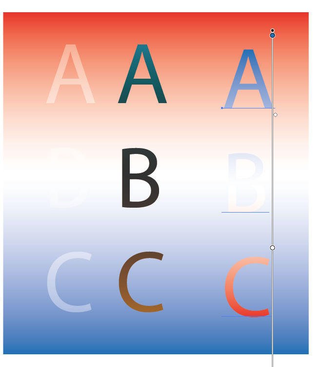
Here is an example of a background grad with the same grad filling text flipped 180º. As you can see my example is not perfect. There is a center portion where the "B" is lost in the white part of the grad. with a bit of fiddeling with the grad you may be able to get some results you are happy with.
Explore related tutorials & articles
Copy link to clipboard
Copied
If you go to the Transparency panel or click on Opacity in the Appearance panel, you can set the Blend mode to Difference to get the inverse of the colors. However, that's unlikely to make it easier to read. You might consider using black text with a white stroke around it.
Copy link to clipboard
Copied
The thing I find most important in type being legable when sitting on a colored backgrouns is contrast. I see this often with new designers who are working on their first publication. Just make sure there is enough contrast between the background and the type. Invers may not give you the needed results.
Copy link to clipboard
Copied
Here is an example of a background grad with the same grad filling text flipped 180º. As you can see my example is not perfect. There is a center portion where the "B" is lost in the white part of the grad. with a bit of fiddeling with the grad you may be able to get some results you are happy with.
Get ready! An upgraded Adobe Community experience is coming in January.
Learn more