


Copy link to clipboard
Copied
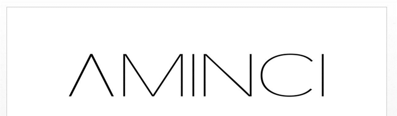
I made a logo using both font (transformed to curves) and shapes. Most of it is diagonal lines, and while they look good in illustrator and when saved as images, the lines get jagged or blurred in pdf format and in word documents or when the image is viewed in large sizes. Sometimes you can even see the pixels, and it was distorted in the brand registration document too, even though it looked fine when it was first uploaded.
I saved the images in png format with the highest possible ppi (2400), high resolution export settings and large dimensions (7790x2089), and am not sure what else to do to fix it. Does anyone know why this is happening?
PNG Image (slightly distorted already)

PNG image in a word document


 1 Correct answer

So you have a .pdf that looks jagged when viewed in Acrobat. Open the .pdf in illustrator and view at 100%.
- if this looks good in Illustrator your problem is in your view settings in Acrobat.
- If this looks bad in Illustrator your problem is with the pdf itself
We do not know how you created the your .pdf and this could even be bitmapped.. The aqua colored lines in your sample are jagged also, so at this point am doubtful this is about your AMINCI logo.
I recreated your art and could not find any o
...Explore related tutorials & articles
 9
Replies
9
9
Replies
9
Copy link to clipboard
Copied
What is your final output device for this image, why are you going with .png? We need to know whether the purpose of this is for printing, or a digital display.
When you look at bitmapped images you want to review at 1 pixel data to 1 pixel of digital monitor, otherwise 100% view in Photoshop. I do not see any problem with the images you posted, but then I do not know exactly how you viewed the image, as you may have bene zoomed in or out.
If you were to output this as a vector to make plates your resolution is typically between 2400 dpi and 3396 dpi for linework and 300dpi for continuos tone.
Copy link to clipboard
Copied
Hi Mike
The purpose is digital display, I'd use the vector format for printing.
Got some screenshots from how it looks in pdf format, which is my biggest problem - the ones I sent before were mostly fine, just a bit blurry. These are zoomed in views and a 100% view, all of them looked very jagged, as opposed to normal fonts in the same document. (This was a PowerPoint converted to PDF, with the logo in PNG format)
I'm worried that this is some problem with the logo itself and not just the visualization, and that it will affect future materials both in digital display and print. It could be just the PDF display, since the background lines are supposed to be straight too and also appear jagged, but I haven't had this problem with any other logo I've ever used.
.png)
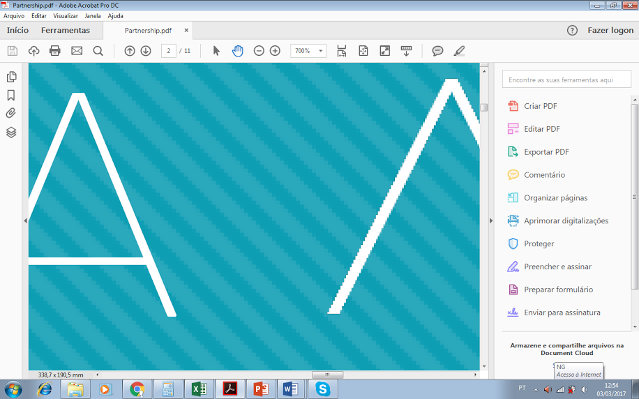
.png)
Copy link to clipboard
Copied
So you have a .pdf that looks jagged when viewed in Acrobat. Open the .pdf in illustrator and view at 100%.
- if this looks good in Illustrator your problem is in your view settings in Acrobat.
- If this looks bad in Illustrator your problem is with the pdf itself
We do not know how you created the your .pdf and this could even be bitmapped.. The aqua colored lines in your sample are jagged also, so at this point am doubtful this is about your AMINCI logo.
I recreated your art and could not find any of the settings causing this to happen on Ultra Thin type.

The ones I suspectedcoudl be part of the issues are:
Enhance Thin Lines usually makes them bolder
Smooth Text- Specifies the type of text-smoothing to apply.
Smooth Line Art- Applies smoothing to remove abrupt angles in lines.
Smooth Images- Applies smoothing to minimize abrupt changes in images.
Please provide a sample of your file, and tell us what settings you used to create your .pdf.
Copy link to clipboard
Copied
I'm linking the ai., ppt and pdf files
PPT Aminci.pptx - Google Drive
The ppt uses the fonts Niveau Grotesk and Filson Soft, they're available in adobe's typekit

Copy link to clipboard
Copied
A PNG should not be used for a logo intended for print.
Copy link to clipboard
Copied
Thankyou for providing files. Your problem is that your "AMINCI" logo is getting bitmapped. I opened you .pdf in Illustrator


Since you did not provide the exact same .ai file that created the .pdf am not sure what happened. You may have placed the .png file into illustrator . If you have vector paths for your logo in illustrator, then they should carry over to your .pdf.
The only ways to bitmap would be quite intentional such as on the PC sending to the pdf write and going into the advanced settings to bitmap the entire pdf.
Copy link to clipboard
Copied
Thank you Mike
I did not create the .pdf file from an .ai file, but from a powerpoint with a .png image in it, so I guess that's why it was bitmapped. I'm not really sure how to fix this, there's no way of inserting a vector in a powerpoint, so how should I make the presentation next time to avoid losing quality? Is it possible to use Microsoft Powerpoint to create pdf presentations with high resolution? Thank you
Copy link to clipboard
Copied
Save your logo as .pdf format, and place that in powerpoint.
Avoid using powerpoint too much for designing anything going to print, Illustrator is better setup for that. Powerpoint is RGB so your colors will change, and even your black will not be 100% black, but a dark grey color made up of CMYK.

Copy link to clipboard
Copied
PNG Image (slightly distorted already)
I am seeing no distortion of jagginess whatsoever on my Retina screen.

Find more inspiration, events, and resources on the new Adobe Community
Explore Now
 AdChoices