Exit
  • Global community
    • Language:
      • Deutsch
      • English
      • Español
      • Français
      • Português
  • 日本語コミュニティ
  • 한국 커뮤니티
0

Arial Regular looks very heavy

Advisor ,
Nov 12, 2019 Nov 12, 2019

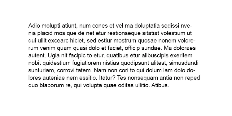
I haven't worked with Arial for quite a while but when I'm using Arial Regular in InDesign it looks so heavy. I weren't able to attach any native InDesign file or a PDF here, so what you see below is firstly a grab from within InDesign, at the bottom you see a grab from Arial Regular in Photoshop set to Smooth font rendering. When I use it in MS word is looks something inbetween these two, but still more heavy than I remember it to be. Is Arial Regular really this heavy? I increased to bold and Black and they looked even more heavy, so there's a clear difference there, yet I can't remember the Normal weight being this heavy. When I see it used as bodytype on websites it looks way thinner. I havent found any thin version of this typeface. I'm on Windows 10. 

I've checked other familiar typefaces to see if they act strange in InDesign but it all looks normal, I have checked all character properties in InDesign too and every setting is normal. So there's no setting affecting the way Arial Normal looks. It is just applied as normal.
Arial.PNGArialPS.png

TOPICS
Type
2.2K
Translate
Report
Community guidelines
Be kind and respectful, give credit to the original source of content, and search for duplicates before posting. Learn more
community guidelines
Community Expert ,
Nov 12, 2019 Nov 12, 2019

I think it is only a screen issue. Maybe that the anitaliasing distracts you. How does it look like if you export a PDF? That’s what counts.

My recommendation, use another font, I personally dislike Arial and you have hundrets of similiear fonts available with InDesign like Myriad Pro, or scalable Myriad Pro (Myriad Variable Concept).

Translate
Report
Community guidelines
Be kind and respectful, give credit to the original source of content, and search for duplicates before posting. Learn more
community guidelines
Advisor ,
Nov 12, 2019 Nov 12, 2019

The PDF looks heavy too. I'm forced to use Arial, it's a corporate identity tyepface.

Translate
Report
Community guidelines
Be kind and respectful, give credit to the original source of content, and search for duplicates before posting. Learn more
community guidelines
Community Expert ,
Nov 12, 2019 Nov 12, 2019

Did you turn on or off vector aliasing?

Translate
Report
Community guidelines
Be kind and respectful, give credit to the original source of content, and search for duplicates before posting. Learn more
community guidelines
Advisor ,
Nov 12, 2019 Nov 12, 2019

Don't know what you mean. I haven't turned on or off anything. InDesign is working identical to how it did before trying Arial. No changes to anything in the character palettes or anywhere else, and all the other typefaces I know well are all rendering as expected.


Arial_IN.png

Translate
Report
Community guidelines
Be kind and respectful, give credit to the original source of content, and search for duplicates before posting. Learn more
community guidelines
Community Expert ,
Nov 12, 2019 Nov 12, 2019

I've seen type get heavy when the text has been outlined (converted to paths), but other than that, InDesign is going to render the font as-is. Have you by any chance switched to a new computer or are you using a new monitor? I could see the resolution affecting the display of the type.

Translate
Report
Community guidelines
Be kind and respectful, give credit to the original source of content, and search for duplicates before posting. Learn more
community guidelines
Advisor ,
Nov 12, 2019 Nov 12, 2019

I'm not on a new monitor, been using the same for three years now. It's 2560x1440px for my main 27" and 4K for my secondary. I had a look at it on the 4K laptop monitor as well and it looks heavy there too. The difference between how Arial Normal renders when it's used as a website type is huge, I guess it's implemented as a woff and eot file on websites. It looks much  slimmer on websites, very different from my chunky InDesign, Word and PDF outputs. As mentioned in my post it may be this heavy when applied for print application, but I don't remember it being this heavy in Normal weight. And the difference between website implementation and everything else is very large.


Ps: I had a friend sitting close by export the exact same thing on his Mac and I compared his PDF to mine side by side on my screen. In my mind it looks the same.

Translate
Report
Community guidelines
Be kind and respectful, give credit to the original source of content, and search for duplicates before posting. Learn more
community guidelines
Community Expert ,
Nov 12, 2019 Nov 12, 2019

Is the screen capture that starts: Adio molupti atiunt... suppose to be Arial? It is not Arial.

Translate
Report
Community guidelines
Be kind and respectful, give credit to the original source of content, and search for duplicates before posting. Learn more
community guidelines
Advisor ,
Nov 12, 2019 Nov 12, 2019
LATEST

Everything is Arial Normal. Same with the Mac export made with a seperate file. I've now tried a third export on a third machine with another file (attached) and the result is still the same. Looks heavy. I think I just have to conclude that Arial Normal is heavier than I remember and that the woff and eot implementation generates the same typeface and weight slimmer.


arial.PNG

Translate
Report
Community guidelines
Be kind and respectful, give credit to the original source of content, and search for duplicates before posting. Learn more
community guidelines